Gallery: LandscapePosted May 23, 201393 views8 comments
Hi folks,
my latest work hope you will enjoy it
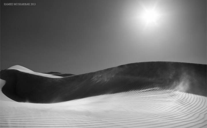
Pentax K-30, 18-55mm, ISO 100, 5 shots blended, F/16
all the comments are welcome
Thanks
Comments
8 comments
Comment posted by Hamed Musharbak on May 23, 2013 at 11:58 AM
colored version
Registered on June 1, 2009, 372 Posts, 2282 Comments
Comment posted by Morris McClung on May 23, 2013 at 12:56 PM
I like both versions. The b&w really emphasizes the tones, lines, and forms.
Registered on May 7, 2007, 670 Posts, 19650 Comments
Comment posted by Ed Lowe on May 23, 2013 at 7:40 PM
Both are very nice, but the B&W version showcases the lines and textures more effectively for me, Hamed.
Ed
Registered on February 7, 2004, 414 Posts, 7115 Comments
Comment posted by Nick Bristol on May 23, 2013 at 8:02 PM
Hi Hamed, Once again, very nice! I really enjoy the lines in this scene. I also like both the b&w and color versions but I think I lean towards the color for my favorite. A close call on this one.
Nick Bristol
Lone Rock, WI
Registered on February 1, 2004, 752 Posts, 14140 Comments
Comment posted by Nick Palmieri on May 23, 2013 at 9:29 PM
I think the tones in the sand and sky make this a perfect image for b+w conversion. I wish you open the shadows a tas on the left side. My preference is the b+w. nice one!
Registered on September 1, 2011, 35 Posts, 748 Comments
Comment posted by Harley Goldman on May 24, 2013 at 10:37 AM
I much prefer the conversion. The B&W conveys much more of a sense of desolation. If it were mine, I might bump the contrast a bit by bringing in the blacks a bit? Nice image.
Registered on November 19, 2003, 586 Posts, 11271 Comments
Comment posted by Eva McDermott on May 24, 2013 at 6:36 PM
Lovely B&W conversion Hamed, my favorite of the two. I do agree with Harley on a slight bump in contrast. Fabulous work none the less.
Registered on January 4, 2009, 1015 Posts, 13229 Comments
Comment posted by Mark Metternich on May 28, 2013 at 8:10 PM
You certainly don't get nearly enough comments for your work. This is a graphic amazement! Both work equally well in my eye.
Registered on June 19, 2009, 276 Posts, 6240 Comments

Comments
8 commentsEd
Nick Bristol
Lone Rock, WI