Gallery: FloraPosted May 6, 201335 views7 comments
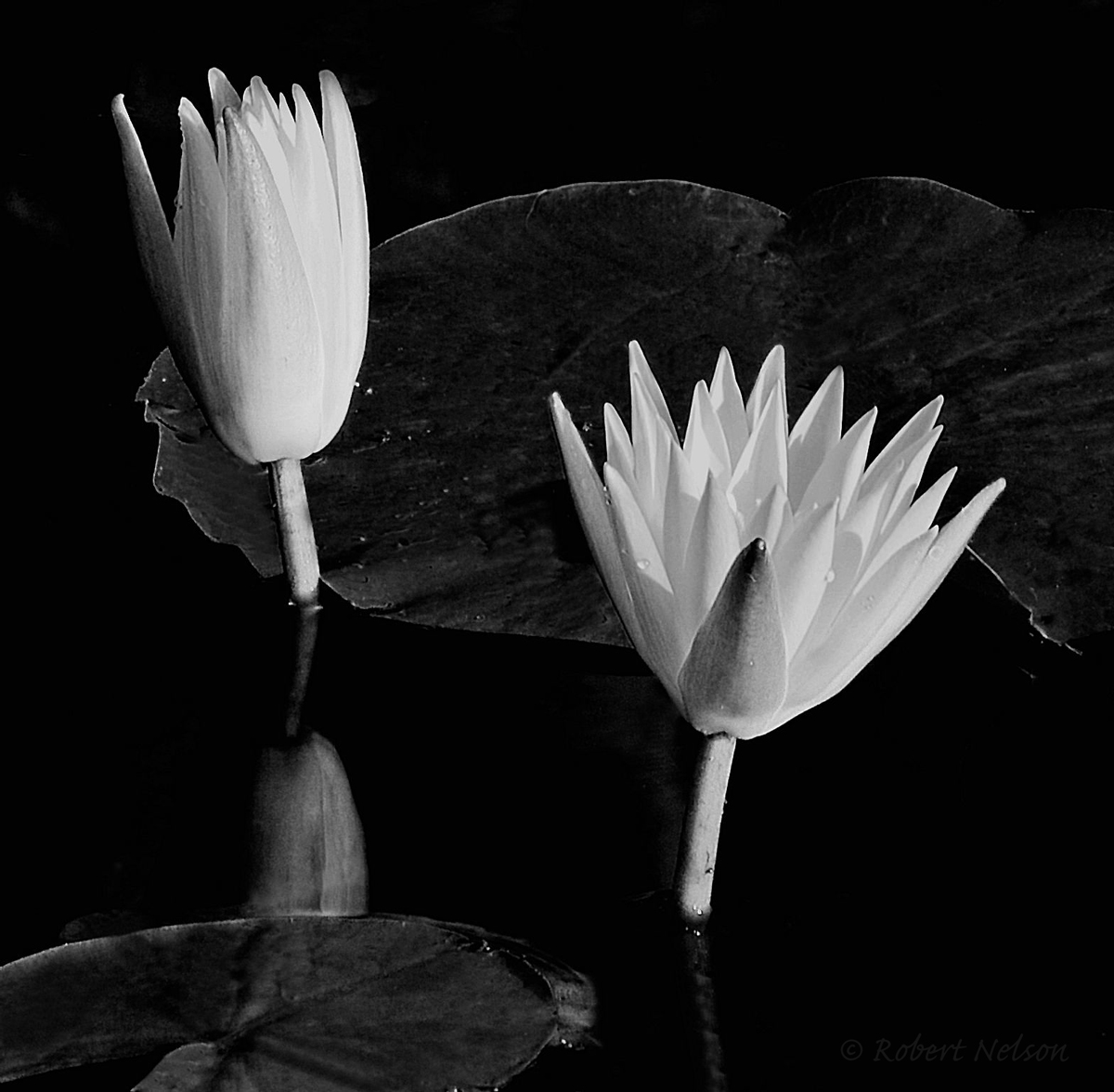
Going through some old files and reworking for the summer shows.
D80, F18, 1/5 sec, tripod
Thanks for comments and critique.
I normally am not a fan of B&W floral, but I thought this might work with a white mat and black frame.
Bob
Comments
7 comments
Comment posted by Gary Yeoh on May 7, 2013 at 2:48 AM
Bob:
B&W flora are a tough sell. However, what is interesting about this image is the triangle composition formed by the two blooms and the the reflection creating tension in the image. I might clone out the hot reflections from the drops as they are a little distracting.
Registered on September 1, 2009, 588 Posts, 8184 Comments
Comment posted by Ian Wolfenden on May 7, 2013 at 8:02 AM
Like the idea of this, Bob and Charly, though I personally find the contrast just a touch too strong. I think the composition is excellent - and the reflection adds a valuable mid-tone note.
Registered on May 18, 2007, 1108 Posts, 7647 Comments
Comment posted by Philip Hodgkins on May 7, 2013 at 3:48 PM
The composition is good, but the contrast is mighty stark. The tonality needs to be more balanced, with more mid-tone representation, IMO.
Registered on July 24, 2006, 2741 Posts, 12349 Comments
Comment posted by John&Patty Benway on May 9, 2013 at 11:32 AM
I like it Bob, it has a different look, and I find it interesting, definitely worth playing with.
John
Registered on May 12, 2006, 626 Posts, 8700 Comments
Comment posted by Elizabeth Arellano on May 11, 2013 at 1:40 PM
Striking B&W, well done.
Registered on February 18, 2008, 35 Posts, 302 Comments
Comment posted by Bill Fach on May 11, 2013 at 8:23 PM
Bob: Really nice conversion IMO. I like the tonal range and your comp. 2 thumbs up! >=))>
Registered on November 1, 2003, 1805 Posts, 26981 Comments
Comment posted by Howard Cheek on May 19, 2013 at 9:38 AM
I agree, this would look very nice "with a white mat and black frame."
I especially like the comp, i.e. spatial relationship of the different elements here
Registered on July 24, 2008, 1201 Posts, 10758 Comments


Comments
7 commentsB&W flora are a tough sell. However, what is interesting about this image is the triangle composition formed by the two blooms and the the reflection creating tension in the image. I might clone out the hot reflections from the drops as they are a little distracting.
John
I especially like the comp, i.e. spatial relationship of the different elements here