Nature Photographers Network
This is the preserved archive of the original Nature Photographers Network. The community continues at naturephotographers.network.
Boardwalk
‹ PreviousPOP Photos GalleryNext ›

Boardwalk

by John Clulow

Gallery: POP PhotosPosted May 6, 201362 views6 comments
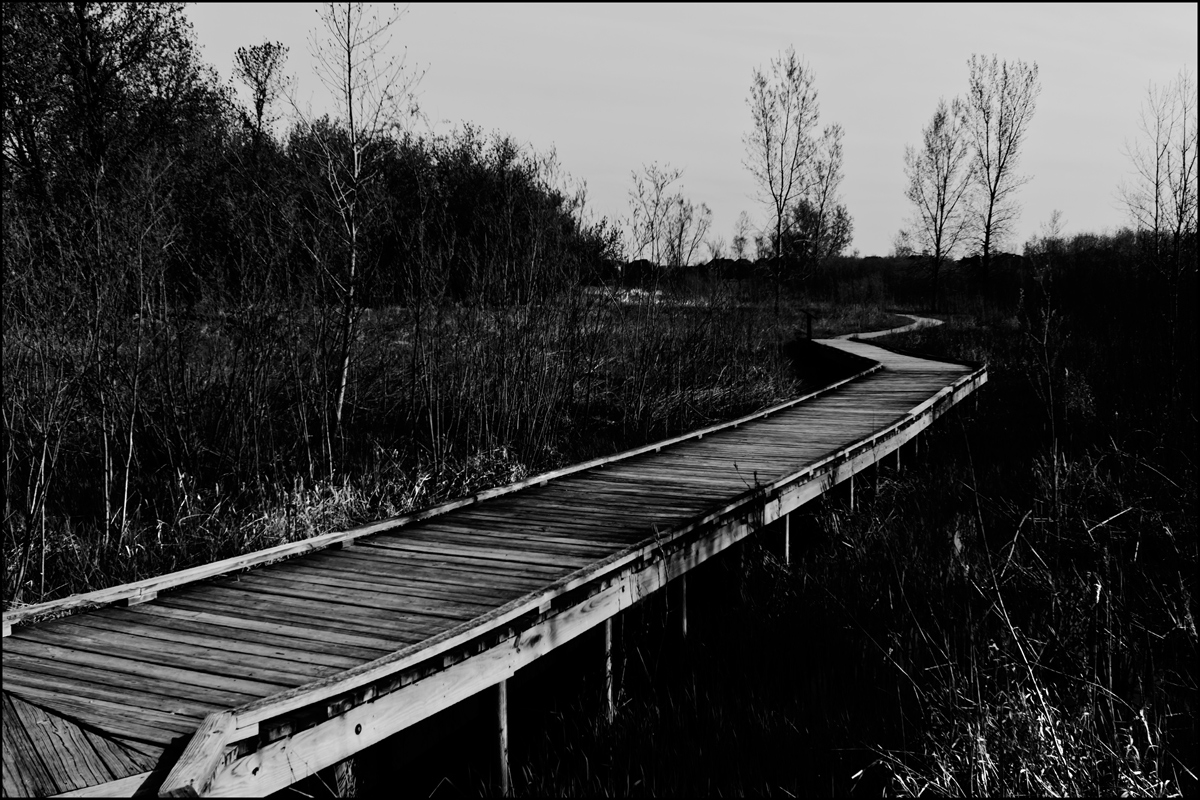
This doesn't fit in Man and Nature, a boardwalk I shot yesterday morning at a local marsh. The intention is one of a semi-abstract that embodies elements like s-curve, lines, and diagonal.

I'd be interested in your reactions, whatever they might be. Does it work?

Pentas K-5, Tamron 10-24mm at 24mm, f/11, ISO 200, 1/500. Contrast adjustment using luminosity masks.

Comments

6 comments
Comment posted by Karen Kane on May 6, 2013 at 3:15 PM
John - interesting treatment!

The s-curve is successful at bringing me into the image, however it does so with an "is it safe" kind of apprehension. Normally, one would expect a boardwalk to evoke a sense of "come and explore", in a pleasant way. With the overall darkness of the sky and closed shadows here, this has a very ominous and foreboding feel.

That makes it engaging for me

:toast:
Registered on August 4, 2012, 66 Posts, 726 Comments
Comment posted by Lon Overacker on May 8, 2013 at 3:49 PM
John,

this works very well for me. On the surface, the lead-in part of the composition is obvious and works very well leading the eye through the frame to what I see as "to infinity and beyond!" ;-) But here is what I find most interesting - and that is the processing. To me anyway, this has a very distinct, nostalgic presentation. An image from the archives - say even 19th century stuff. Adding a slight sepia tone is all that this one needs to really look like a historical image.

Well seen, captured and processed.

Lon
Registered on November 24, 2006, 521 Posts, 19147 Comments
Comment posted by John Clulow on May 8, 2013 at 5:11 PM
Thanks for the comments regarding your reactions, Karen and Lon. We'll see what happens in class critique tomorrow evening with this and all the blue bell pics :smile:

Meanwhile, Lon, I like the sepia touch per your suggestion and have added it below
Registered on November 1, 2012, 155 Posts, 1079 Comments
Comment posted by Harley Goldman on May 8, 2013 at 6:23 PM
I am liking the image a lot and the sepia toning really works well. Very nice.
Registered on November 19, 2003, 586 Posts, 11271 Comments
Comment posted by Vance Gese on May 9, 2013 at 1:33 AM
Great leading lines with the boardwalk moving the back quite nicely. One could almost wonder if you are trying to convey the idea of life's path and the unknowns, given the deep shadows to either side of the boardwalk, one encounters along the way. I like the sepia toning on the repost.
Registered on November 13, 2008, 298 Posts, 6629 Comments
Comment posted by Eva McDermott on May 19, 2013 at 1:06 AM
The sepia version works best for me John. The darker areas add some intrigue to your image. I too like how the boarwalk leads the viewer through the marsh.
Registered on January 4, 2009, 1015 Posts, 13229 Comments