Blue Bell Field
by John Clulow
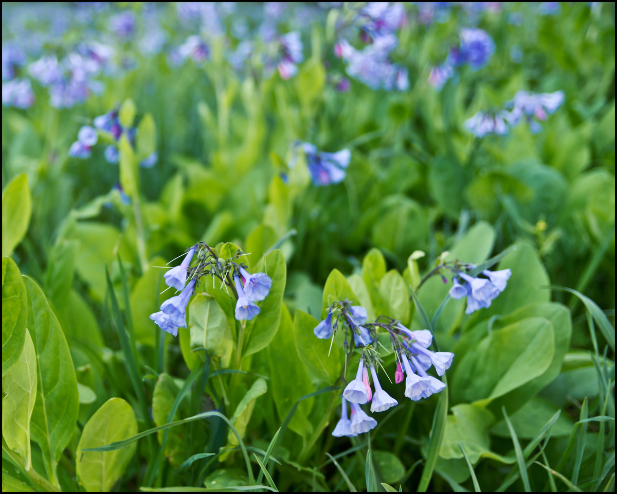
This was taken before the previous blue bell picture I poated and receipt of feedback on that. My intentions were to emphasize a few individuals in the lower right relative to the rest of the color field in the upper left and to have diagonal flow in luminance directed toward the bottom right corner.
I tried to put something different in each of the corners in terms of luminance and color, leaving the upper right empty.
I'm going to submit this as one of five for the weekly class assignment, and I'd be greatful to see your reaction, whatever that may be.
Pentax K-5, Tamron 17-50mm at 26mm, f/2.8 tripod, ISO 100, 1/250s contrast improvement using luminosity masks.

Comments
5 commentsAs I do very little closeup work myself I cannot comment too much on technical aspects beyond saying I like the image. The shallow DOF seems perfect for this arrangement too. Very nice capture.
As an exercise to critique an assignment, I am going to be a little hypercritical and I hope you don't mind. I am not connecting with image. There is too much green 'empty' spaces and not enough blue bells to convey a field of these flowers. May be a lower angle of view sweeping across the field might be better but I do not know if there is something on the horizon that is preventing you from doing it. The anchor point is not particularly strong and I am left guessing which foreground clump is really the focus. I would probably get a little closer to the blooms and place them at the 2/3 intersect to remove any doubt where you want the view to rest their eyes. Lastly, the luminonsity contrast is a little too subtle for me to appreciate (but I am viewing this on a cheap monitor). BTW have you tried TK luminosity masks - they are really great.
Bob
Gary: Special thanks to you for your in-depth critique. For me, this is a big part of what makes NPN unique and of such great value in our efforts toward continuous improvement.
As for TK luminosity masks, I use them on most images and did so for this one. I recorded an action in CS5 that generates 12 masks automatically. Mark Seaver told me about this a few weeks ago, and it is a tool I'd recommend as you obviously do.