D800
70-180mm macro @ 135mm
1.3 sec, f/16
Mode: Av
Metering: Multi-segment
Exp comp: +1/3
ISO: 200
AF mode: MANUAL
White balance: AUTO
Flash: Off
Comments
12 comments
Comment posted by Bill Fach on May 5, 2013 at 8:45 AM
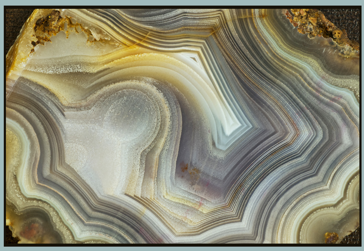
Sandy: Crop this in from the edges to completely fill the frame with the striations and this is spectacular. As is I'm afraid its merely fabulous. Nicely done.>=))>
Registered on November 1, 2003, 1805 Posts, 26981 Comments
Comment posted by Rick Turner on May 5, 2013 at 9:20 AM
I agree with Bill. First thing I noticed is all four edges of background. Very interesting none the lewss and a little crop and it becomes magic.
Registered on February 18, 2012, 534 Posts, 2755 Comments
Comment posted by Rob Graham on May 5, 2013 at 9:37 AM
Bill and Rick have it right, crop the edges away. This is a beautiful opening image for the weekly challenge.
Registered on August 22, 2006, 842 Posts, 2824 Comments
Comment posted by SandyRichardsBrown on May 5, 2013 at 12:58 PM
Thanks for the suggestions! Re-post attached:
Registered on November 24, 2003, 3937 Posts, 12909 Comments
Comment posted by Karen Kane on May 5, 2013 at 1:04 PM
Absolutely great start to the week Sandy! I do like the cropped version better
Registered on August 4, 2012, 66 Posts, 726 Comments
Comment posted by RL Potts on May 5, 2013 at 7:29 PM
I prefer the first version. The corners provide a framing device like a vignette and the darker edges give more contrast. But the other way looks nice too. This is a beautiful image that captures the illusion of depth. Excellent.
Registered on November 24, 2003, 188 Posts, 985 Comments
Comment posted by Bill Fach on May 5, 2013 at 8:17 PM
Sandy: 2+ thumbs up on the repost. >=))>
Registered on November 1, 2003, 1805 Posts, 26981 Comments
Comment posted by Scott Fricke on May 5, 2013 at 8:19 PM
Repost really hits the spot, great image Sandy.
Registered on January 19, 2007, 133 Posts, 1448 Comments
Comment posted by Carolyn Derstine on May 7, 2013 at 4:51 PM
Great shot of the wonderful designs in this rock, Sandy. I agree the repost is a better comp with a cleaner feel even though the original was good too. A great rock abstract and a good start for our theme!
Registered on February 16, 2011, 610 Posts, 3684 Comments
Comment posted by Jim Lockhart on May 7, 2013 at 7:30 PM
I'm undecided about the need for cropping myself...true, you remove some distracting elements, but lose some of the subject too, and take away context. I'm guessing this is a geode? Have seen many of them in my travels through New England and they're always beautiful and fascinating. Very nice patterns in there; the left side actually reminds me of the universal street sign symbol for a library . Thanks for sharing,
Jim
Registered on February 19, 2013, 91 Posts, 500 Comments
Comment posted by Mark Seaver on May 8, 2013 at 11:08 AM
Love all the banding. Agates are soooo cool! I actually like the original best. The repost feels too tight in the upper left to me.
Registered on January 23, 2011, 1103 Posts, 17270 Comments
Comment posted by John Clulow on May 10, 2013 at 7:43 PM
Gorgeous both before and after cropping.
Registered on November 1, 2012, 155 Posts, 1079 Comments

Comments
12 commentsJim