Gallery: POP PhotosPosted April 12, 2013200 views5 comments
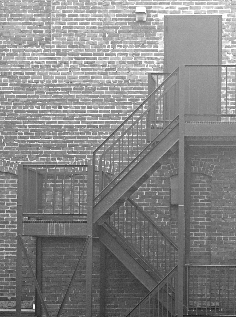
One that I am now able to post here in the POP gallery, taken awhile ago. D90, larger posted, thanks for any comments!
Comments
5 comments
Comment posted by Harley Goldman on April 12, 2013 at 12:19 PM
Bill, nice strong graphics and interesting patterns in this scene. It works quite nicely. I might consider increasing the contrast by bringing in the black point in levels or curves?
Registered on November 19, 2003, 586 Posts, 11271 Comments
Comment posted by John Clulow on April 12, 2013 at 5:47 PM
First of all, I absolutely love this image. Except for one minor thing that I will get to.
Like Harley, I also looked initially at the lack of dynamic range. So I took the time to look at this and moved the left slider in levels over and I didn't like the result nearly as well as what you have presented, and to be honest, I didn't expect to.
I fact, you could perhaps even go a little further in the opposite direction; that of reducing contrast so that the mind of the viewer has to provide that, and the underlying geometry requires that!
That is what is going on here, I think; the geometry screams for the mind to recognize it, but the contrast is less that the mind might like, and it's lazy. So it has to work a little, and in working, it realizes how it is always such a key determinant of our perception. It doesn't like that because it wants us to live under the illusion that things and events exist from their own side and it, the mind and perceptual processes, are transparent.
So this, I think, is a wonderful work of art !! Many KUDOS!!
Now as to the very minor point, I would suggest a perspective crop to fix the deviations from parallelism that exist primarily over on the left edge against the vertical metalwork, but also the brick lines there. And then perhaps a very slight adjustment might be considered on the right edge, but probably nobody will notice.
In conclusion, looking at your image is like listening to the Goldberg Variations, but maybe with the volume turned way down so I have to work a little to understand what I'm hearing, if that makes sense.
Registered on November 1, 2012, 155 Posts, 1079 Comments
Comment posted by Bill Maile on April 13, 2013 at 12:33 AM
Harley and John--thanks for the advice, I disagree with the contrast boost, I tried it. Like it just the way it is but everyone has their own opin.
John, you are spot on, I think, on you are spot on--I have to check whether the slight lean is me, or the stairs themselves. More tomorrow, but I really appreciate both of you opins, and that's a huge compliment IMO.
Registered on March 2, 2009, 984 Posts, 2518 Comments
Comment posted by Bill Maile on April 13, 2013 at 12:05 PM
One last point, I did try boosting contrast to see what it looked like before I posted and to be honest Harley, it wasn't what I wanted.
So on this repost, I went a bit the other way. An attempt to straighten slightly, a bit of a crop from the bottom, and added some "softness" to it, rather than increase the contrast. IDK, just something I had in mind with this, it was very foggy that day and I like the "mist-ery".
Registered on March 2, 2009, 984 Posts, 2518 Comments
Comment posted by Bob&Charly Nelson on April 14, 2013 at 10:21 PM
I really like this Bill, and I agree with the boost to bring out the image. Well seen.
Bob
Registered on October 27, 2005, 289 Posts, 4202 Comments

Comments
5 commentsLike Harley, I also looked initially at the lack of dynamic range. So I took the time to look at this and moved the left slider in levels over and I didn't like the result nearly as well as what you have presented, and to be honest, I didn't expect to.
I fact, you could perhaps even go a little further in the opposite direction; that of reducing contrast so that the mind of the viewer has to provide that, and the underlying geometry requires that!
That is what is going on here, I think; the geometry screams for the mind to recognize it, but the contrast is less that the mind might like, and it's lazy. So it has to work a little, and in working, it realizes how it is always such a key determinant of our perception. It doesn't like that because it wants us to live under the illusion that things and events exist from their own side and it, the mind and perceptual processes, are transparent.
So this, I think, is a wonderful work of art !! Many KUDOS!!
Now as to the very minor point, I would suggest a perspective crop to fix the deviations from parallelism that exist primarily over on the left edge against the vertical metalwork, but also the brick lines there. And then perhaps a very slight adjustment might be considered on the right edge, but probably nobody will notice.
In conclusion, looking at your image is like listening to the Goldberg Variations, but maybe with the volume turned way down so I have to work a little to understand what I'm hearing, if that makes sense.
John, you are spot on, I think, on you are spot on--I have to check whether the slight lean is me, or the stairs themselves. More tomorrow, but I really appreciate both of you opins, and that's a huge compliment IMO.
So on this repost, I went a bit the other way. An attempt to straighten slightly, a bit of a crop from the bottom, and added some "softness" to it, rather than increase the contrast. IDK, just something I had in mind with this, it was very foggy that day and I like the "mist-ery".
Bob