The restless sea II
by Jorne de Bruin
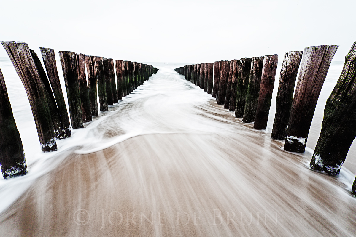
A slighty desaturated version of the image I posted a few weeks back. (it also has a slightly differnt composition and incoming wave). I chose this style because I liked the bleakness of it, which fit the mood and weather at the shoot itself. I'm curiois to hear which one you like best, as I've heard very differing opinions on both images.
The monochrome image you can see here: http://www.naturephotographers.net/imagecritique/ic.cgi?a=vp&pr=203864&CGISESSID=998231076118b034e2e234d13c7346e4&u=766
Thanks for looking!
Tech: 1dsmk II, 17mm, 2 sec @ iso 50 and f/22

Comments
6 commentsHaving said this, however, not having seen the B&W version, I think the mind could still impute meaning. For me, for all of the aforementioned reasons, this one has existential implications; passing out of this life into "The Gates of Oblivion" as Arlo Gutherie characterizes it or "Into the Masterpiece" per Leonard Cohen.
First, we have this blinding white light, and going into such a light is what is often described by those returning from near death experiences. The aging pylons, some with lichens growing on them, lead inexorably into the Light and the two figures floating in the distance; The only only remaining vestige of color other than the deck itself and the last wave ebbing toward the sea.
In the B&W version, you see that the figures are actually standing on an expansive beach in the horizon, just the other side of the lake or pond, not eternity. You also have a lot more going on in the foreground, the here-and-now. And, perhaps most importantly, you don't notice the lichens.
PS: Below the comment box and just above and to the left of the "Choose File" button is a hyperlink named "Text Style Menu" which will tell you how to create a hyperlink to your earlier image.
Gary.