Nature Photographers Network
This is the preserved archive of the original Nature Photographers Network. The community continues at naturephotographers.network.
Pacific Paradise
‹ PreviousLandscape GalleryNext ›

Pacific Paradise

by Johan Eickmeyer

Gallery: LandscapePosted March 31, 2013495 views11 comments
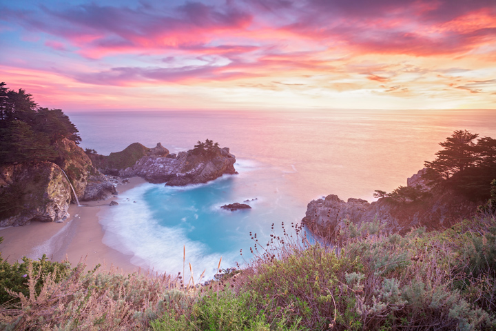
I've probably reprocessed this photo more times than any other I have taken. Even though it is just a two exposure blend, it has been very difficult to recreate the scene as how it was seen and felt in person. The colors were some of the most vivid I have ever seen.

I drove around 300 miles and wasn't expecting to get to Big Sur until later in the evening. I happened to arrive at McWay Falls around 5 minutes before the sunset. Oh boy! What a show! :jump:

It was one of the most intense and moving sunsets I have ever witnessed. I can only imagine how great it must have been to live in this spot many years ago, before it was donated as a park.

I spent another 2 weeks in this area thinking sunsets like this were the norm, and I could not have been any more wrong, according to some locals I met along the way. On top of that, it is crazy how many good shots are blocked off by walls of poison oak. It grows like crazy down there! The raccoons would raid my tent and truck every night and spread poison oak residue over everything. My hands were puffy for days after leaving there.

Photoshop CS6
Canon 5d2
16-35 II @ 16mm
Lee 3stop ND 4x4 filter

Thanks for looking!
Johan :wavey:

Comments

11 comments
Comment posted by Adam Smith on March 31, 2013 at 2:44 PM
Beautiful way to capture the lighting and portray an image built around beauty. I love images like this because them bring a relaxing state. They cause me to think of all the good things in life. Good image. I like the use of the water and the longer exposure.
Registered on November 21, 2012, 16 Posts, 107 Comments
Comment posted by Serkan Imisiker on March 31, 2013 at 2:45 PM
Johan,
This a very good composition and colors are so vivid. I only suspect that especially the bushes at the lower end of the photo were highlighted quite strongly and somewhat it seems a little bit distracting. Since I did not see the real scene you are the one who can judge this in person. Well done.
Serkan
Registered on March 15, 2013, 25 Posts, 44 Comments
Comment posted by Scott Fricke on March 31, 2013 at 3:14 PM
Johan, it is difficult not knowing what the lighting was when you took the photo, but my initial reaction to seeing the photo was "too bright". To me I think the whole image good be darkened, being careful to leave detail in the dark trees. You certainly did capture a terrific image, I love color of the water in the cove and the beautiful color in the clouds, nicely composed.
Registered on January 19, 2007, 133 Posts, 1448 Comments
Comment posted by Johan Eickmeyer on March 31, 2013 at 3:55 PM
Thanks for the feedback!

The lower bushes are way higher above the water than the rest of the scene below, and as such did receive more light. I could try pulling them back a little if they are too distracting.

I should try processing images for both web posting and print, as it seems people find my print processed photos too bright. Prints tend to need at least a 1 stop boost to look right in real light, where computer screens tend to look fine a little darker due to being self-illuminated. I'll keep that in mind for all of the new photos I take this year and process web versions too. All of the photos I have done to date are processed for printing, and have been pushed to the right as far as possible. I hate dark photos when printed and hung in natural light.
Registered on March 25, 2013, 36 Posts, 164 Comments
Comment posted by Peter Coskun on March 31, 2013 at 4:09 PM
This is a beautiful view, but I think overall it is a tad too bright. I also think a slight vignette would help draw the viewer into the falls. Definitely potential to be a dramatic image with a few minor tweaks.
Registered on October 31, 2011, 170 Posts, 1240 Comments
Comment posted by Johan Eickmeyer on March 31, 2013 at 4:34 PM
Just a quick edit to darken the overall lighting and foreground.

I still like having a brighter image personally, at least when viewing on my calibrated monitor setup. It does look a little too bright on my laptop though. I like images to be bright and uplifting more often than moody and dramatic. I'll try giving this image another go once I'm back on my calibrated setup and see if I can't find a good middle ground.
Registered on March 25, 2013, 36 Posts, 164 Comments
Comment posted by Bill Reid on March 31, 2013 at 4:42 PM
Beautiful image Johan. I much prefer the repost as it pulls my eyes into the image and I like the colors better. Well done.
Registered on January 27, 2013, 65 Posts, 2460 Comments
Comment posted by Ed Lowe on March 31, 2013 at 8:46 PM
Looks like a perfect way to end the day, Johan. I prefer the repost as the slightly darker version gives the colors a little more punch. I hope you had time to enjoy the view after the lightshow was over. :toast:

Ed
Registered on February 7, 2004, 414 Posts, 7115 Comments
Comment posted by Peter Coskun on April 1, 2013 at 12:34 AM
The repost looks much better to me. Good work!
Registered on October 31, 2011, 170 Posts, 1240 Comments
Comment posted by Shantikara Valuska on April 1, 2013 at 10:07 AM
Wonderful image! A bit strong saturation, but I like it. The repost looks better.
I agree with you about the brightness issues, I also have troubles with posting here in proper brightness/saturation.
I've seen your website, you have an excellent portfolio! :smile:
:toast:
Registered on July 25, 2011, 38 Posts, 451 Comments
Comment posted by John Mumaw on April 1, 2013 at 2:56 PM
I much prefer the repost! Lovely colors and an incredible scene you captured. Well done!
Registered on September 9, 2005, 62 Posts, 2289 Comments