Nature Photographers Network
This is the preserved archive of the original Nature Photographers Network. The community continues at naturephotographers.network.
Unruliest + Repost
‹ PreviousFlora GalleryNext ›

Unruliest + Repost

by Eirini Pajak

Gallery: FloraPosted February 14, 201353 views10 comments
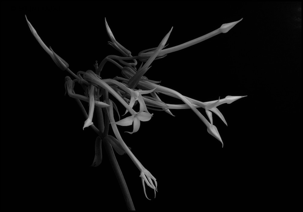
This was actually the first of the Unruly Series but I never posted it here because I liked the other two better. Seeing Lorna's excellent flora images made me think I should try it in B&W.

Stack of 8

Comments/Criticisms welcome.

Comments

10 comments
Comment posted by Eirini Pajak on February 14, 2013 at 1:30 PM
Here is the color version for comparison...
Registered on December 13, 2011, 216 Posts, 1671 Comments
Comment posted by Lorna Taylor on February 14, 2013 at 3:55 PM
Just fantastic !! Love the B&W but I am bias as I always prefer B&W ! !
Registered on November 12, 2010, 254 Posts, 3083 Comments
Comment posted by John Clulow on February 14, 2013 at 8:05 PM
I agree with the person from Alberta; the B&W is like a symphony of form. And Alberta isn't bad either, especially west of Calgary, and then BC becomes even better.
Registered on November 1, 2012, 155 Posts, 1079 Comments
Comment posted by Philip Hodgkins on February 14, 2013 at 8:29 PM
Now stop that! :biggrin: I can't keep up with this. The color is excellent, but the B & W is superb! :toast:
Registered on July 24, 2006, 2741 Posts, 12349 Comments
Comment posted by Gary Yeoh on February 17, 2013 at 1:05 AM
Eirini:

I do like the B&W more than the color version. I know you like your image dark but a little more tonal range in the B&W would be more my taste (a quick check showed that the brightest value is only around the 200 and way down from the max of 255.
Registered on September 1, 2009, 588 Posts, 8184 Comments
Comment posted by Eirini Pajak on February 17, 2013 at 11:09 AM
Thanks for the input Gary...I don't know if this version fixes the problem?
Registered on December 13, 2011, 216 Posts, 1671 Comments
Comment posted by Giuseppe Guadagno on February 17, 2013 at 1:49 PM
Well done Eirini! For me it is a beautiful image also in B&W.
Take care.
Registered on February 3, 2007, 827 Posts, 5052 Comments
Comment posted by Albert Darmo on February 17, 2013 at 4:37 PM
Hi Eirini :wavey: Beautifully composed to show the excellent form, i too prefer the B&W version better, especially the second post
Albert Darmo
Registered on November 25, 2008, 1386 Posts, 11978 Comments
Comment posted by Morris McClung on February 21, 2013 at 12:01 PM
Yeah, what Phil said. :biggrin: :toast:
Registered on May 7, 2007, 670 Posts, 19650 Comments
Comment posted by Lucy Aron on March 24, 2013 at 12:02 PM
Very cool and b & w a fine choice. Wonder what it would look like with the grey tones slightly higher key....


lucy
Registered on February 25, 2011, 189 Posts, 1160 Comments