Gallery: LandscapePosted February 11, 2013336 views15 comments
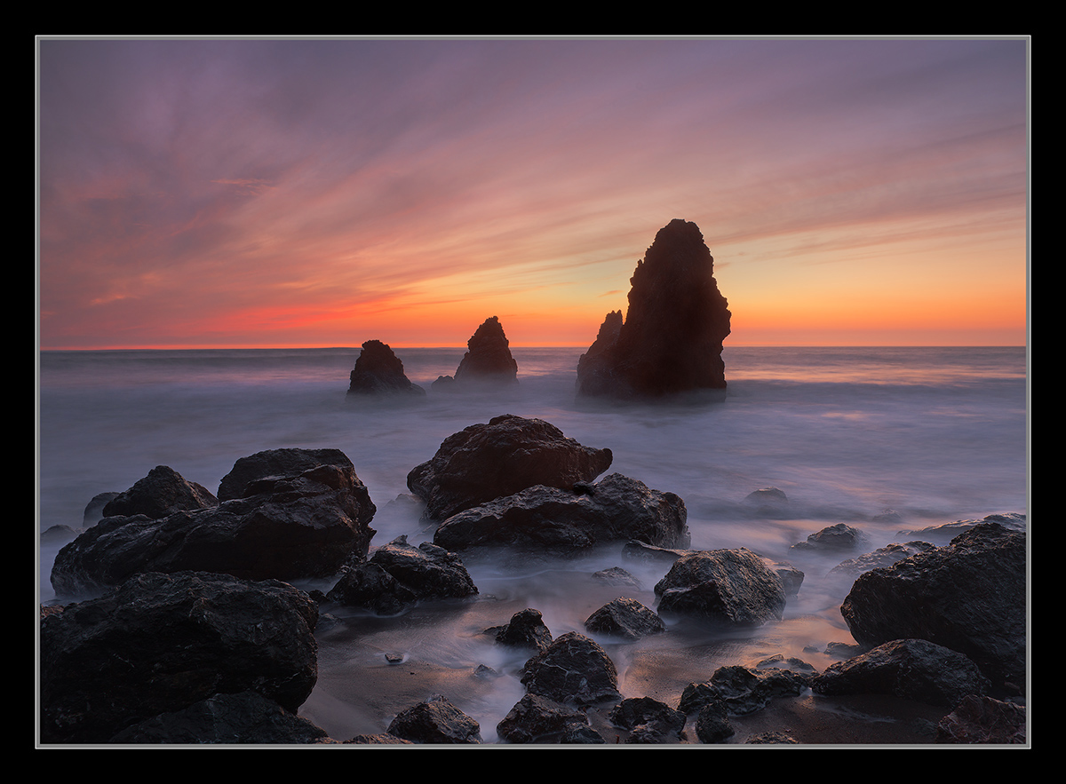
Late light, and color coupled with a long exposure. I have neutralized the midground water more in the larger version. What do you think?
D800,
24-70mm,
8sec, F/9.5
ISO 200,
Thanks,
Chris
Comments
15 comments
Comment posted by Brian Schrayer on February 11, 2013 at 9:31 PM
Nicely composed with beautiful light, Chris. I personally would prefer a bit more texture in the water, but I realize that is subjective and as you note it was also late so a long exposure was necessary. Very nice work, Chris!!
Registered on May 28, 2004, 114 Posts, 2890 Comments
Comment posted by Morris McClung on February 11, 2013 at 10:18 PM
The colors are great in this, and the long exposure lends a timeless feel to the scene. A beautiful coastal sunset. I do prefer this version.
Registered on May 7, 2007, 670 Posts, 19650 Comments
Comment posted by Bill Fach on February 11, 2013 at 11:41 PM
Chris: Strikingly beautiful. Superb capture and processing. Most excellent.>=))>
Registered on November 1, 2003, 1805 Posts, 26981 Comments
Comment posted by Hamed Musharbak on February 12, 2013 at 12:20 AM
This is nice but i prefere the previous but this one also beatiful, i like the colors
Hamed
Registered on June 1, 2009, 372 Posts, 2282 Comments
Comment posted by John&Patty Benway on February 12, 2013 at 8:07 AM
What do I think, gorgeous, really like the colors, very natural looking, not over saturated like some I've seen,all & all, beautiful work, and beautifully presented.
John
Registered on May 12, 2006, 626 Posts, 8700 Comments
Comment posted by Mark Seaver on February 12, 2013 at 9:53 AM
Wow, the comparison with the previous post is dramatic. I like this version better because is appeals to my appreciation of quiet details. The drama in the previous post is palpable and it would have been wonderful to be there, but this version lets me think about sitting quietly and daydreaming as the light slowly fades. I like the centered stacks in the mid-ground with the flow in both the clouds and the surf adding a sense of action. The subtle colors reflected in the water are a great addition. I'd print this one large and hang it.
Registered on January 23, 2011, 1103 Posts, 17270 Comments
Comment posted by Tony Kuyper on February 12, 2013 at 10:33 AM
Nice scene with lots of interest in the foreground, middle-ground, and background. Not sure what you mean by "neutralized the midground water" but to me it seems a bit lacking in detail. This lack of detail sort of heightens the sense of sea spray, but it seems a bit dense. I should also mention that I'm on my laptop, which can muddle things sometimes.
Registered on November 1, 2003, 364 Posts, 22328 Comments
Comment posted by Nick Bristol on February 12, 2013 at 11:08 AM
Another beautiful image from here Chris. I think this comp works great and I love the mood of this one. The colors are wonderful. I like the water better in the original (smaller one). Seems to be a bit more blue instead of the more gray tone in the larger one. Nice work...again!
Nick Bristol
Lone Rock, WI
Registered on February 1, 2004, 752 Posts, 14140 Comments
Comment posted by Skip Layman on February 12, 2013 at 12:21 PM
A very nice mood shot. The long exposure almost makes the water look like a low fog is hanging over it.
Registered on November 1, 2003, 558 Posts, 1704 Comments
Comment posted by Wayne Jones on February 12, 2013 at 1:30 PM
What do I think? I think this is gorgeous! It's difficult to compare the larger and smaller versions; there may be a subtle difference in saturation or contrast, but they both look good to me.
Not sure if you want to compare this to your earlier image from this place, but if you do, here are some questions to think about:
1. Do you want to know what would appeal to more "non-photographer" people?
If so, here are two samples: Both my wife and my 9 year-old granddaughter (independently) said they prefer the earlier one because of the brighter colors.
2. What is you intention as an artist? (There are no wrong answers as long as you are being truthful.)
Is this picture about:
(a) the landscape; or
(b) your personal impression of the landscape; or
(c) your skill as a photographer and/or artist?
3. Also, is it more important to you that you convey the literal reality of the scene, or how skillful, artistic, or clever the photographer is in interpreting it? (Not quite the same question as no. 2)
SUGGESTION: Print them both large and mount them back-to-back so you can rotate them from time to time, according to how you feel, or who you are showing it to!
Registered on April 18, 2007, 953 Posts, 6435 Comments
Comment posted by Zack Clothier on February 12, 2013 at 7:36 PM
A nice followup to your previous post Chris. I like both versions, but I think the composition is a little stronger in this one. The tradeoff, of course, being the light. I do prefer the slightly more blue water in the smaller version here.
Registered on January 28, 2010, 343 Posts, 2257 Comments
Comment posted by Eva McDermott on February 12, 2013 at 8:19 PM
I like your previous post better Chris but that is just my opinion. The foreground is much more lively in your previous version. If I had not seen your previous post though I would say this is wonderful (if you know what I mean).
Registered on January 4, 2009, 1015 Posts, 13229 Comments
Comment posted by Kathy Barnhart on February 13, 2013 at 1:13 PM
Chris, this is another gorgeous shot of Rodeo Beach, and I like the dreamy feel of a longer exposure. But I also like the lively water in the previous post and the brighter colors. Both are wonderful shots, just a slightly different feel to each one. It's a great study in how a change in exposure time, viewpoint and light can impact the mood of a photo.
Registered on November 11, 2011, 404 Posts, 1639 Comments
Comment posted by Dan Baumbach on February 14, 2013 at 7:39 PM
You're getting some nice ones from Rodeo beach. This might be my favorite. I like the addition of the foreground rocks.
- Dan
Registered on November 1, 2003, 473 Posts, 7980 Comments
Comment posted by Vincent Piotrowski on February 17, 2013 at 9:34 PM
This is nice. A classic concept well executed.
Registered on January 20, 2012, 6 Posts, 48 Comments

Comments
15 commentsHamed
John
Nick Bristol
Lone Rock, WI
Not sure if you want to compare this to your earlier image from this place, but if you do, here are some questions to think about:
1. Do you want to know what would appeal to more "non-photographer" people?
If so, here are two samples: Both my wife and my 9 year-old granddaughter (independently) said they prefer the earlier one because of the brighter colors.
2. What is you intention as an artist? (There are no wrong answers as long as you are being truthful.)
Is this picture about:
(a) the landscape; or
(b) your personal impression of the landscape; or
(c) your skill as a photographer and/or artist?
3. Also, is it more important to you that you convey the literal reality of the scene, or how skillful, artistic, or clever the photographer is in interpreting it? (Not quite the same question as no. 2)
SUGGESTION: Print them both large and mount them back-to-back so you can rotate them from time to time, according to how you feel, or who you are showing it to!
- Dan