Nature Photographers Network
This is the preserved archive of the original Nature Photographers Network. The community continues at naturephotographers.network.
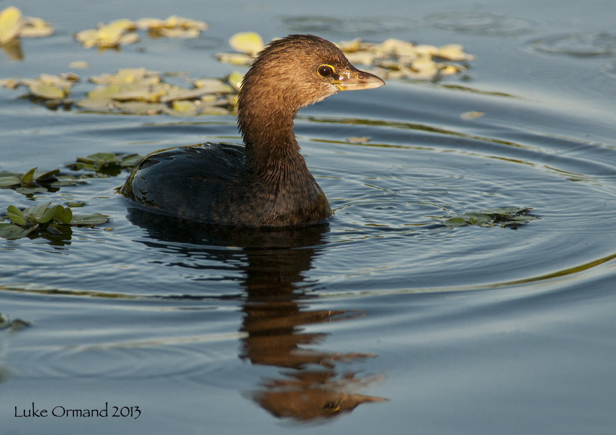
Morning Grebe
‹ PreviousAvian GalleryNext ›

Morning Grebe

by Luke Ormand

Gallery: AvianPosted February 5, 201391 views9 comments
I really liked the selective lighting on the head - though I wish I'd take a few vertical images instead of solely horizontal.

Nikon D300s 300 f4 + 1.7X TC HH @ Green Cay Wetlands
f/8
1/1000s
ISO 500
-.67 EC

Cropped to 75%, sharpened in CS5 on 27" iMac

- Luke

Comments

9 comments
Comment posted by Charles Gangas on February 5, 2013 at 8:05 PM
I too like the light you've captured on the Grebe and the comp stands well as presented IMO.
Registered on August 12, 2009, 544 Posts, 2414 Comments
Comment posted by Richard Ditch on February 5, 2013 at 8:23 PM
I too like the light, and thre horizontal composition is fine with me. I'd try darkening the leaves behind the grebe a bit.
Registered on November 1, 2003, 1031 Posts, 12705 Comments
Comment posted by John Neukirch on February 5, 2013 at 10:06 PM
The highlight on the head says it all to me. You can fix everything else as per others opinions. :toast:
Registered on July 9, 2012, 207 Posts, 1476 Comments
Comment posted by Dennis Plank on February 5, 2013 at 11:01 PM
Beautiful light on the Grebe's head, Luke.

:toast:
Registered on January 28, 2008, 1767 Posts, 23192 Comments
Comment posted by Kurt Bowman on February 6, 2013 at 12:56 AM
Love the light on the little Grebe Luke, I also think darkening the BG leaves would take this up even another notch. But all around nice capture.
Registered on June 19, 2008, 1005 Posts, 8028 Comments
Comment posted by Craig Strand on February 6, 2013 at 2:46 AM
Good capture Luke, I also like the lighting on the head and the reflection.
Registered on March 30, 2008, 416 Posts, 2885 Comments
Comment posted by Ron Dudley on February 6, 2013 at 11:03 AM
Luke, I agree - the selective lighting is a big plus and I like the horizontal presentation too, though perhaps it's a bit tight up top. Well done.
Registered on March 30, 2007, 437 Posts, 10915 Comments
Comment posted by Nate Chappell on February 7, 2013 at 8:03 PM
I like the spotlighting on the face here Luke, a little more room on top would improve this imo :toast:
Registered on February 1, 2006, 1158 Posts, 19528 Comments
Comment posted by Wayne Willison on February 8, 2013 at 8:09 AM
Looks like stage lighting. Cool.
Registered on April 10, 2009, 292 Posts, 3967 Comments