I couldn't help myself - after seeing Max's high-key Kalahari cheetha post I thought of this one, and remembered that I wanted to post it here.
Similar high-key treatment (late morning light: 10am-ish)
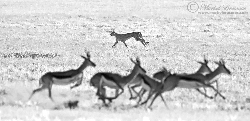
This young male cheetah was stalking the herds in the valley from on high up a dune for a while...but in his inexperience he started the chase too soon and it was over before it really began.
I do like this frame though - it's a bit unconventional and won't be everyone's cuppa...but I'd love your thoughts. Why do or don't you like it? And Brad, I will post the colour version in the thread just for you

Techs:
Nikon D3s with Nikkor 500mm f4 VR-II + 1.4xTC @ 700mm
f8.0 @ 1/6400 SS @ ISO-4000
I was set up for getting sharp shots of the fastest mammal on land - hence the settings biased towards SS despite the bright conditions...

Comments
10 commentsYour thoughts?
I like the balance between the subjects going in opposite directions and the way they create two parallel lines. To me, the crop is the toughest choice here. I could see it working with a bit more space at the bottom (if the original frame allowed), and I'd also wonder about tightening the sides and shaving off the empty space a bit, merely because to me this is more about the shapes than the subjects themselves. But that's not to say those would be any better... just ideas that crossed my mind when I first looked at this.
Max
Perhaps I should post the uncropped unprocessed file just for reference when making crop suggestions...
Overall I think you went about this the right way, Morkel.
Max
Two small nits: the leg position of the cheetah looks awkward, and I'd clone out that dark blob below the left most springbok. And those blown out oof highlights at the bottom too. Hope that makes sense.
Marsel
Thanks for including colour version - helps a lot (and so does the uncropped version). No doubt about it for me - I definitely prefer the B&W version.
I like that this image is telling a bit of a story. It's not fully apparent why the cheetah is going one way and the prey are going in the opposite direction, but there's obviously some form of predator-prey interaction going on here. And the tension introduced by the opposing directions of travel adds considerable interest to the shot. This image makes one look twice (or more)...which is almost always a sign that it works. Well done.
You know, for me there's something about the original posted shot that negatively impacts my appreciation of it more than any tweaking of the crop - those blown out areas along the bottom of the frame that extend up to the feet of the springbok. And, when I look at the uncropped, unprocessed file I see no sign of over-exposed areas there - which implies to me that those blown out areas are a product of post-processing. And now that I've given it a closer look I can see those blown out areas are simply green(er) patches in the original...so they were introduced by pushing the greens/yellows during conversion (so retrievable with a little selective work in the conversion).
Cheers...
Brad