Nature Photographers Network
This is the preserved archive of the original Nature Photographers Network. The community continues at naturephotographers.network.
Marin Headlands
‹ PreviousLandscape GalleryNext ›

Marin Headlands

by Chris Chamberlain

Gallery: LandscapePosted January 14, 2013378 views16 comments
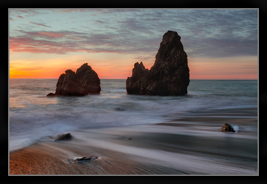
So, back to my softer side. A little later with softer light and colors. This was processed before the high contrast vertical from the same location. So, I would say this is more "typical" processing for me. Hope you enjoy it.

Chris

Comments

16 comments
Comment posted by Eva McDermott on January 14, 2013 at 10:18 PM
I must say, I like the much better Chris. While the other version had some striking characteristics, I think this speaks of a more subtle beauty. The water motion in the foreground, detail in the stacks, beautiful color in the sky are irresistible. Wish I was there to witness this.
Registered on January 4, 2009, 1015 Posts, 13229 Comments
Comment posted by Brian Schrayer on January 14, 2013 at 10:44 PM
Beautiful image, Chris. Although it is a relatively small part of the composition I really like the warm reflected light in the lower left hand corner. The lines formed by the tide lead my eye out to sea. I like the similar shape of the sea stacks. Oh, and then there's the sky - beautiful work!! :toast:
Registered on May 28, 2004, 114 Posts, 2890 Comments
Comment posted by Morris McClung on January 14, 2013 at 11:58 PM
PP looks fine in this. Nice light, color, and mood. The comp pulls everything out of the left side, though. Of course, that may just be what you wanted.
Registered on May 7, 2007, 670 Posts, 19650 Comments
Comment posted by Dennis Chamberlain on January 15, 2013 at 12:49 AM
The softer colors are nice. I just wish you would have composed it so that the rocks were more to the right.
Registered on January 6, 2013, 12 Posts, 44 Comments
Comment posted by John&Patty Benway on January 15, 2013 at 7:37 AM
Pretty scene indeed Chris, beautiful light, color and comp. Well done.
John
Registered on May 12, 2006, 626 Posts, 8700 Comments
Comment posted by Mark Seaver on January 15, 2013 at 10:31 AM
The gentle warmth is palpable. I really like how you used the flow in the sand to lead to the stacks and included the sky color but kept the sun off stage.
Registered on January 23, 2011, 1103 Posts, 17270 Comments
Comment posted by Chet Dowell on January 15, 2013 at 10:59 AM
Well done Chris. This is beautiful work. Chet
Registered on December 3, 2012, 237 Posts, 1171 Comments
Comment posted by Kurt Budliger on January 15, 2013 at 11:42 AM
What's not to love about this, well done.
Registered on June 11, 2006, 113 Posts, 2116 Comments
Comment posted by Bret Edge on January 15, 2013 at 12:29 PM
I really like the pastels of the sky and the streaks of water rushing over sand. Lovely image, Chris.
Registered on November 1, 2003, 711 Posts, 6363 Comments
Comment posted by Gary McGhee on January 15, 2013 at 2:59 PM
The receeding surf lines look really good Chris, I like the slight showing of detail in the rocks and the lovely sunset colours.

Gary.
Registered on April 15, 2010, 142 Posts, 2416 Comments
Comment posted by Bill Chambers on January 16, 2013 at 9:38 AM
I much prefer this style of processing for you. I think I like the vertical format of the other a little better but overall, I prefer this image. This is understated yet so eye catching. Love the pastel sky and the receding water.
Registered on April 10, 2005, 753 Posts, 21216 Comments
Comment posted by Lon Overacker on January 16, 2013 at 3:43 PM
Chris,

This is beautiful. Outstanding job with the processing here. I think the stacks have just enough detail in them and those little highlights make a big difference too. Awesome color and I think you nailed the contrast here too. Sorry for not commenting on the previous revision, but I prefer this one anyway! :smile:

Lon
Registered on November 24, 2006, 521 Posts, 19147 Comments
Comment posted by Anthony Vincent on January 16, 2013 at 4:34 PM
I do enjoy. Lovely higher contrasts in the fg and then leading off to softer and more peaceful atmosphere. Great seeing you excel at this photography thing :wink:
Registered on February 5, 2009, 199 Posts, 2775 Comments
Comment posted by Harry Lichtman on January 16, 2013 at 4:56 PM
Perfectly balanced with rocks in just the right places. Nice contrast using the streaking water and the static rocks. Subtle rock highlights, especially the right corner very nice.
Registered on September 17, 2010, 304 Posts, 3507 Comments
Comment posted by Alex Mody on January 18, 2013 at 3:47 AM
Nothing wrong with keeping things soft. This image is great!
Registered on December 25, 2007, 163 Posts, 1896 Comments
Comment posted by Mark Metternich on January 20, 2013 at 6:38 PM
Fabulous Chris!!!!!!!!!! :toast:
Registered on June 19, 2009, 276 Posts, 6240 Comments