Gallery: LandscapePosted January 14, 2013237 views7 comments
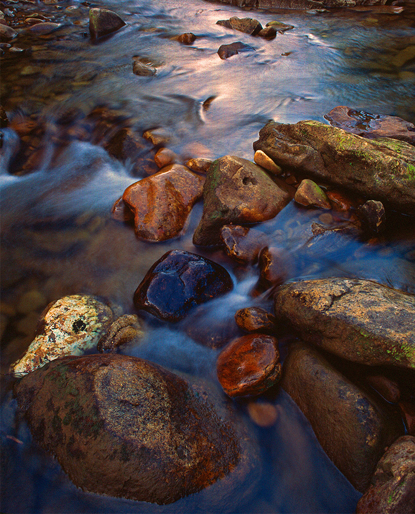
From my view it was as if the river had brought these beautiful rocks and laid them at my feet. Comments and suggestions welcome. From 35mm slide film.
Comments
7 comments
Comment posted by Brian Schrayer on January 14, 2013 at 8:02 PM
The variety of color and texture in the rocks hold my interest very well and the warm / cool contrasts in the water complement the scene very nicely. Beautiful image, Chet!!
Registered on May 28, 2004, 114 Posts, 2890 Comments
Comment posted by Morris McClung on January 14, 2013 at 11:53 PM
I like the color, light, perspective, and comp in this a lot.
Registered on May 7, 2007, 670 Posts, 19650 Comments
Comment posted by John&Patty Benway on January 15, 2013 at 7:57 AM
Very appealing scene Chet, love the stream shots, beautiful colors, detail and light. Well done.
John
Registered on May 12, 2006, 626 Posts, 8700 Comments
Comment posted by Mark Seaver on January 15, 2013 at 10:23 AM
Wonderful! The color and sheen on the rocks leads to the gentle reflection. Your scan looks great.
Registered on January 23, 2011, 1103 Posts, 17270 Comments
Comment posted by Navin Sarma on January 15, 2013 at 11:06 PM
The light on the water is very appealing! I like the natural colors as well. The comp is nice too, though the only critiuqe I can give is there isn't one area of the frame outwardly grabs my attention over another. Perhaps that is by design. I also see a little color noise in the large version that you might look at.
Registered on July 17, 2011, 233 Posts, 1373 Comments
Comment posted by Chad Merrell on January 16, 2013 at 9:41 AM
Well seen. Well composed. Well processed. Well done.
Registered on July 8, 2010, 91 Posts, 304 Comments
Comment posted by Harry Lichtman on January 16, 2013 at 10:02 AM
The warm and cool tones work very well in this comp. My only suggestion might be to darken the top most highlights of the water in the top of the image - too much of an eye draw out of the image. The reflected light in the brooks is very soothing and appealing. Nicely seen.
Registered on September 17, 2010, 304 Posts, 3507 Comments

Comments
7 commentsJohn