Nature Photographers Network
This is the preserved archive of the original Nature Photographers Network. The community continues at naturephotographers.network.
Good Light at the Rodeo
‹ PreviousLandscape GalleryNext ›

Good Light at the Rodeo

by Chris Chamberlain

Gallery: LandscapePosted January 6, 2013527 views15 comments
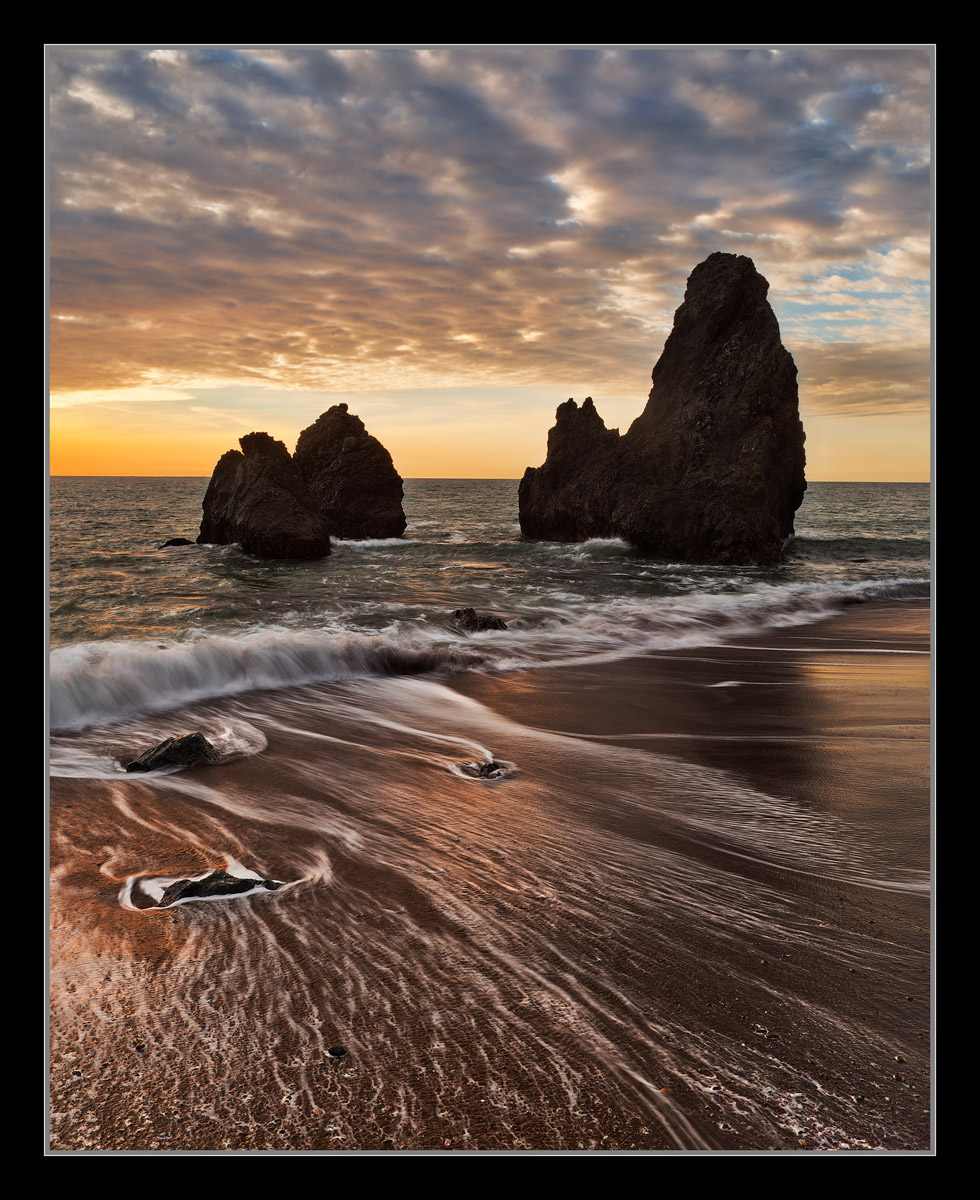
Rodeo Beach, that is! Lived within an hour of here almost my whole life, and just got to it last month! Went once a few years back, but went the wrong way up the coast, looking for these famous sea stacks. Didn't realize you can actually look right at them from the parking area. It's funny how things look totally different with point of view. They don't really become recognizeable as the icons that they are until you are almost directly behind them.

I went a little punchier with the contrast than I normally do with the midtone curves I like what it did with the foreground beach. This sand is dark to begin with, and the almost black appearance, I like. What do you think?

D800,
24-70mm,
3 soft grad,
1/4 sec, F/13,

Thanks,
Chris

Comments

15 comments
Comment posted by Peter Coskun on January 6, 2013 at 7:25 PM
I really like the foreground patterns and the tones in the sand. I'm finding the sea stacks a bit dark for my taste (although they probably appear dark in person), but I would also expect a little bit of warm light on the left sides of the stacks. Either way this is a very nice image and I would love to shoot this spot sometime.
Registered on October 31, 2011, 170 Posts, 1240 Comments
Comment posted by Morris McClung on January 6, 2013 at 7:35 PM
A very rich image. Almost dark roasted. :biggrin: Great light and color, too.
Registered on May 7, 2007, 670 Posts, 19650 Comments
Comment posted by Vance Gese on January 6, 2013 at 8:48 PM
The dark tones in the beach and the hint of detail in the sea stacks work very well, Chris, to my eye. Love the color in the sky and the touch of warm light on the beach. The larger image is flat out awesome. Nice work with the grad; can't tell at all one was used.
Registered on November 13, 2008, 298 Posts, 6629 Comments
Comment posted by Tony Kuyper on January 6, 2013 at 9:55 PM
This even looks great on my laptop, which is odd. Colors and contrast look really good, and you nailed the composition. I really like the way the diagonal wave breaks up the scene.
Registered on November 1, 2003, 364 Posts, 22328 Comments
Comment posted by Kris Johnson on January 6, 2013 at 9:57 PM
The water in the foreground is stunning. The rest of the image is great as well.
Registered on March 6, 2010, 26 Posts, 299 Comments
Comment posted by Todd Liotine on January 6, 2013 at 10:00 PM
Processing looks great, I like the contrast. What makes this image special to me is the diagonal streaks in the foreground, it really helps the view arond the scene. Im betting you had to take more than one shot to accomplish that.
Registered on July 1, 2008, 131 Posts, 671 Comments
Comment posted by David Chauvin on January 6, 2013 at 10:41 PM
Before I read your description my first thought was that this looks a bit bolder than your usual processing. The comp is wonderful and the lines of foam returning from the previous wave give it a nice depth. All in all I think it is a fine image as presented. I can almost hear the crash and hiss of the waves coming and going. :cool:
Registered on August 5, 2004, 1007 Posts, 5595 Comments
Comment posted by Eva McDermott on January 6, 2013 at 11:44 PM
The surf lines in the foreground really draw me in Chris. I also like the golden glow of the sand and surf. Beautiful and bold capture.
Registered on January 4, 2009, 1015 Posts, 13229 Comments
Comment posted by Kah Kit Yoong on January 7, 2013 at 3:02 AM
I find this a very good seascape with wonderful light. I do have some reservations about the processing. A bit too much contrast in the foreground and oversharpened in general.
Registered on September 27, 2006, 636 Posts, 10682 Comments
Comment posted by R.Bill Moser on January 7, 2013 at 12:39 PM
Great seascape image. Love the colors and the mood. Great foreground. Fantastic work
Registered on January 29, 2010, 285 Posts, 4281 Comments
Comment posted by Bill Chambers on January 7, 2013 at 1:59 PM
Beautiful Chris! Perfect shutter speed for the water draining back into the ocean and I love the richness of thew colors on the beach. Beautiful sky too. It looks like there's some slight haloing around the largest stack but I'm on a crappy work monitor so it's kinda hard to tell.
Registered on April 10, 2005, 753 Posts, 21216 Comments
Comment posted by Nick Bristol on January 7, 2013 at 4:35 PM
Great shot Chris! I like this comp and the light and colors look great. The foreground water looks fantastic! Nice grad work too! :smile:

Nick Bristol
Lone Rock, WI
Registered on February 1, 2004, 752 Posts, 14140 Comments
Comment posted by Jenaya Launstein on January 7, 2013 at 7:02 PM
Simply gorgeous! I always love these slow shutter speed images, it makes the water look stunning! Lovely light, as you already mentioned :wink: .
Registered on February 8, 2011, 254 Posts, 1302 Comments
Comment posted by Stan Rose on January 7, 2013 at 8:02 PM
owwww....you are killing me with the contrast, Chris--it is Wayyyyyy too much!
Was that subtle enough critique? :wink:
I like the subject and comp though...i just think it screams: SOFT! If the waves were crashing on the camera, then maybe you could get away with the heavy contrast hammer here...
Congrats on the 1st place--well deserved! :wavey:
Registered on September 15, 2005, 836 Posts, 17099 Comments
Comment posted by Brad Clinch on January 7, 2013 at 9:40 PM
Chris, I echo others in the praise of the sand and water foreground-nailed it with the right colors and water streaks! I too wonder about the dark stacks and to what extent their detail could be brought out as the eye is drawn back out to sea by the wonderful sand and water segment. The large image made my feet wet. :biggrin:
Registered on January 5, 2013, 37 Posts, 261 Comments