Nature Photographers Network
This is the preserved archive of the original Nature Photographers Network. The community continues at naturephotographers.network.
Chasing The Light
‹ PreviousLandscape GalleryNext ›

Chasing The Light

by Drew M Wright

Gallery: LandscapePosted December 30, 2012812 views15 comments
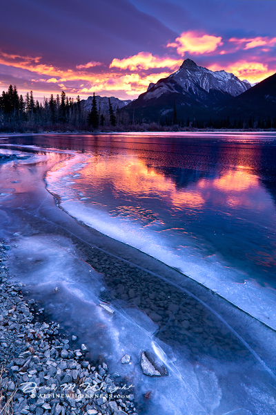
Captured this one on a trip Banff National Park back in 2009. Only had seconds to setup the shot and was driving like mad to find a location to capture the color so the title "Chasing The Light" is a literal term in this case.

Thanks for your comments!

Comments

15 comments
Comment posted by Peter Coskun on December 30, 2012 at 7:52 PM
That sure looked like it was some light show! I really like the comp here, the flowing forms of the ice plus the colorful reflection make this very nice. However, the sky is blown especially in the nice pink/orange clouds. If you could find a way to fix that this would be a real prize winner.
Registered on October 31, 2011, 170 Posts, 1240 Comments
Comment posted by Mike Ramy on December 30, 2012 at 8:19 PM
Drew,
Sweet !
The Ice and the Water reflection combination is Outstanding. Well worth the effort and Well Done,
The blown sky is not a problem to me with the offsetting reflection, I didn't even notice it until I read Peter's insightful comment.
:toast:
Registered on June 16, 2012, 567 Posts, 2809 Comments
Comment posted by Lon Overacker on December 30, 2012 at 8:45 PM
Drew,

Outstanding composition and a beautiful scene of Rundle and it's surrounds. The near/far 2/3 comp is very strong - did I mention the composition was excellent? I like the little bit of rocky shoreline, then the ice and of course the great reflection.

For my taste though, the saturation in the sky is too strong. I would say clipped per se, but pretty heavy in color and sat; at least to my eye. Obviously colors are open to interpretation and personal choice.

Lon
Registered on November 24, 2006, 521 Posts, 19147 Comments
Comment posted by Youssef Ismail on December 30, 2012 at 9:22 PM
Drew,

Fantastic composition. Grabs my eye and leads me in nicely. The colors a bit too electric for my tastes, especially the coulds in the sky.
Registered on November 1, 2003, 474 Posts, 5555 Comments
Comment posted by Drew M Wright on December 30, 2012 at 9:37 PM
Thanks for the feedback! Here is an updated version with cloud corrections and saturation reduction in the sky. Personally, wouldn't want to reduce the sat any further since this is almost exactly what I remember at the time of capture. I usually like to keep it real and only typically add a touch of color for effect in post processing, but in this case I actually had to reduce the saturation from the original raw.
Registered on June 18, 2008, 23 Posts, 106 Comments
Comment posted by Todd Liotine on December 31, 2012 at 11:09 AM
Drew, Wonderful composition and details however I think the colors are too strong, the repost is better. It looks like there is a purple color cast in the image?
Registered on July 1, 2008, 131 Posts, 671 Comments
Comment posted by Mark Seaver on December 31, 2012 at 11:48 AM
Great light and a wonderful sweep of foreground ice. I also really like the layered clouds in the sky. Yes, I find the blown highlights in the sky somewhat distracting, but that's a minor nit on a very fine image. The slightly reduced saturation of the repost is a decided improvement.
Registered on January 23, 2011, 1103 Posts, 17270 Comments
Comment posted by Tony Kuyper on December 31, 2012 at 5:04 PM
Very special light indeed. The foreground ice shapes are as good as the clouds and mountains. They contrast very well colorwise.
Registered on November 1, 2003, 364 Posts, 22328 Comments
Comment posted by Adam Smith on December 31, 2012 at 6:25 PM
Great use of lines in the image and directing the viewer Drew. Also great use of lighting. Email me, I would love to talk to you about this image and get some pointers on how to capture images such as this.
Registered on November 21, 2012, 16 Posts, 107 Comments
Comment posted by Ben Horne on December 31, 2012 at 7:04 PM
There's something about the color of the color of the original shot that looks a bit overcooked at first, but once I have a chance to really look at the image -- it seems very natural. I do prefer the color of the original, but I would suggest darkening the foreground a bit. The brightness of the foreground divides the image between foreground and background, and gives a bit of that overcooked feeling.
Registered on August 27, 2009, 51 Posts, 959 Comments
Comment posted by Hussain Nalwala on January 1, 2013 at 2:17 AM
Drew lovely take. Could you please give us your setting .... Thanks.
Registered on April 18, 2011, 298 Posts, 339 Comments
Comment posted by Hussain Nalwala on January 1, 2013 at 11:37 PM
Drew lovely take. Could you please give us your setting .... Thanks.
Registered on April 18, 2011, 298 Posts, 339 Comments
Comment posted by Dan Roberts on January 2, 2013 at 12:00 AM
Great color obviously and the curve of the ice along the shoreline really adds to the overall composition. Nice.
Registered on March 9, 2011, 69 Posts, 501 Comments
Comment posted by Drew M Wright on January 2, 2013 at 8:53 PM
Here's the exif data:

Capture Date: Nov 30th, 2009
Camera Settings: ISO 100, 21mm @ f/11, 4 sec
Registered on June 18, 2008, 23 Posts, 106 Comments
Comment posted by Mark Metternich on January 5, 2013 at 9:13 PM
wow! :toast:
Registered on June 19, 2009, 276 Posts, 6240 Comments