Gallery: LandscapePosted December 13, 2012175 views13 comments
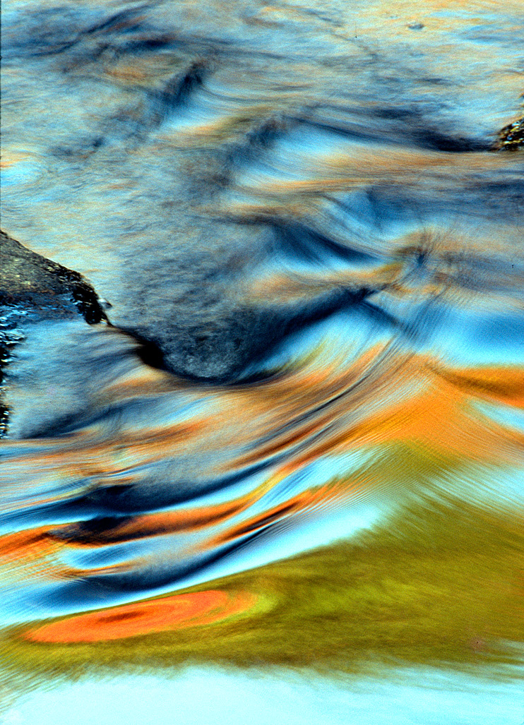
This is another image from Glade Creek in Babcock State Park, WV. It is a little different because the water action produced a nice arrangement of different shapes and colors.
Comments
13 comments
Comment posted by Nick Palmieri on December 13, 2012 at 9:24 PM
Hey Chet, I like the abstract quality of this. If it were mine I think I would crop the image almost in half, in my opinion, the bottom half of the image holds all the interest and would stand stronger if the top was not there. Love the colors and shapes on the bottom.
Registered on September 1, 2011, 35 Posts, 748 Comments
Comment posted by Scott Smorra on December 13, 2012 at 10:20 PM
Very nice colors and shapes Chet. I like the image as presented, but I can definitely see the square comp that Nick suggested. I'd be interested to know what the technical specs are for this image, Camera/Lens and exposure info (ISO, shutter speed, aperture). Thanks! Scott
Registered on November 2, 2009, 161 Posts, 2143 Comments
Comment posted by Youssef Ismail on December 13, 2012 at 10:35 PM
Nice!!!
Registered on November 1, 2003, 474 Posts, 5555 Comments
Comment posted by Joseph Campisi on December 13, 2012 at 10:54 PM
Very cool abstract Chet! Love the vibrant colors.
Registered on November 24, 2008, 304 Posts, 3211 Comments
Comment posted by Chet Dowell on December 14, 2012 at 7:39 AM
Thanks for the comments. I appreciate your suggestions. Scot this is an older image and I don't have the info you requested. Sorry. I only know I was using fuji film and Canon Equipment. For several years I sold my work on the arts and crafts show circuit and this image was well received. Chet
Registered on December 3, 2012, 237 Posts, 1171 Comments
Comment posted by Mark Seaver on December 14, 2012 at 9:15 AM
Lovely abstract with the bright orange up front and the swirling dark blues carrying into the distance. I'd be tempted to burn in the light blue at the bottom of the frame (or crop half of it).
Registered on January 23, 2011, 1103 Posts, 17270 Comments
Comment posted by Nathan Apodaca on December 14, 2012 at 12:01 PM
I can see the brush strokes! Fantastic colors...
Registered on November 16, 2011, 67 Posts, 1127 Comments
Comment posted by Nancy Lea Sandy on December 14, 2012 at 12:31 PM
Pretty colors and a nice motion blur. I agree with the suggested crop as the bottom half is where all the interest is. Nice job
Registered on January 24, 2011, 576 Posts, 6942 Comments
Comment posted by Lon Overacker on December 14, 2012 at 12:47 PM
Chet,
Wonderful and certainly color natural abstract. The contrast is pretty heavy, but I think it works to accentuate the form of the "waves" and impact. The saturation may be slightly strong for my taste, but totally understand this is an abstract and this is well within personal choice and interpretation.
The only suggestion I have would be very slight crops from left and right to remove the little jagged edges of rock showing. Not all of the big rock on the left, just up to where the water is trying to merge with the frame. There's also a couple of dust spots as well as the slide mount is not cropped all the way out in the UL edge.
Oh, the large version works well as the texture of the film grain comes through and I think adds a nice element. Overall, this is a great nature abstract.
Lon
Registered on November 24, 2006, 521 Posts, 19147 Comments
Comment posted by Stan Rose on December 14, 2012 at 10:14 PM
Personally, id crop out the left side rock entirely, since i think this is all about the texture/color and would be pure abstract if you could get rid of the rocks. Then i'd rotate 90 degrees cause it looks cooler as a horizontal rather than vertical pano. Nice!
Registered on September 15, 2005, 836 Posts, 17099 Comments
Comment posted by Jimmy Gekas on December 15, 2012 at 1:24 PM
I think the colors here are super cool. I do wish that you could do without the top and some of the bottom, as it would really emphasize the colors and shapes.
Registered on July 26, 2007, 244 Posts, 2807 Comments
Comment posted by Catherine Reilly on December 18, 2012 at 9:28 PM
Masterful abstract of water motion and reflected light/color. For total abstraction I'd suggest taking off the bottom right up to where the green begins. Ooooh, just fabulous!
Registered on August 16, 2006, 603 Posts, 9192 Comments
Comment posted by Adam Smith on January 1, 2013 at 3:47 PM
I would also crop in a little bit, the main focal point is the abstract colors right? If so then I would definitely crop in and capitalize on that area. The upper right where you see the moss or whatever that little area is - is distracting and takes away from the powerful abstract colorful punch this image has to offer. I love the coloring.
Registered on November 21, 2012, 16 Posts, 107 Comments

Comments
13 commentsWonderful and certainly color natural abstract. The contrast is pretty heavy, but I think it works to accentuate the form of the "waves" and impact. The saturation may be slightly strong for my taste, but totally understand this is an abstract and this is well within personal choice and interpretation.
The only suggestion I have would be very slight crops from left and right to remove the little jagged edges of rock showing. Not all of the big rock on the left, just up to where the water is trying to merge with the frame. There's also a couple of dust spots as well as the slide mount is not cropped all the way out in the UL edge.
Oh, the large version works well as the texture of the film grain comes through and I think adds a nice element. Overall, this is a great nature abstract.
Lon