Nature Photographers Network
This is the preserved archive of the original Nature Photographers Network. The community continues at naturephotographers.network.
Emerging
‹ PreviousLandscape GalleryNext ›

Emerging

by Navin Sarma

Gallery: LandscapePosted December 12, 2012303 views10 comments
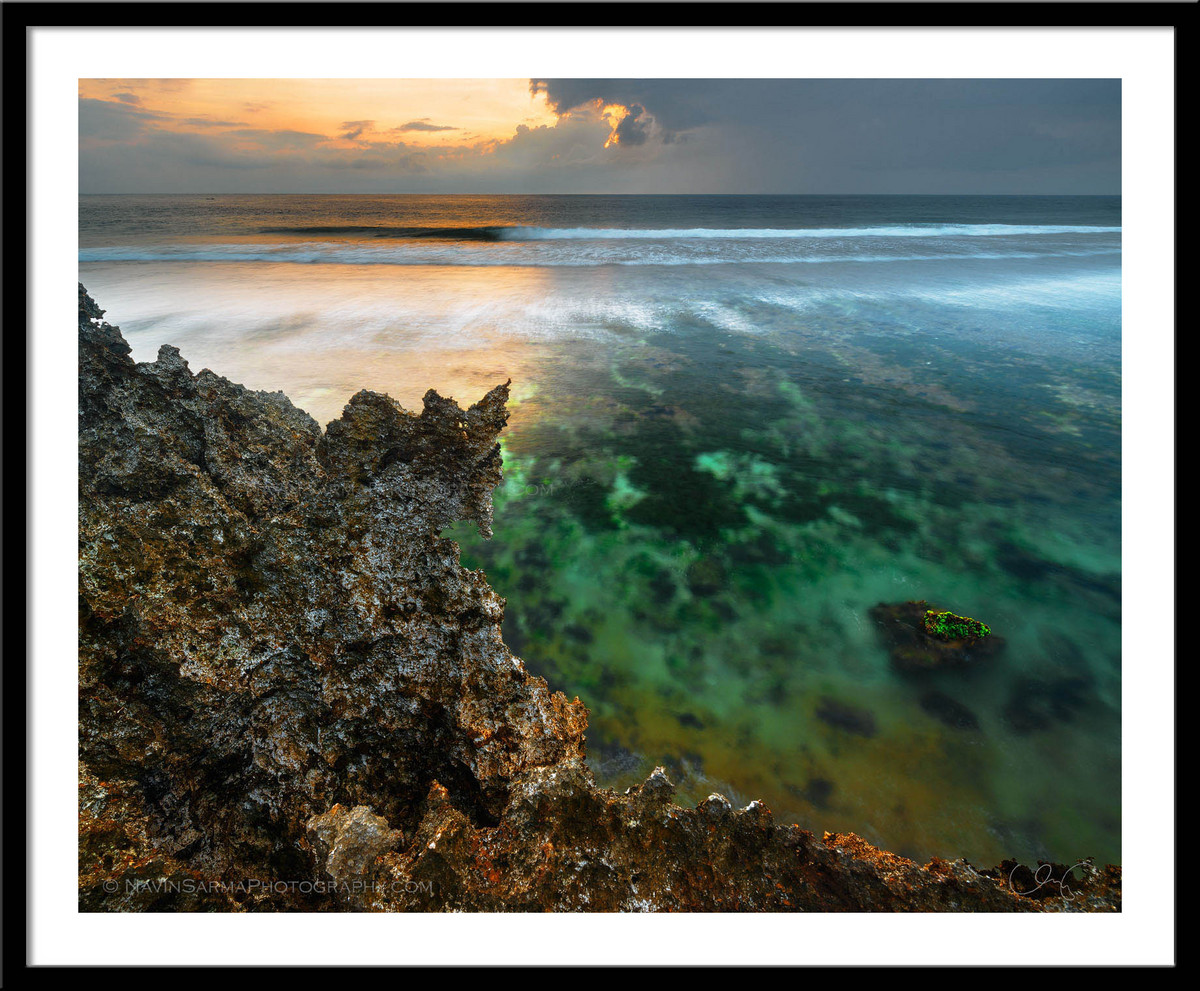
A brilliant sunrise contrasts over limestone cliffs and a shallow lagoon at Nusa Dua, Bali

This is another edition of my previous image from Bali, Indonesia. I took another pass at the image, trying to achieve more color congruence and cohesion of light and composition. It was an interesting scene to capture and I tried to do something different. I'm very curious for your thoughts.

Nikon D800, Nikon 14-24, CPL, 2 images for DR & focus

Comments

10 comments
Comment posted by Dean Sauskojus on December 12, 2012 at 2:44 AM
Both pretty nice shots Navin. For myself I would prefer more blue in the sky like the original to contrast nicely with the yellow sunlight. It's pretty hard to choose between the two, but the color nut that I am I prefer your other version. BTW congrats on the marriage. What a fantastic place for a honeymoon. I wish you well. I finally bit the dust and bought the Nikon lens. I'll let you know how it goes. Congrats!
Registered on September 29, 2009, 137 Posts, 2659 Comments
Comment posted by Rick Turner on December 12, 2012 at 6:57 AM
Navin,

Well seen composition here and color of water sweet :wink:
Sunset just right :toast:
Registered on February 18, 2012, 534 Posts, 2755 Comments
Comment posted by John Mumaw on December 12, 2012 at 7:21 AM
I do like the 'half & half' light on the ocean, and the foreground complements that well. I like the composition and the subtler, less contrasty 'development' here more than your previous version. However, I much prefer the skies in that previous one. Cropping out all but about a centimeter of the sky here keeps the eye focused on the landscape and would be an asset IMO.
Registered on September 9, 2005, 62 Posts, 2289 Comments
Comment posted by Natalie Mikaels on December 12, 2012 at 8:02 AM
Hi Navin: I was a fan of your original image from this location. I loved the vivid colors in the first version. I realize some folks are put off by "saturated" colors. However, in a sunrise scene like this one, I would bet that the colors you were witnessing in front of you were naturally saturated and vivid. Personally, I would embrace that color palette and bring out the oranges in the sky even more. But, that's just me....
Registered on November 3, 2011, 45 Posts, 181 Comments
Comment posted by Phil Pogledich on December 12, 2012 at 11:57 AM
This works very well for me and I much prefer it to your earlier post of this location. The color of the water and level of contrast both appear very natural. Nicely done all around.

One minor processing comment/question is whether the blend at the horizon is just slightly off, as I see a somewhat brighter line right where the ocean meets the sky in the center of the frame. Strangely, it is only apparent in the smaller version though and perhaps it is just a sharpening artifact.
Registered on August 24, 2009, 123 Posts, 3099 Comments
Comment posted by Kah Kit Yoong on December 12, 2012 at 12:52 PM
The jagged form of the rock against the idyllic green water is an effective juxtaposition for me. Well processed.
Registered on September 27, 2006, 636 Posts, 10682 Comments
Comment posted by Lon Overacker on December 12, 2012 at 3:34 PM
Navin,

I like this more subdued version; comes across more natural. I do think, and we all need to be careful with this - don't let too many opinions sway you from altering your vision too much, if that makes sense. I may like the processing on this one better, already we know others like the other versions as well. Personally, I think you've come closer to your goal of "...trying to achieve more color congruence and cohesion of light and composition."

No matter how you slice it, you still have a unique image and it's understandable why you want to perfect it.

Lon
Registered on November 24, 2006, 521 Posts, 19147 Comments
Comment posted by Julian Barkway on December 12, 2012 at 3:41 PM
Fascinating scene with clever composition and colour contrasts. Top work!

:toast:
Registered on January 18, 2007, 344 Posts, 1961 Comments
Comment posted by Navin Sarma on December 12, 2012 at 8:14 PM
Thanks, everyone for the comments so far! Please do keep providing your input.

@Dean, thanks for your well wishes! We had a blast in Bali (though it was a little more commercialized than I had hoped). I'm glad you got the 14-24. I'm sure you won't regret it.

@John & Natalie, thanks for your thoughts. The blue was actually what the RAW file brought forth, but I thought it clashed with the orange, brown, green, and teal. Just too many colors going on at once that didn't mesh well with each other. One of my last touches was to desaturate the blues, but I see your point in the overall drama of the sky.

@Phil, I hadn't noticed that until you mentioned it! I don't know if it is just exacerbated by sharpening or what. It seems to be the light shimmering off the water... I don't see any processing issues.

@Lon, thanks for your words. I understand that everyone has their own opinion, including me. I just want to cast the net as far as possible and then work to weed out the comments I agree with

:toast: :toast:
Registered on July 17, 2011, 233 Posts, 1373 Comments
Comment posted by Tony Kuyper on December 12, 2012 at 9:42 PM
Very nice comp. I like how the abstract foreground transitions into the more familiar background. This is a pretty unique way to use contrast in photography.
Registered on November 1, 2003, 364 Posts, 22328 Comments