Nature Photographers Network
This is the preserved archive of the original Nature Photographers Network. The community continues at naturephotographers.network.
Autumn Mélange
‹ PreviousLandscape GalleryNext ›

Autumn Mélange

by Jim Greenwood

Gallery: LandscapePosted December 10, 2012317 views16 comments
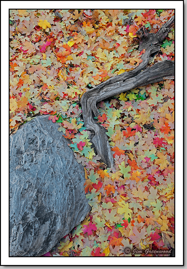
This is yet another image captured along the dry washes up in east Zion.

This photograph was in fact taken within the field of view of this earlier post, between the large rock and the trees on the left.

I'm not sure if this composition should be classified as "arranged". But, in the interest of full disclosure, for this image I do recall adding a few leaves to cover a small bare spot near the top of the frame before shooting. On rare occasions, Mother Nature can use a little compositional assistance. :wink: :smile:

Canon 5DII
Canon 16-35mm f/2.8L II
35mm, f/18, 1.3 seconds, ISO 50

Comments

16 comments
Comment posted by Ian Cameron on December 10, 2012 at 7:25 PM
Quite gorgeous Jim. A really colourful slice of late Autumn colour sensitively portrayed. A beautiful image. :toast:
Registered on August 6, 2004, 1125 Posts, 3318 Comments
Comment posted by scott lanz on December 10, 2012 at 8:51 PM
Terrific, Jim. What an amazingly attractive assortment of leaves! The rock is interesting as well.
Registered on November 14, 2003, 840 Posts, 12902 Comments
Comment posted by Mark Seaver on December 10, 2012 at 9:45 PM
The collection of colors and shapes in the leaves are great and the rock and limb set them off very nicely. Where do the blue/turquoise leave come from?
Registered on January 23, 2011, 1103 Posts, 17270 Comments
Comment posted by Rick Turner on December 10, 2012 at 11:27 PM
Great design elements and color. :wink:
Registered on February 18, 2012, 534 Posts, 2755 Comments
Comment posted by Rudy Ruberti on December 11, 2012 at 12:21 AM
The touch of green is really nice within all the yellows and reds. Nicely composed, too. Mélange is also a geologic term referring to a jumbled mass of various rock types.
Registered on October 28, 2008, 179 Posts, 1875 Comments
Comment posted by Joseph Campisi on December 11, 2012 at 9:03 AM
Beautiful "melange" of colors Jim! Love the comp as well. A little less cyan in some of those leaves maybe?
Registered on November 24, 2008, 304 Posts, 3211 Comments
Comment posted by Russell Colletta on December 11, 2012 at 10:05 AM
I like composition and don't think sprinkling a few leaves counts for a major rule violation in any way. This really works IMO. Nice!
Registered on October 31, 2009, 114 Posts, 1008 Comments
Comment posted by Morris McClung on December 11, 2012 at 12:07 PM
I would have to agree the cyan seems a touch too strong, and the lighting looks pretty flat. But, maybe you aren't looking for pop in this one and want it to be a quieter image. Another excellent comp!
Registered on May 7, 2007, 670 Posts, 19650 Comments
Comment posted by Todd Liotine on December 11, 2012 at 1:06 PM
Wonderful intimate landscape.
Registered on July 1, 2008, 131 Posts, 671 Comments
Comment posted by Tony Kuyper on December 11, 2012 at 3:48 PM
Comp works nicely. Really like all the colors in the leaves. Maybe feels a bit cyanish.
Registered on November 1, 2003, 364 Posts, 22328 Comments
Comment posted by Jim Greenwood on December 11, 2012 at 6:04 PM
Hmmm ... a few of you have mentioned a cyan cast. I initially worked this up on my notebook computer at the hotel near Zion. It's a pretty good notebook. But most notebook monitors leave something to be desired I guess. But I'm not really seeing a cyan cast myself now that I'm back home using my desktop monitor. In fact, I checked the PS file, and I actually had decreased the cyan saturation by 10 points. Maybe it's just my eyes. :smile:

Anyway ... thanks for the honest comments.
Registered on November 9, 2003, 229 Posts, 1523 Comments
Comment posted by Lon Overacker on December 11, 2012 at 8:54 PM
Jim,

I really like this intimate arrangement; great design and all the diversity of color in the leaves make for an engaging image.

I will have to say though, that to me and my monitor, the colors are a little different and perhaps flat, but I don't think it's a global thing. I think the cyan comes up because some of the green leaves, the lighter shaded ones have a different look and perhaps lean towards the green side of cyan. But then there are some more vibrant greens buried a little bit that look over saturated to me. And then the light reds, yellow and oranges are what seem a little flat, almost without detail - BUT, it's really almost pointless judging detail in leaves at the web size. Lastly, this might lack contrast in spots, mostly around the middle.

I didn't mean to go on about it, but I think you have an image here that's worth squeezing ever last ounce of perfection out of. It's a good one.

Lon
Registered on November 24, 2006, 521 Posts, 19147 Comments
Comment posted by Eva McDermott on December 12, 2012 at 1:31 AM
I like the carpet of color and intersection of the tree limb and rock Jim. Abstract in a way but beautiful.
Registered on January 4, 2009, 1015 Posts, 13229 Comments
Comment posted by Phil Pogledich on December 12, 2012 at 12:05 PM
Great image, Jim, and a nice find in the field too. I noticed the same cast and minor saturation issue in the greens/cyans as the others pretty quickly and I think Lon's comments (as usual) describe it the best.
Registered on August 24, 2009, 123 Posts, 3099 Comments
Comment posted by Jimmy Gekas on December 12, 2012 at 12:16 PM
Seems a bit cool to me and maybe needs a little darkening of the leaves, too. Otherwise, I really like the comp and the subject. Keep 'em coming from Zion! :toast:
Registered on July 26, 2007, 244 Posts, 2807 Comments
Comment posted by Navin Sarma on December 12, 2012 at 3:13 PM
very nice arrangement and i like the way you have processed the colors.
Registered on July 17, 2011, 233 Posts, 1373 Comments