Nature Photographers Network
This is the preserved archive of the original Nature Photographers Network. The community continues at naturephotographers.network.
IceWorld +2
‹ PreviousLandscape GalleryNext ›

IceWorld +2

by Stan Rose

Gallery: LandscapePosted November 28, 2012608 views45 comments
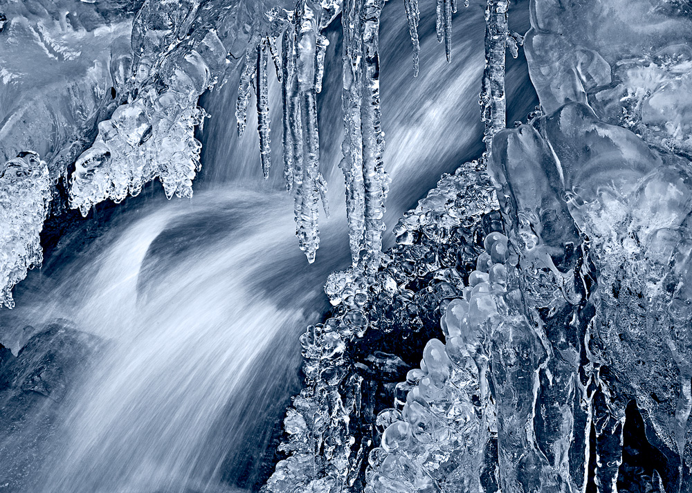
Made my semi-annual trip up to Green Mountain Falls today to take some pics of the creek/falls--it's my fav icy location! First time ive hiked there with no snow on the ground :frown: but on the bright side, all the absurd warm snow-less weather made for some clean ice!
I limited myself to one lens for this trip, took mostly closeups with the 100mm macro. This is 1/4s at f/20. B&W conversion with slight blue toning. PLEASE SEE LARGE!
C&C Welcome!
B&W and color below!

Comments

45 comments
Comment posted by Eva McDermott on November 28, 2012 at 12:35 AM
Fantastic Stan! Love the icy cold and water motion.
Registered on January 4, 2009, 1015 Posts, 13229 Comments
Comment posted by Youssef Ismail on November 28, 2012 at 12:51 AM
Wild photo Stan and the development you chose is great. Almost does not look real.
Registered on November 1, 2003, 474 Posts, 5555 Comments
Comment posted by Joseph Campisi on November 28, 2012 at 1:03 AM
Man, I really want to get some icy waterfall shots this year, now more than ever! Killer image Stan! :toast:
Registered on November 24, 2008, 304 Posts, 3211 Comments
Comment posted by Ian Cameron on November 28, 2012 at 3:42 AM
Gorgeous Stan

Very much like this. Is that a hint of movement I see in that water? Precocious indeed :biggrin:
Registered on August 6, 2004, 1125 Posts, 3318 Comments
Comment posted by John&Patty Benway on November 28, 2012 at 4:08 AM
Yup, it's that time of year again, lots of detail and very nice light brings this chilly little ice scene to life, cant wait to get out myself, I like it, beautiful work Stan.
John
Registered on May 12, 2006, 626 Posts, 8700 Comments
Comment posted by Bob&Charly Nelson on November 28, 2012 at 5:41 AM
Fantastic detail and conversion. Really well done in my opinion.
Bob :wavey:
Registered on October 27, 2005, 289 Posts, 4202 Comments
Comment posted by David Chauvin on November 28, 2012 at 5:41 AM
Wicked cool! The comp, color and detail (especially in the large view) just draw me in. So much to explore in the frame and the lack of any real indication of scale makes it more fascinating. :cool: :cool: :cool:
Registered on August 5, 2004, 1007 Posts, 5595 Comments
Comment posted by scott lanz on November 28, 2012 at 6:55 AM
Terrific, Stan. I like the clean ice; good close-up comp.
Registered on November 14, 2003, 840 Posts, 12902 Comments
Comment posted by Nancy Lea Sandy on November 28, 2012 at 8:44 AM
Crisp, clean and crystal clear. the slight bluing adds a bit of chill. This is just beautiful.
Registered on January 24, 2011, 576 Posts, 6942 Comments
Comment posted by Joana Roncero on November 28, 2012 at 9:28 AM
It's stunning. composition, color, everything is fantastic. Well done
Registered on August 27, 2012, 17 Posts, 70 Comments
Comment posted by John Mumaw on November 28, 2012 at 9:32 AM
Wow...this is spectacular! The shutter speed you chose for the water was perfect (no milky flow for you!).
B&W toning is simply perfect. Excellent capture!
Registered on September 9, 2005, 62 Posts, 2289 Comments
Comment posted by Harley Goldman on November 28, 2012 at 10:09 AM
Beautiful image, but can't say the blue toning is working for me. Other than that, excellent. Fascinating formations.
Registered on November 19, 2003, 586 Posts, 11271 Comments
Comment posted by Matt Anderson on November 28, 2012 at 10:41 AM
Refreshingly different !
Chicken Dinner !!!
Registered on September 6, 2007, 346 Posts, 2696 Comments
Comment posted by Lon Sharp on November 28, 2012 at 11:13 AM
Great glistening shapes, Stan, and expertly captured. I like diagonal flow of the water against the vertical icicles. Detail is marvelous too, although I would be interested in seeing a version without the blue.
Registered on December 9, 2007, 258 Posts, 9892 Comments
Comment posted by Stan Rose on November 28, 2012 at 11:23 AM
Thanks guys--glad you like!
The scale here was about 2-3 feet across. The thing that is great about this location is there are all these little rock 'caves' that the water flows through, so it creates these little icy worlds that are really quite cool.
Matt--i never heard the chicken dinner phrase before (ive led a sheltered life...) that's what i like about this forum--you learn such useful info on a daily basis! :biggrin:
Registered on September 15, 2005, 836 Posts, 17099 Comments
Comment posted by R.Bill Moser on November 28, 2012 at 11:30 AM
Stan, this is a stunning image. I like everything about it. Great details and the large version is a must here. :toast:
Registered on January 29, 2010, 285 Posts, 4281 Comments
Comment posted by Jeffrey Sipress on November 28, 2012 at 11:37 AM
Nice comp and shutterspeed on this one, Stan.
Registered on February 17, 2004, 236 Posts, 1197 Comments
Comment posted by Matt Anderson on November 28, 2012 at 11:41 AM
"Winner Winner, Chicken Dinner" is the phrase... ;)
People use to say it in Vegas when they won $
Registered on September 6, 2007, 346 Posts, 2696 Comments
Comment posted by Shane McDermott on November 28, 2012 at 11:51 AM
This is superb Stan, love everything about it!
Registered on November 12, 2007, 49 Posts, 1074 Comments
Comment posted by Nick Bristol on November 28, 2012 at 11:54 AM
Fantastic!! I love the blues tones in the ice here which looks really natural to me. The clarity in the ice is excellent and I love the looks of the moving water behind it. Really nice!! We have ice here the last couple of mornings on the smaller ponds and back waters. :toast:

Nick Bristol
Lone Rock, WI
Registered on February 1, 2004, 752 Posts, 14140 Comments
Comment posted by Peter Richter on November 28, 2012 at 11:54 AM
Stan, this is a stunning image to me, especially by your confrontation of flow and congelation.

Peter
Registered on November 10, 2010, 218 Posts, 2723 Comments
Comment posted by John Williams on November 28, 2012 at 12:12 PM
Stunning Stan! Nice job on playing with a single lens; sometimes being limited can really get the creative juices flowing. I do wish the comp was moved slightly left, but that's just because I am boring and conventional.

:toast:
Registered on September 6, 2007, 221 Posts, 5985 Comments
Comment posted by Morris McClung on November 28, 2012 at 1:11 PM
Oh, Mommy! Pure art, Stan. I think the toning you put in takes this way over the top. That and the clarity that lens has. Impressive. I like this horizontal version better, I think. :toast:
Registered on May 7, 2007, 670 Posts, 19650 Comments
Comment posted by Dietrich Gloger on November 28, 2012 at 2:00 PM
Wow, this looks great Stan. The title fits so well. I like the feeling of being so close to the action. The metallic look is pretty cool too.
Registered on January 26, 2007, 360 Posts, 9876 Comments
Comment posted by Harry Lichtman on November 28, 2012 at 2:03 PM
Excellent - Very tactile image - I just want to touch that ice. Like the contrast of the hard and sharp water to the round and smooth ice. A beauty!
Registered on September 17, 2010, 304 Posts, 3507 Comments
Comment posted by Bill Chambers on November 28, 2012 at 2:08 PM
Very pretty Stan. Love the clarity of the ice, and chosen shutter speed. Nice conversion, but I don't really care too much for the blue tinting - a little overdone there IMO.
Registered on April 10, 2005, 753 Posts, 21216 Comments
Comment posted by SandyRichardsBrown on November 28, 2012 at 2:25 PM
Stunning!
Sandy
Registered on November 24, 2003, 3937 Posts, 12909 Comments
Comment posted by Stan Rose on November 28, 2012 at 2:26 PM
I'll post a color and b&W version shortly--though i doubt it will change my mind here. I usually don't like toned images, ive only done about 3 or 4 of them in the past 8 years--but i thought it was clearly the way to go with this--the color is just distracting (subtle browns etc) and B&W doesnt convey the cold mood. This is only a 10% tone--pretty subtle really. Will be interested in hearing some more opinions...
Registered on September 15, 2005, 836 Posts, 17099 Comments
Comment posted by Stan Rose on November 28, 2012 at 3:24 PM
OK--here's the side by side comparison--the original color and the B&W version before the toning.
Registered on September 15, 2005, 836 Posts, 17099 Comments
Comment posted by John Mumaw on November 28, 2012 at 6:25 PM
"I usually don't like toned images...but i thought it was clearly the way to go with this"
And clearly it was looking at the overwhelming opinion here. This version simply reinforces that decision.
Registered on September 9, 2005, 62 Posts, 2289 Comments
Comment posted by Vance Gese on November 28, 2012 at 7:02 PM
Incredible, Stan. Simply incredible. The tonality you achieved, the intricacy of the detail, the texture in the water, everything is simply stunning.
Registered on November 13, 2008, 298 Posts, 6629 Comments
Comment posted by Robert Dayton on November 28, 2012 at 7:13 PM
Good eye, Stan! This is special. I'm enjoying the smaller version, but the larger one
blows me away. I should think that you might want to make this into a print.
Registered on November 11, 2008, 281 Posts, 3958 Comments
Comment posted by Ian Haskell on November 28, 2012 at 7:23 PM
Nice shot Stan.

Ian
Registered on October 30, 2008, 24 Posts, 673 Comments
Comment posted by Nick Palmieri on November 28, 2012 at 8:31 PM
Beautiful shot!
Registered on September 1, 2011, 35 Posts, 748 Comments
Comment posted by Russell Colletta on November 28, 2012 at 9:18 PM
Like this comp better than the vertical on RMNP, but hard to find fault with either Stan. Great work on the tonal range. Have fun with the new toy.
Registered on October 31, 2009, 114 Posts, 1008 Comments
Comment posted by Joseph Campisi on November 28, 2012 at 10:05 PM
Personally, I agree with you Stan. You added just the right amount of blue to effectively convey the frigidity of the scene without it being over the top. You made the right choice IMO!
Registered on November 24, 2008, 304 Posts, 3211 Comments
Comment posted by Jared Atencio on November 28, 2012 at 11:41 PM
Awesome work Stan-the toning enhances in this case IMO :toast:
Registered on June 23, 2009, 21 Posts, 422 Comments
Comment posted by Lon Overacker on November 29, 2012 at 2:55 PM
Stan,

Better late than never! But I couldn't let this one go without adding to the accolades. What can I say that hasn't been said? This is simply a phenomenal image. The toning is absolutely perfect (as is the processing overall.) Stunning image Stan.

Now, I also can't let this go by without getting something straight. Is 1/4s considered a short enough shutter speed for "natural" water? I guess it hasn't reached the smoke state yet, so we're good. :biggrin: :biggrin: Couldn't resist buddy!

Lon
Registered on November 24, 2006, 521 Posts, 19147 Comments
Comment posted by Bruce King on November 29, 2012 at 3:23 PM
The large version rocks Stan. I've tried getting similar shots and was unable to manage the highlights this well. NICE. :toast:
Registered on January 14, 2010, 276 Posts, 2212 Comments
Comment posted by Stan Rose on November 29, 2012 at 6:59 PM
Lon--that's a fair comment and even though i know you're just poking me it gives me a great opportunity to jump on my soap box :wink:

You're right--when i'm critical of long exposures i'm talking about 4 seconds plus usually, and even then it depends on the subject and the goals of the photographer--cause i've heaped praise on some uber long exposures before in this gallery.

To be totally honest, for this shot i wanted to go faster, but i was limited because i needed to go with a small aperture for the dof (focus stack wouldn't work too well given the moving water) I neglected to add in my specs that this was shot at ISO 200 also, to give me a bit faster exposure. I could have raised it to ISO 400 but there was zero difference between 1/4 second and 1/8 second in appearance, and all i care about is how it looks. This doesn't look exactly how it did to my eye, but it's closer than if i had gone with 2-4 seconds.

I also took a whole bunch of shots at 1/2500s f/2.8, ISO 3200, but they're not worth sharing... :wink:
Registered on September 15, 2005, 836 Posts, 17099 Comments
Comment posted by Lon Overacker on November 29, 2012 at 7:05 PM
NP Stan, I'm with ya, besides soap boxes are over rated, it all gets dirty anyway. :wavey: :wink:

I'm gonna send you a note so I don't take up space here.
Registered on November 24, 2006, 521 Posts, 19147 Comments
Comment posted by Jimmy Gekas on November 30, 2012 at 1:47 AM
So, so sweeeet, Stan! I like both the toned and the b/w versions. Maybe even somewhere in between. Sick shot either way you slice it. :toast:
Registered on July 26, 2007, 244 Posts, 2807 Comments
Comment posted by Stuart Williams on December 1, 2012 at 5:48 AM
nice one stan. i think the contrast is a touch too strong for my eye but it does add the the graphic nature of the image. toning works for me.
Registered on December 7, 2007, 247 Posts, 4792 Comments
Comment posted by Mark Metternich on December 1, 2012 at 9:55 PM
Crazy layering and depth to this Stan! Love it! And that is from someone who usually doesn't like the close ups too much. :toast:
Registered on June 19, 2009, 276 Posts, 6240 Comments
Comment posted by Stan Rose on December 2, 2012 at 2:20 AM
Thanks for all the comments, folks! :wavey:
Registered on September 15, 2005, 836 Posts, 17099 Comments