Nature Photographers Network
This is the preserved archive of the original Nature Photographers Network. The community continues at naturephotographers.network.
Warm Glow
‹ PreviousLandscape GalleryNext ›

Warm Glow

by Eva McDermott

Gallery: LandscapePosted November 26, 2012947 views14 comments
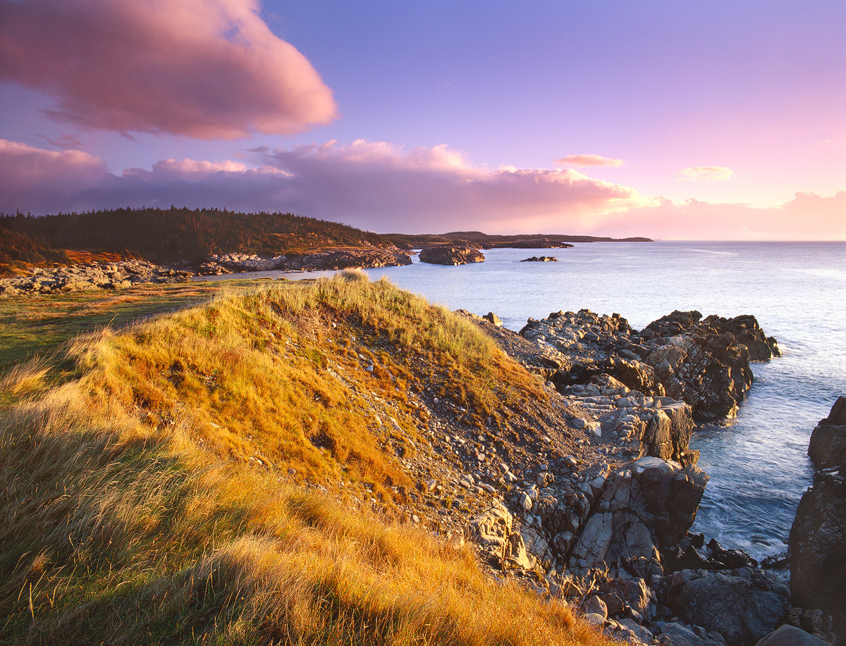
Louisbourg Lighthouse Point, Cape Breton, Nova Scotia

This image was taken before Golden Morning. The warmth of the newly risen sun provided some nice warm colors on the landscape though it was very cold with a stiff wind.

Thanks for having a look. Appreciate your input especially on the comp. This was taken from a different vantage point than my previous post and don't know if the diagonal angle works here. I do like the color and light more in this image however. Thanks for any input.

Pentax 67II
Pentax 67 55-100mm
Velvia 50
1.5-Stop ND Gradient HE

Comments

14 comments
Comment posted by Nathan Apodaca on November 26, 2012 at 6:37 PM
Seeing that the cloud (upper left corner), small peninsula, and curving shadows all lead somewhere in common, I feel the diagonal lines work here. Although, IMO, I wish I could see a bit farther right than the image allows, this is a strong image for me. The rich, golden light hitting the landscape and the pink clouds overhead provide a lot to look at and enjoy!
Registered on November 16, 2011, 67 Posts, 1127 Comments
Comment posted by Joerg Bonner on November 26, 2012 at 6:37 PM
i love the golden glow on the grassy slope, which also provides a nice, curved leading line.
Registered on September 5, 2011, 44 Posts, 221 Comments
Comment posted by John Clulow on November 26, 2012 at 7:13 PM
I feel this has some potential, but it's just too much for me all the way around, starting with the frame.
Then we have the saturation of color.

In my view as one person with no particular expertise or training, I think this could benefit from a significant "toning down".

I would suggest reducing the saturation significantly, even maybe to B&W, and removing that garrish thick black frame and replacing it with something very thin and elegant.

It's kind of sad, really. Fundamentally, this is an excellent composition; it is just way to hyperbolically stated in terms of chroma and the frame, etc.

But maybe that's just me and the strange mood I'm in this evening after getting home after a bad day at work .... :biggrin:


Registered on November 1, 2012, 155 Posts, 1079 Comments
Comment posted by Eva McDermott on November 26, 2012 at 8:35 PM
Hi John - This is a film image and true to the color on the Velvia 50 transparency. No saturation was added. In fact,I reduced the yellows a bit. I am a long time film user. I love the old effects of film which is why I decided to get back to it last year after I went digital in 2005. I don't need PS (except for minor adjusts for contrast and sharpening), Photomatix, HDR Pro or any of that. I scan my own transparencies making it true to the transparency. As for the frame, when I print an image I use exclusively a white matte but for web viewing I use a black border or "lights out" effect which is my preference. I never add PS frames to my images. As for frame/border size that is dictated by the website here. It is not adjustable. The larger view has no frame. Many thanks for your comments on my posts. I do appreciate your input. As a moderator, I especially appreciate your participation, comments, and input on others images as well. It is good to see such heart felt participation such as yours. Thank you.
Registered on January 4, 2009, 1015 Posts, 13229 Comments
Comment posted by Justin Reznick on November 26, 2012 at 9:02 PM
Eva,

The subject appears to be the ridge line, but then you have an interesting little inlet on the right competing for attention. I would focus on one or the other and in this image I think it would be stronger with the ridge line more central and the inlet cropped out.

I like the golden light on the grass and the sky is not overpowering, it's processed just right IMO!
Registered on November 24, 2009, 79 Posts, 515 Comments
Comment posted by Tom Roper on November 26, 2012 at 9:02 PM
Excellent shot. I think the diagonal works here. Although it was mentioned I too would like to see a little more right, those rocks in the lower right hand corner give a hint of something else out there. The light is great too and works well with the colors of Velvia.
Registered on January 19, 2012, 5 Posts, 46 Comments
Comment posted by scott lanz on November 26, 2012 at 9:27 PM
I like the rich, warm colors. The colors look quite good to me.
Registered on November 14, 2003, 840 Posts, 12902 Comments
Comment posted by Vance Gese on November 26, 2012 at 10:30 PM
Love that golden light, Eva, that bathes this scene. The multiple curves of the bluff you were standing on, the shoreline below, and the distant shoreline work quite well in my opinion. The grasses are beautiful but I'm a sucker for low light on grasses. Nicely done.
Registered on November 13, 2008, 298 Posts, 6629 Comments
Comment posted by Nick Bristol on November 27, 2012 at 8:27 AM
A beautiful scene Eva. I really love the light and golden glow of the foreground grass. I bet it looks awesome viewing this trans on a light box...something I miss now. :smile:

Nick Bristol
Lone Rock, WI
Registered on February 1, 2004, 752 Posts, 14140 Comments
Comment posted by Mark Seaver on November 27, 2012 at 9:20 AM
I really like the long arch of golden grass and how it points to the pink/magenta sky. Looks like a lovely morning (even if it was cold).
Registered on January 23, 2011, 1103 Posts, 17270 Comments
Comment posted by Bob&Charly Nelson on November 27, 2012 at 9:40 AM
I enjoy these coastal captures. At first I thought there might be too much empty space on the right, but the more I look at it I think other wise. Well done in my opinion.
Bob :wavey:
Registered on October 27, 2005, 289 Posts, 4202 Comments
Comment posted by Morris McClung on November 27, 2012 at 10:53 AM
Just a lovely mix of colors in this one. From the golden grass to the blue water and finally with the pinks in the sky. A very beautiful image, Eva.
Registered on May 7, 2007, 670 Posts, 19650 Comments
Comment posted by Lon Overacker on November 27, 2012 at 12:42 PM
Eva,

I think the light here is wonderful and I think the composition works quite well; especially the bit of a sweeping curve of the bluff (or whatever this might be called, headland, shore, hill, um, I dunno.) Balance wise, I'm wishing the big cloud was further right, but it's not a big deal really. And I don't see a crop at all, even though it's tempting to want to crop the outcropping on the far right, but it just doesn't work cutting the right side unless to crop in entirely eliminating the channel, but then you lose the grand vista kinda look you've captured. All in all, this works well for me as is Eva. The light on the grass steals the show.

Lon
Registered on November 24, 2006, 521 Posts, 19147 Comments
Comment posted by Russell Colletta on November 27, 2012 at 4:17 PM
Wow Eva, beautiful color, light and detail. I like the comp as is, but when I did a window cropping of the right side it might be a little stronger look to me. I like the golden curve a lot, and then there's that sky! Very nice.
Registered on October 31, 2009, 114 Posts, 1008 Comments