Nature Photographers Network
This is the preserved archive of the original Nature Photographers Network. The community continues at naturephotographers.network.
Fall...Into Fall
‹ PreviousLandscape GalleryNext ›

Fall...Into Fall

by Justin Richardson

Gallery: LandscapePosted November 22, 2012280 views12 comments
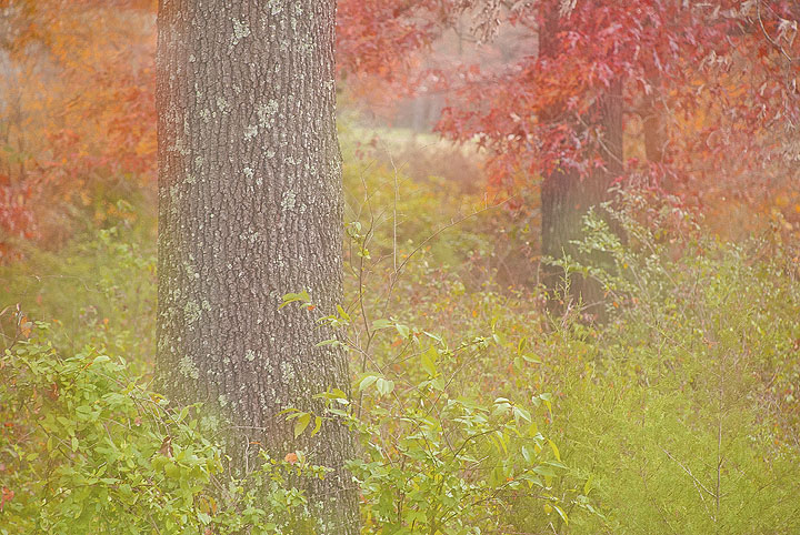
Happy Thanksgiving everyone! Took this in the woods behind my house this morning since we are FINALLY getting some color. This is a two shot multiple exposure done in camera, one sharp, one oof, with just a little saturation enhancement in ps.

Nikon D200, nikkor 70-300mm@85mm, f5.6@1/125, ISO 100

Comments

12 comments
Comment posted by Joseph Campisi on November 22, 2012 at 8:37 PM
Very dreamlike Justin, and I'm guessing that was what you were going for. I think it's pretty cool.
Registered on November 24, 2008, 304 Posts, 3211 Comments
Comment posted by Justin Richardson on November 22, 2012 at 8:40 PM
Excatly what i was going for Joe..Thank you!
Registered on November 18, 2012, 28 Posts, 134 Comments
Comment posted by Jeremy Calow on November 22, 2012 at 9:35 PM
Neat image Justin, great colour. I would like the glow to be a bit more toned down, but like the feel that it gives. :toast:
Registered on November 8, 2007, 39 Posts, 363 Comments
Comment posted by John Clulow on November 23, 2012 at 5:28 AM
I like this a lot for the reasons already mentioned. However, I want to share with you a perceptual effect I noticed happening when I first saw it; It had a flat, two-dimensional feel; not that that is a bad thing; I'm just reporting my perception.

And I analyzed the root cause for this as connected with the rather thin DoF with the plane of acceptably sharp focus falling at the surface of the tree trunk with the lichens on the bark located in the left vertical third line.

One alternative, of course, would have been to shoot this close up but using an ultra wide angle lens so that you would have a short half hyperfocal distance to give you acceptably sharp focus throughout. Then, I think, that same tree would have actually contributed to a three-dimensional effect.

Another approach would be to perhaps make the entire image soft. I'm thinking that would perhaps also have contributed to a sense of more depth than the one you presented.

But I guess what I'm feeling is that despite the very exquisite, luminous color contrasts that just shout out the season, for me personally the above analysis arises from an immediate sense of visual discordance in the focus and its subsequent effect upon depth. OK.. so that's my 2 cents :wavey:
Registered on November 1, 2012, 155 Posts, 1079 Comments
Comment posted by Stan Rose on November 23, 2012 at 12:41 PM
I think it's the work of SATAN! :eek:

Ok, im kidding. :biggrin: It looks like water on the lens to me, but i kind of like the effect! I see what john is saying, but i dont think depth is essential here. Its a mood piece, maybe closer to photo art in some respects but it falls within my definition of non-photo-art but artistic photography. :smile:
Registered on September 15, 2005, 836 Posts, 17099 Comments
Comment posted by Justin Richardson on November 23, 2012 at 1:33 PM
Thanks for the comments everyone!

Stan- Thanks! I was going for the artsy look here :wink: The second of the multiples was completely oof, creating this extreme "glow" effect..i did consider puting this in photo art..

John- I took your advice, and, although i was trying to keep this photo as untouched as possible, i think the softer look does give it a deeper look.

Thoughts anyone??
Registered on November 18, 2012, 28 Posts, 134 Comments
Comment posted by Morris McClung on November 23, 2012 at 4:21 PM
I like the tones better in the second image. Richer colors as well. Nice color combination and I like shallow dof for effect as well.
Registered on May 7, 2007, 670 Posts, 19650 Comments
Comment posted by Lon Overacker on November 23, 2012 at 4:22 PM
Justin,

Nice! Reminds me of the film days experimenting with in-camera double exposures. I'm sure it's much easier in the digital age... The slightly bright exposure and of course the double-exposure give this quite a dreamy look, which I think works beautifully.

I just saw the repost and I really like that one.

On a side note I wanted to let you know that I believe this to be a better fit in Photo Art. I'm not going to move it as I know you're still finding your way around the galleries, so no problem. But as the guidelines were set up, this technically a composite, or as we did in the old times, a "sandwhich," it's really a good candidate for PA. The other clue to me just trying to moderate, is when someone says, "I was going for the artsy look," kinda tells me which gallery it belongs too. No biggie Justin, just giving you some thought for future posts.

Gotta love the image and results though. Well done.

Lon
Registered on November 24, 2006, 521 Posts, 19147 Comments
Comment posted by Justin Richardson on November 23, 2012 at 4:31 PM
Thanks Morris/Lon! I really did kind of struggle with where to put this...i posted another mutiple exposure in the photo art gallery, but this one seemed to be, well, more landscape-ish artsy? :confused: Yeah, i really didn't know if it belonged here or not. Thank you for the info!
Registered on November 18, 2012, 28 Posts, 134 Comments
Comment posted by Nancy Lea Sandy on November 23, 2012 at 5:35 PM
moody, soft, feels like a summer meadow to me
Registered on January 24, 2011, 576 Posts, 6942 Comments
Comment posted by Kathy Barnhart on November 23, 2012 at 11:35 PM
Love the dreamy look and pastels in this. Beautiful colors and fall feeling.
Registered on November 11, 2011, 404 Posts, 1639 Comments
Comment posted by David Chauvin on November 24, 2012 at 2:36 PM
When I opened this it was like a pleasant flashback to the eighties for me. I prefer the repost,,,,,the color is more pleasing. :cool:
Registered on August 5, 2004, 1007 Posts, 5595 Comments