Gallery: FloraPosted November 17, 201249 views9 comments
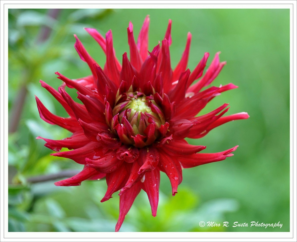
Another Dahlia from my photo file; picture taken some time back. Any suggestions and honest critique is highly appreciated.
Nikon D90
140mm
F/6
1/80sec
ISO 200
Tripod - remote control
Comments
9 comments
Comment posted by John Clulow on November 17, 2012 at 11:01 AM
Hi Mire,
You asked for honest critique, so I hope you will receive it well :)
First, the asepects of it that I lke are the strong contrasts in color and, on the left side, contrast of form. And the color of the center is indeed connected with that of the background.
There are also a few things I want to tell you which detract from what I take to be your intent. The background on the right has a very nice boheh, but that seems to be lost over on the left, wherein the background seems to be taking on more of the flower's form and thus fighting with it. Perhpas that was your intention, but it isn't working that well within my brain, I must say.
I notice the fact, even though it is a small point, that one of the petals about 1/3 the distance from left to right runs out of the frame of the image. Somehow that is bothersome to my eye. Perhaps with a much closer crop and parts running out of the edges all around it wouldn't be, but in that it is just this one, single, individual point, it becomes problematic, I find, when I check how my my individual mind is seeing it: This isn't a judgement; just a repor of fact.
Finally, while it is ordinarily supposed to be better to place an image off-center. I think this one is perhaps too little so placed; it is fighting with being centered or off-centered. I would think it would be received better by my eye were it exactly centered and were the bottom petal included wholly and were the background be more like the right on the left. So that is my feedback after observing how my mind saw it.
Now, all that having been said, it is lovely as it is and how you presented it. And I am much happier having seen it than I would have been had you decided not to post it. I hope you take my critique comments within that overall frame.
Registered on November 1, 2012, 155 Posts, 1079 Comments
Comment posted by Russell Colletta on November 17, 2012 at 12:24 PM
This generally works for me Miro. Would like to see a little more room at the bottom though.
Registered on October 31, 2009, 114 Posts, 1008 Comments
Comment posted by Nancy Lea Sandy on November 17, 2012 at 1:00 PM
Is this what they call a spider dahlia? It's spiky petals against the softer bg are startling. Beautiful color, too. a minor nit would be the one petal that is creeping out of the bottom of the frame. Otherwise, beautiful
Registered on January 24, 2011, 576 Posts, 6942 Comments
Comment posted by scott lanz on November 18, 2012 at 8:28 AM
Miro, the red dahlia works really well against the green bg, and the dahlia itself has great color and form. I agree with John's thoughtful critique regarding the overall comp and bg. Re the bg, the bright leaves are a bit distracting. This effect might have been controlled with the use of a polarizer (which I use probably 90% of the time in daylight flora images) and/or a diffuser.
Registered on November 14, 2003, 840 Posts, 12902 Comments
Comment posted by Bill Fach on November 18, 2012 at 4:49 PM
Miro: The petal going out of the frame and some softness in the center do impact this for me. A touch more DOF seems appropriate. Beautiful subject though and overall this is very nice. >=))>
Registered on November 1, 2003, 1805 Posts, 26981 Comments
Comment posted by Albert Darmo on November 18, 2012 at 5:19 PM
Hi Miro At F/6 you managed to keep most of the dahlia in focus.. in a perfect world, i would have used a neutral artifical BG. and shot at F/10 to get the whole Dahlia in focus. i love your composition, except the cut off petal. and the colors and form of the subject are marvelous
Albert Darmo
Registered on November 25, 2008, 1386 Posts, 11978 Comments
Comment posted by Pat Sampson on November 19, 2012 at 11:27 AM
I like the colors Miro. I do find the viewer's left side a little distracting. Overall though the image works for me.
pat
Registered on May 19, 2007, 953 Posts, 15989 Comments
Comment posted by Gary Yeoh on November 19, 2012 at 8:24 PM
Miro:
I basically agree with Bill, a bit more DOF and wish the petal is not clipped at the bottom. The bg on the right is very nice.
Registered on September 1, 2009, 588 Posts, 8184 Comments
Comment posted by Morris McClung on November 21, 2012 at 10:39 AM
A little soft in focus on my monitor, but I really like the color combinations.
Registered on May 7, 2007, 670 Posts, 19650 Comments


Comments
9 commentsYou asked for honest critique, so I hope you will receive it well :)
First, the asepects of it that I lke are the strong contrasts in color and, on the left side, contrast of form. And the color of the center is indeed connected with that of the background.
There are also a few things I want to tell you which detract from what I take to be your intent. The background on the right has a very nice boheh, but that seems to be lost over on the left, wherein the background seems to be taking on more of the flower's form and thus fighting with it. Perhpas that was your intention, but it isn't working that well within my brain, I must say.
I notice the fact, even though it is a small point, that one of the petals about 1/3 the distance from left to right runs out of the frame of the image. Somehow that is bothersome to my eye. Perhaps with a much closer crop and parts running out of the edges all around it wouldn't be, but in that it is just this one, single, individual point, it becomes problematic, I find, when I check how my my individual mind is seeing it: This isn't a judgement; just a repor of fact.
Finally, while it is ordinarily supposed to be better to place an image off-center. I think this one is perhaps too little so placed; it is fighting with being centered or off-centered. I would think it would be received better by my eye were it exactly centered and were the bottom petal included wholly and were the background be more like the right on the left. So that is my feedback after observing how my mind saw it.
Now, all that having been said, it is lovely as it is and how you presented it. And I am much happier having seen it than I would have been had you decided not to post it. I hope you take my critique comments within that overall frame.
Albert Darmo
pat
I basically agree with Bill, a bit more DOF and wish the petal is not clipped at the bottom. The bg on the right is very nice.