Colors of History
by Adrian Klein
It's been a while since I have been on here or posted anything. Always great work to view.
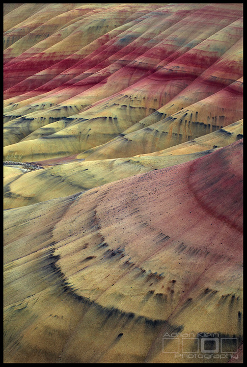
This is a more intimate view of the Painted Hills than most of my work from there. Looking for all honest feedback. Additionally please chime in on color tones and hues if they seem off (assuming you have a calibrated monitor). I just got a new system built and calibrated my monitors yet want to make sure nothing is funky.
Canon 5DMKII
70-200L
F/16
1.6 seconds
ISO 100
Processing: a few layers working color balance, saturation and levels

Comments
23 commentsWelcome back.
Perfect processing ;)
Great to see an image from. I so much prefer these intimate comps from the Painted Hills over the broader landscape views. This one is exceptional; strong comp, great design, beautifully crafted.
Hard to comment on the color since I don't have a personal reference of having been there. I think the saturation may lean a little strong (mostly the burgundy,) but overall the colors are quite beautiful to my eye and <calibrated> monitor. Certainly falls within personal choice and license. Not sure why I even bothered to mention it... ;-)
Wonderful image.
Lon
Nick Bristol
Lone Rock, WI
Peter
Chris
It works. The colors and tones look good on my monitor.
Stan, you gets bonus points for your comment. Great eye! I completely agree and noticed that when I was photographing the scene. However the loss to the hills in the back right moving down enough to completely eliminate that small strip was not worth it to me in the end.