Nature Photographers Network
This is the preserved archive of the original Nature Photographers Network. The community continues at naturephotographers.network.
Pahono Garden +rp
‹ PreviousLandscape GalleryNext ›

Pahono Garden +rp

by Lon Overacker

Gallery: LandscapePosted November 11, 2012259 views26 comments
A little off season I know. I'm still milking the images I captured way back in May and I don't have anything new to work on. That will change soon as I'm expecting my film back from our recent fall outing to, yes, Yosemite.

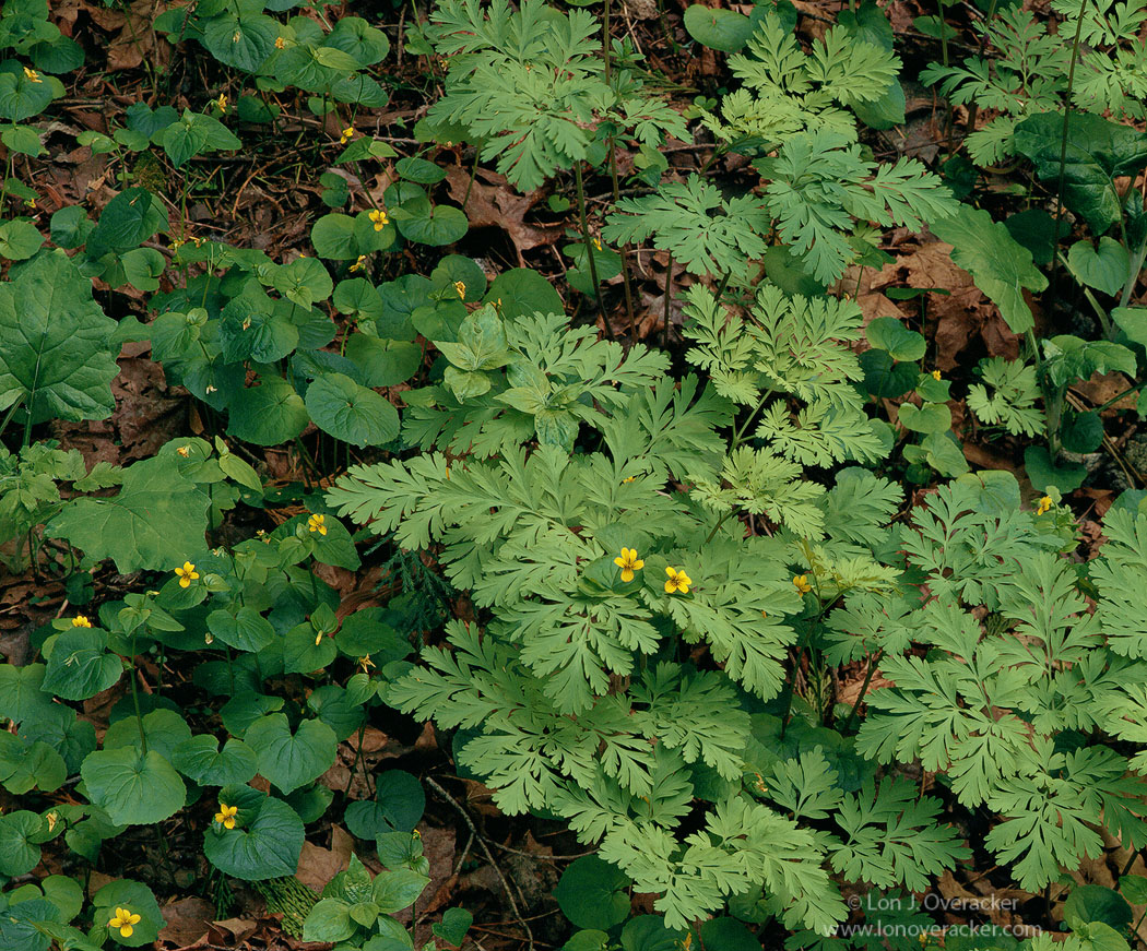
This was just a few minute walk up the trail from the Fern Spring image I posted. Nothing terribly exciting, but I liked this quiet and intimate little garden setting. I'm posting a second exposure and would like to ask your opinion as to which one you prefer.

Thanks for any and all honest comments and critiques!

4x5, Nikkor 300mm, f/32 @1s, Astia 100F.

Thanks!
Lon

Comments

26 comments
Comment posted by Lon Overacker on November 11, 2012 at 3:30 PM
Here's an alternate version.
Registered on November 24, 2006, 521 Posts, 19147 Comments
Comment posted by John&Patty Benway on November 11, 2012 at 4:03 PM
I dont know where you guys come up with such pristine gardens, the gardens around me have half eaten leaves and rotted logs, quite messy. yes, I love these small scenes of nature, as you probably know, as to which one I like best, definitely the darker exposure, second post, it's just very appealing to me. Beautiful work Lon.
John
Registered on May 12, 2006, 626 Posts, 8700 Comments
Comment posted by Bill Fach on November 11, 2012 at 4:25 PM
Lon: Not a bad FLORA image :wink: Love the frame filling comp and all the details in the larger version especially. I give a very small edge to the second version. 2 thumbs up! >=))>
Registered on November 1, 2003, 1805 Posts, 26981 Comments
Comment posted by Paul Breitkreuz on November 11, 2012 at 4:33 PM
Lon, well I'll have to go with the first, although, the second looks like it could be a bit nicer. But what the heck, they're both very fine images. The first one gets the nod with the resulting larger version.
The Astia always does the greens and yellows up nicely, as seen here. Detail in the larger version really brings things to life.
OK , I took yet another look at the second, I think John & Bill are on to something there with the second one. Hmmmm, got a coin to toss?.... :biggrin:
Registered on February 25, 2006, 525 Posts, 8448 Comments
Comment posted by Morris McClung on November 11, 2012 at 5:46 PM
A very strange reaction to both of these, Lon. It sounds odd to say that while viewing the first one, my frontal lobe move upwards, and while viewing the second, it moves downward. :jump: The first has a decidedly happy feeling to, a brighter mood.
And, the second has the darker richer colors giving more of a somber mood. I'm not really making any sense, am I?
Well, anyway, right now I like the first version more. As more of the weekend disappears today, I'm sure I will like the second more. :biggrin:
Registered on May 7, 2007, 670 Posts, 19650 Comments
Comment posted by Richard Teller on November 11, 2012 at 6:11 PM
I like the rich color of the second image better. The yellow flowers give just enough variation to make the image interesting.
Registered on August 23, 2010, 1162 Posts, 6692 Comments
Comment posted by scott lanz on November 11, 2012 at 6:44 PM
As already mentioned, this is a very attractive, pristine woodland scene. The larger version is a treat to look at and study. I prefer the more even exposure in the first, but only slightly in this web presentation.
Registered on November 14, 2003, 840 Posts, 12902 Comments
Comment posted by Brian Schrayer on November 11, 2012 at 7:10 PM
Lon, nice intimate image. I like the contrasting green tones and the dappled yellow flowers. I think that I prefer the original post. The darker plants on the left hand side of the repost draw my eye too much and take away from the cohesive feeling of the overall image.

By the way, thanks for all that you do as moderator and for your thoughtful and constructive comments on everyone's images. I know that I learn a lot from reading your comments not only on my own images but on other's images as well. :wavey:
Registered on May 28, 2004, 114 Posts, 2890 Comments
Comment posted by Tony Kuyper on November 11, 2012 at 7:24 PM
Just the right amount of variety of foliage to engage the viewer but not overwhelm them. I like the arrangements and textures very well.

Both images seem just a bit flat to me. Natural, to be sure, but they don't quite sparkle like some of your images.
Registered on November 1, 2003, 364 Posts, 22328 Comments
Comment posted by Lon Overacker on November 11, 2012 at 9:20 PM
Thanks for the comments so far folks, I appreciate it.

I think I'm leaning towards the first version and feel like Brian that the darker leaves in the 2nd version draw the eye outward. And Brian, thanks very much for the kind words, I appreciate it.

Tony - I agree, and here's a repost. I think the combination of Astia and that I'm usually quite leary of pushing greens too much, left this one a little flat as you suggest. Good call. Here's a quick workup of the 1050 image (not even from my psd file) adding a bit more saturation and a slight Orton touch to it. I think I'll rework my original when I get this posted on my website.

thanks folks!

Lon
Registered on November 24, 2006, 521 Posts, 19147 Comments
Comment posted by Preston Birdwell on November 11, 2012 at 10:57 PM
Lon, as you know, I really have a special place for these Sierra gardens. I was all set to go with the initial post, that is, until I viewed the latest one with the increased saturation and orton effect.

That one gets my vote. The extra work makes it sing. It will make a gorgeous print. Well seen, and nicely done!

--P
Registered on November 1, 2003, 471 Posts, 5188 Comments
Comment posted by Paul Breitkreuz on November 11, 2012 at 11:04 PM
Lon, the last post works best even at the smaller size. The additional saturation brought it up nicely and now compliments the very fine intimate scene..... :wink:
Registered on February 25, 2006, 525 Posts, 8448 Comments
Comment posted by Eva McDermott on November 11, 2012 at 11:09 PM
Enjoyable intimate scene Lon. I like the fantastic detail and light you have captured here.
Registered on January 4, 2009, 1015 Posts, 13229 Comments
Comment posted by John Mumaw on November 11, 2012 at 11:24 PM
The reposted version is quite beautiful. I think that the two flowers alone in that particular group of foliage really make this stand out. Without them, this just work nearly as well. Nice work!
Registered on September 9, 2005, 62 Posts, 2289 Comments
Comment posted by Vance Gese on November 11, 2012 at 11:54 PM
Your composition is simply wonderful, Lon, the variation in greens and the delicate details of the leaves set against last years leaves works so very well. The flowers are icing on the cake. Your third post really nails it in my opinion. Such a peaceful and quiet image. Exquisite work.
Registered on November 13, 2008, 298 Posts, 6629 Comments
Comment posted by Dietrich Gloger on November 12, 2012 at 1:01 AM
Looks like your archetypical scene and composition Lon. I like it a lot, the composition is beautiful, well balanced and the three ingredients (green leaves, yellow blossoms, forest floor) complement each other well. The saturation was ok for me in the first version, as this is a calm and quiet image, but more pop never hurts such images either.
Registered on January 26, 2007, 360 Posts, 9876 Comments
Comment posted by Ant on November 12, 2012 at 2:46 AM
Ha, what a beautiful understory garden!... I like a lot images like this one, and would hang them around all over my house... Between the different versions... Don't know.
The second is more direct, the contrast is more appealing, and the third is very well balanced and gives a good combination of the previous two... But in the end I may prefer the first one, which in my opinion gives a more intimate feeling...
Registered on April 13, 2009, 27 Posts, 474 Comments
Comment posted by John&Patty Benway on November 12, 2012 at 8:58 AM
I guess I'll change my mind, your last post has a slight glow, which is a little more appealing to me, personally, I would be happy with any one of them. Beautiful Lon.
John
Registered on May 12, 2006, 626 Posts, 8700 Comments
Comment posted by Nick Bristol on November 12, 2012 at 9:37 AM
Lon, This is really a wonderful shot. I enjoy the earthy and natural feel of this very much. I have enjoyed looking at all three versions now, and the 3rd one is perfect for my taste. Great comp too! Excellent work with this... :toast:

Nick Bristol
Lone Rock, WI
Registered on February 1, 2004, 752 Posts, 14140 Comments
Comment posted by Mark Seaver on November 12, 2012 at 10:18 AM
Lon, I definitely prefer the lighter version. Even the small version of this intimate look offers the details that have always made large format special. The repost has a nice pop.
Registered on January 23, 2011, 1103 Posts, 17270 Comments
Comment posted by Harley Goldman on November 12, 2012 at 11:34 AM
Count me in for the reworked version. Nice image, but as you said, nothing terribly exciting. :biggrin:
Registered on November 19, 2003, 586 Posts, 11271 Comments
Comment posted by Stan Rose on November 12, 2012 at 12:36 PM
You're right, Lon--not terribly exciting :wink: :biggrin:
Not that all photos have to be....
I like numero uno here... :wavey:
EDIT: i swear i just read Harley's comment lol--well, i think there's a consensus growing... :wink: :wink:
Registered on September 15, 2005, 836 Posts, 17099 Comments
Comment posted by Youssef Ismail on November 12, 2012 at 2:25 PM
Lon,

The re-worked version sings. What I like about this photo most is the patterns in the plant to the right side. Astia was the right choice for this scene.
Registered on November 1, 2003, 474 Posts, 5555 Comments
Comment posted by Nancy Lea Sandy on November 12, 2012 at 6:28 PM
Nice composition. I like the brighter version, feels more spring-like
Registered on January 24, 2011, 576 Posts, 6942 Comments
Comment posted by Brian Schrayer on November 12, 2012 at 9:45 PM
I'm revisiting this and I definitely like the last repost. I think the refinements really bring it more to life.
Registered on May 28, 2004, 114 Posts, 2890 Comments
Comment posted by John Williams on November 13, 2012 at 12:49 AM
Final repost hits the sweet spot Lon. I like it with a bit cropped off the top. It's a nice image, but I see where folks are going with the exciting comments. Of course it's your own fault because of your typical posts :wink: .
Registered on September 6, 2007, 221 Posts, 5985 Comments