Nature Photographers Network
This is the preserved archive of the original Nature Photographers Network. The community continues at naturephotographers.network.
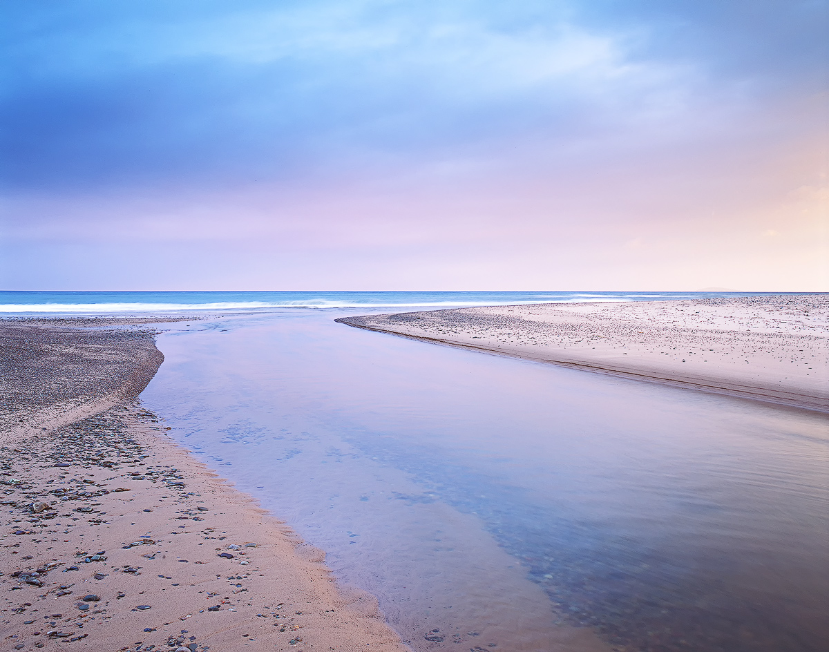
Pastel Dawn II
‹ PreviousLandscape GalleryNext ›

Pastel Dawn II

by Eva McDermott

Gallery: LandscapePosted November 9, 2012787 views20 comments
Inverness Beach, Cape Breton, Nova Scotia 2012

Velvia 50 film version. Digital version here Pastel Dawn. I personally like this version better.

A small river on Inverness Beach, Cape Breton, Nova Scotia on a cloudy morning. The weather went completely downhill after I took this image.

Pentax 67II
Pentax 67 55-100mm
1.5 Stop HE ND Gradient
4 Stop ND

Thanks for having a look.

Comments

20 comments
Comment posted by Scott Smorra on November 9, 2012 at 9:34 PM
Beautiful image Eva. I really like the colors and simplicity here. Both images are excellent, but I prefer the film version as well.
Registered on November 2, 2009, 161 Posts, 2143 Comments
Comment posted by Kurt Budliger on November 9, 2012 at 9:37 PM
Knew it was yours as soon as I saw the thumb, great shot, love the gentle sweep of the river and pastel colors.
Registered on June 11, 2006, 113 Posts, 2116 Comments
Comment posted by Tony Kuyper on November 9, 2012 at 10:33 PM
Nicely calming image. It's relaxing just to look at it.
Registered on November 1, 2003, 364 Posts, 22328 Comments
Comment posted by Richie Graham on November 9, 2012 at 11:41 PM
The soft colors and lines are what makes this work for me. Viewing the larger photo highlights the strength of these elements substantially more to my eye. Thanks for sharing.
Registered on September 2, 2011, 15 Posts, 33 Comments
Comment posted by John&Patty Benway on November 10, 2012 at 7:18 AM
Really like the warm mood Eva, close, but I prefer the V-50. Beautifully seen and presented.
John
Registered on May 12, 2006, 626 Posts, 8700 Comments
Comment posted by Peter Richter on November 10, 2012 at 7:54 AM
Eva, the plainness of your composition is very impressive for me. The details are delightful already in the web version, I really would like to enjoy a large print of this.

Peter
Registered on November 10, 2010, 218 Posts, 2723 Comments
Comment posted by David Chauvin on November 10, 2012 at 8:41 AM
A calming image to say the least. The subtle differences between the digital and velvia versions is interesting.
Registered on August 5, 2004, 1007 Posts, 5595 Comments
Comment posted by Nick Bristol on November 10, 2012 at 9:30 AM
Lovely... and very calming. This comp works great.

Nick Bristol
Lone Rock, WI
Registered on February 1, 2004, 752 Posts, 14140 Comments
Comment posted by Morris McClung on November 10, 2012 at 10:45 AM
Man, I love me some Velvia. Yes, sometimes I miss those days, too. But, not the costs. :biggrin: Lovely pastels throughout. They make for a tranquil beauitful scene.
Registered on May 7, 2007, 670 Posts, 19650 Comments
Comment posted by Chris Chamberlain on November 10, 2012 at 12:42 PM
I love big drama, but soft calm pastel condition such as this are among my favorite situations to shoot. Must be the peaceful feeling that comes over me when experiencing them. This is beautiful!

Chris
Registered on March 13, 2007, 500 Posts, 8365 Comments
Comment posted by Paul Breitkreuz on November 10, 2012 at 1:20 PM
Already stated, any amazing calming effect to this capture, Eva. The depth and placement of the horizon also provides a perfect transition point. Has a nice V-50 pastel look without any color being overdone or harsh either. :cool:
Registered on February 25, 2006, 525 Posts, 8448 Comments
Comment posted by Bill Chambers on November 10, 2012 at 3:02 PM
I like the brightness and contrast better in this version but have to say I like the color better in the digital version.
Registered on April 10, 2005, 753 Posts, 21216 Comments
Comment posted by Wayne Willison on November 10, 2012 at 3:26 PM
Nova Scotia is notorious for weather going downhill. But this is sweet, love the uncluttered pastels and endless Atlantic shores.
Registered on April 10, 2009, 292 Posts, 3967 Comments
Comment posted by Nancy Lea Sandy on November 10, 2012 at 3:41 PM
Simple and sweet. Nice work
Registered on January 24, 2011, 576 Posts, 6942 Comments
Comment posted by Lon Overacker on November 10, 2012 at 4:36 PM
Eva,

I love this! The simplicity is striking, yet the composition is engaging. But most of all, I love what you've managed and pulled off with the Velvia and the wonderful colors here. Personally, heads above the digital version. Not just being biased and so much has to do with how you may have processed each, but this one just pops - yet is subtle in it's color and presentation.

Lon
Registered on November 24, 2006, 521 Posts, 19147 Comments
Comment posted by Youssef Ismail on November 10, 2012 at 6:02 PM
Eva,

I like this version better as well. Why do you think that is?
Registered on November 1, 2003, 474 Posts, 5555 Comments
Comment posted by Kah Kit Yoong on November 11, 2012 at 1:09 AM
Hmmm Velvia trumps RAW. Love the simplicity of the shapes and pastel colours.
Registered on September 27, 2006, 636 Posts, 10682 Comments
Comment posted by Stan Rose on November 12, 2012 at 12:58 PM
I like the digital version better--even tho i havent seen it :biggrin:
Cool shot, Eva, im really liking a crop that takes out the saturated cyan up top, and gives you nice thirds :wink:
OK, i just checked out the digital. The difference is this is brighter and more saturated, both good in this case except for the top portion, which i would crop in both cases.
Registered on September 15, 2005, 836 Posts, 17099 Comments
Comment posted by Andrew Morrill on November 12, 2012 at 11:57 PM
Really great shot with calming wonderful color. I definitely prefer the film color and higher micro contrast. Congrats.
Registered on June 10, 2010, 51 Posts, 216 Comments
Comment posted by Stuart Williams on November 21, 2012 at 12:04 AM
love this one too. colours are lovely.
Registered on December 7, 2007, 247 Posts, 4792 Comments