Nature Photographers Network
This is the preserved archive of the original Nature Photographers Network. The community continues at naturephotographers.network.
20,001
‹ PreviousLandscape GalleryNext ›

20,001

by scott lanz

Gallery: LandscapePosted October 25, 2012316 views12 comments
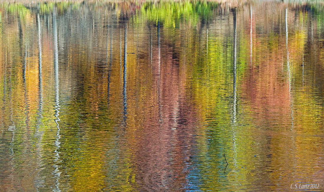
Another fall reflection abstract. The title is in reference to Stan's comment yesterday, posted in response to Mark's image, that there are 20,000 reflection abstracts on the web. Now there are 20,001. :wink: This one was taken 10/22/12 at Mill Creek MetroParks, Youngstown. Nikon D700, 80-400 @ 180, iso 400, 1/100. Comments, questions, and suggestions welcome.

Comments

12 comments
Comment posted by Paul Breitkreuz on October 25, 2012 at 10:07 AM
Scott,
Well, I guess I get to be the first commenter on number 20,001 then... :biggrin:
I like it as it's intended, an abstract. The singular tree trunk reflections provides a bit of bracketing of segments of the scene here and there. A nice variety of colors in the foliage reflections too.
The only thing I might try is a clone or CA of the small sticks, but not necessary to still get the visual impact here. :cool:
Registered on February 25, 2006, 525 Posts, 8448 Comments
Comment posted by SandyRichardsBrown on October 25, 2012 at 10:42 AM
Don't know about the others, but # 20,001 is sweet. I love these fall reflection abstracts. Every one is different and unique, and I never tire of them.
Beautiful image -

Sandy
Registered on November 24, 2003, 3937 Posts, 12909 Comments
Comment posted by Bill Chambers on October 25, 2012 at 11:23 AM
I love reflection abstracts, especially when they're captured as nicely as this. Most seem to have darker colors many times and I really like the lively coloration here. I do have one nit and one suggestion though. The nit - I would clone the branch sticking out of the water slightly above the bottom a third of the way in from the right - very minor! My suggestion would be to crop down from the top to remove the grass reflection in order to make it more consistent in it's theme. One of the better reflection abstracts I've seen in a while Scott - wish it was mine!! Large version is really sweet!!
Registered on April 10, 2005, 753 Posts, 21216 Comments
Comment posted by Mark Seaver on October 25, 2012 at 11:32 AM
Scott, when do we begin our space odyssey, 10 times better than 2001? :smile: Love the wide spectrum of colors and the "poles" holding them down. I like the "twinge of reality" created by that little twig in the lower right. Well seen!
Registered on January 23, 2011, 1103 Posts, 17270 Comments
Comment posted by Nancy Lea Sandy on October 25, 2012 at 12:55 PM
beautiful abstract. I think your inclusion of the reflected trunks gives this a unique feel and separates it from the other ffr's (fall foliage reflections) Beautiful colors.
Registered on January 24, 2011, 576 Posts, 6942 Comments
Comment posted by Morris McClung on October 25, 2012 at 6:22 PM
I'm with Paul about cloning out anything that breaks up the flow of the abstract. And, for something that is the 20,001 of this type of shot, there were most that do not have such a great range of color. Gorgeous image, Scott! :toast:
Registered on May 7, 2007, 670 Posts, 19650 Comments
Comment posted by Dennis Harding on October 25, 2012 at 6:37 PM
There may well be 20,000 others out there but I think this one is just great....well done Scott
Registered on January 19, 2011, 33 Posts, 408 Comments
Comment posted by Kyle L. Krause on October 26, 2012 at 2:42 PM
Truley stunning Scott, very artistic. I love images like this. I would not change a thing. Excellent work!
Registered on June 15, 2010, 29 Posts, 605 Comments
Comment posted by Wayne Jones on October 26, 2012 at 9:49 PM
I've seen a lot of fall reflection abstracts. Most are beautiful, even though many are very similar. This one is very beautiful, and unique. Since I am more into documenting the wonders of nature than creating abstract art, I love all of this, grass, stick and all. ... and the paintbox of all those colors is amazing!
Registered on April 18, 2007, 953 Posts, 6435 Comments
Comment posted by Tony Kuyper on October 27, 2012 at 2:18 PM
Neat abstract. The ripple really make this one.
Registered on November 1, 2003, 364 Posts, 22328 Comments
Comment posted by Stan Rose on October 28, 2012 at 8:05 AM
Love the title! :razz:
With all due respect to Bill--i STRONGLY disagree with his suggestions.
I agree with Wayne, and others---and that was the point i was trying to make with Mark (in my typical, tactful way :wink: ), this is a very common subject, so for it to work (for me) it has to engage me. This engages me much more effectively than #20,000, because:
A) it has that twig (which makes it more than just an abstract!)
B) It has the top (Ditto)
C) It has vertical lines intersecting the horizontals
D) The ripples are subtle
E) The colors are varied and balanced.
As far as this 'theme' goes, it can't get any better than this. I love this shot (and I really like many of those other 20,000, including Mark's :wink: )
I'm not out to bash Mark, who I really respect from his fine work. I'm just calling it as i see it. I could recreate Mark's shot in PS without even using a photo in about 30 minutes. It would take me days if not weeks to do that in the case of this photo--if i could even do it at all. That's why this shot engages me.
Registered on September 15, 2005, 836 Posts, 17099 Comments
Comment posted by scott lanz on October 28, 2012 at 11:54 AM
Thanks for the comments, Stan and everyone else. Stan, I'm glad you didn't take any offense at the title. I took a bunch of abstracts this day, including a slightly cropped version of this one. I also made an alternate, more abstract version of this one which cropped the top and cloned the stick (which would reflection abstract image 20,002), but I personally like the bit of real orientation that lets the viewer know the design is real and natural. Plus, I figured it was better to leave the stick and top in and get comments on them. Thanks again.
Registered on November 14, 2003, 840 Posts, 12902 Comments