Nature Photographers Network
This is the preserved archive of the original Nature Photographers Network. The community continues at naturephotographers.network.
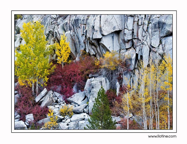
Fall Palette in Granite
‹ PreviousLandscape GalleryNext ›

Fall Palette in Granite

by Todd Liotine

Gallery: LandscapePosted October 15, 2012646 views28 comments
This is an image from Bishop Creek area. When possible I've trying to shot different types of images that can all work together in a presentation, in a home, etc. This is my second image in that series from my latest trip. I really like the colors and textures, and I don't think I've seen anything like this out of the area. I spotted this in really harsh light scouting around and came back when the conditions were right. I have tighter compositions of this scene as well but this one stood out to my so I'm sharing this image. Let me know what you think.

Comments

28 comments
Comment posted by Scott Fricke on October 15, 2012 at 11:22 AM
I like this comp Todd, the light rocks really highlight the colors in the trees and add texture to the scene, well done!
Registered on January 19, 2007, 133 Posts, 1448 Comments
Comment posted by Mark Seaver on October 15, 2012 at 11:29 AM
Beautiful! The contrast between the colored trees & shrubs and the light rocks is great and the cracks between the rocks add a fine texture.
Registered on January 23, 2011, 1103 Posts, 17270 Comments
Comment posted by Preston Birdwell on October 15, 2012 at 1:59 PM
Todd,

I've made a few attempts at this very spot. I like the various trees and bushes along with the granite. The tones and color look nice.

The red bushes are Creek Dogwood.

--P
Registered on November 1, 2003, 471 Posts, 5188 Comments
Comment posted by Todd Liotine on October 15, 2012 at 2:11 PM
Thanks Preston, I thought they must be related to dogwood, really beautiful this time of year.
Registered on July 1, 2008, 131 Posts, 671 Comments
Comment posted by R.Bill Moser on October 15, 2012 at 2:29 PM
I like how you composed this scene. Nice color contrast. Well done
Registered on January 29, 2010, 285 Posts, 4281 Comments
Comment posted by Bill Chambers on October 15, 2012 at 3:33 PM
Beautiful Todd. Wonderful color and a great mix of elements. I dinitely wouldn'y go with a tighter comp; if anything, this still feels a little tight IMO, especially on the left side. Very nice presentation - would love to have this in my portfolio.
Registered on April 10, 2005, 753 Posts, 21216 Comments
Comment posted by Todd Liotine on October 15, 2012 at 3:46 PM
Thanks Bill, on the left side there are some branches and another tree that are there that would've been distracting and loose the balance I was trying to create, but I agree a little more granite would've been nice.
Registered on July 1, 2008, 131 Posts, 671 Comments
Comment posted by Karen Kane on October 15, 2012 at 3:49 PM
Todd - I really like the contrasting texture between rocks and vegetation, and also the way the rocks (being near-white) accentuate the fall colors! I think if you went any tighter, it would need to focus on the rocks - from this perspective it looks like there might be some neat abstracts within the rocks (specifically upper-right corner) - but I don't know what's beyond your frame. Nicely done!

Registered on August 4, 2012, 66 Posts, 726 Comments
Comment posted by Todd Liotine on October 15, 2012 at 3:57 PM
Thanks Karen, I wasn't clear in my wording above but not really tighter versions of this composition but some vertical compositions that focus around the trees on the left and the red creek dogwoods.
Registered on July 1, 2008, 131 Posts, 671 Comments
Comment posted by Alex Mody on October 15, 2012 at 4:43 PM
Awesome, Todd. Love the color and composition.
Registered on December 25, 2007, 163 Posts, 1896 Comments
Comment posted by Nick Bristol on October 15, 2012 at 4:57 PM
This looks great, Todd. I like this comp and you really have some wonderful color and textures here. Very nice work!

Nick Bristol
Lone Rock, WI
Registered on February 1, 2004, 752 Posts, 14140 Comments
Comment posted by Tom Hilton on October 15, 2012 at 4:58 PM
I like this a lot Todd...
Well seen - well done!
:toast: :toast:
Registered on September 19, 2011, 68 Posts, 668 Comments
Comment posted by scott lanz on October 15, 2012 at 8:44 PM
Well seen and beautifully composed, Todd. :toast:
Registered on November 14, 2003, 840 Posts, 12902 Comments
Comment posted by Harry Lichtman on October 15, 2012 at 8:47 PM
I agree, a nice mix of texture and colors that would look great on a wall. You've controlled the chaos well. Not sure ho I would change this.
Registered on September 17, 2010, 304 Posts, 3507 Comments
Comment posted by Rick Turner on October 15, 2012 at 8:55 PM
Very nice design of the competing elements :toast:
Registered on February 18, 2012, 534 Posts, 2755 Comments
Comment posted by Scott Smorra on October 15, 2012 at 9:32 PM
Very nice colors here Todd. It's not very often that a scene will have this combination of colors. Well done!
Registered on November 2, 2009, 161 Posts, 2143 Comments
Comment posted by Nancy Lea Sandy on October 15, 2012 at 10:09 PM
A wonderful mix of colors. In particular, I like the contrast between the frothy foliage and the blocky, geometrical shapes of the rock. Beautiful image
Registered on January 24, 2011, 576 Posts, 6942 Comments
Comment posted by Chris Chamberlain on October 15, 2012 at 10:25 PM
Hey dude! I know exactly where this is, cause I was standing there trying to find a way to compose it with only 70mm! I was really wanting a 70-200 at that moment.

I even hiked up to below this on the other side of the creek, but the perspective was wrong. Really is a great little spot with great diversity of color with the creek dogwood adding the deep red. It all works well against the pale blues of the rock wall too. Nice one!

Chris
Registered on March 13, 2007, 500 Posts, 8365 Comments
Comment posted by Tony Kuyper on October 15, 2012 at 10:33 PM
EXCELLENT! What a fantastic fall scene. Almost abstract but also very real. It takes a bit to get a handle on the scale and realize those rocks are pretty darn big.
Registered on November 1, 2003, 364 Posts, 22328 Comments
Comment posted by Matt Anderson on October 15, 2012 at 11:32 PM
Chaotic, but it some how works, and works quite well!
Registered on September 6, 2007, 346 Posts, 2696 Comments
Comment posted by Vlad Sadovsky on October 16, 2012 at 3:08 AM
Well done, almost perfect abstract of color spots contrasting with grey of the rock. I like how the trunk lines work with cracks in the rock, though I feel a bit they make almost for 2 separate images in one. Nicely done.
Registered on November 12, 2010, 48 Posts, 358 Comments
Comment posted by John&Patty Benway on October 16, 2012 at 7:51 AM
Really pretty colors Todd, and I definitely like the way you composed it. Beautifully done.
John
Registered on May 12, 2006, 626 Posts, 8700 Comments
Comment posted by Lon Overacker on October 16, 2012 at 11:50 AM
Todd,

I really like this! Definitely a different take on the Eastern Sierra, yet recognizable at the same time. I'm on my work laptop, so color is hard to judge, but I'm wondering if this is a little too blue in general? Maybe not, but thought I would throw that out there. I do like the mix of warm autumn colors with the cold granite.

The only wish I had was for a tad more room around the sides; especially left and maybe bottom - but I suspect you had something unwanted at the bottom. No biggie, I still like the combo of the rock and fall color. NIce arrangement of the elements too.

Lon
Registered on November 24, 2006, 521 Posts, 19147 Comments
Comment posted by Harley Goldman on October 16, 2012 at 5:51 PM
Great perspective on this scene I know quite well. Excellent job and great take on it. Beauty.
Registered on November 19, 2003, 586 Posts, 11271 Comments
Comment posted by Ethan Meleg on October 16, 2012 at 9:33 PM
Beautiful texture, color and balance in the composition!
Registered on October 4, 2009, 2 Posts, 20 Comments
Comment posted by Rudy Ruberti on October 17, 2012 at 6:13 PM
Very nice image of Bishop Creek. I spent a couple of afternoons there this fall and the colors were great. I really like the use of the granite wall in the background.
Registered on October 28, 2008, 179 Posts, 1875 Comments
Comment posted by Paul Breitkreuz on October 18, 2012 at 11:49 AM
Hey Todd, Yep, been here a few times over the years myself. Great collection of colors from this variety of foliage, along with the granite too. Like Lon, I too see a bit of blue / cyan cast here. I might try to neutralize some of that slightly to see if you like the look better. I think it just might bring out the foliage and rocks detail even better then it already is. :cool:
Registered on February 25, 2006, 525 Posts, 8448 Comments
Comment posted by Todd Liotine on October 18, 2012 at 2:19 PM
Thanks Lon and Paul I'll remove that in the final for print/ website along with recalibrating my monitors
Registered on July 1, 2008, 131 Posts, 671 Comments