Nature Photographers Network
This is the preserved archive of the original Nature Photographers Network. The community continues at naturephotographers.network.
White Rock + Repost
‹ PreviousLandscape GalleryNext ›

White Rock + Repost

by David Edwards

Gallery: LandscapePosted October 7, 2012211 views7 comments
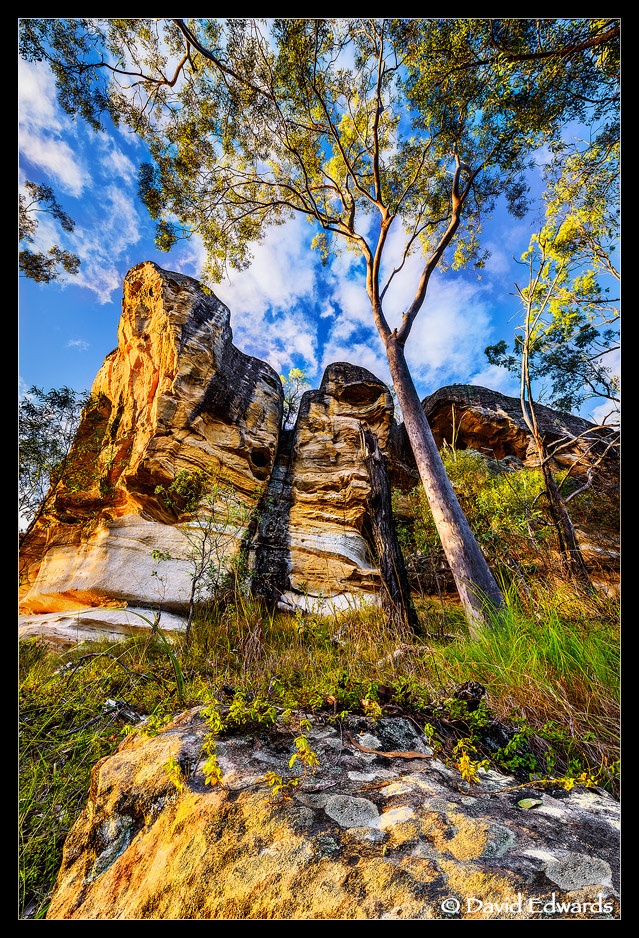
White rock is an aboriginal sacred site known as "Nugam", meaning "Dog". There is a significant spirit around this rock, which forms part of a series of locations that were once used in ceremony.

I photographed at this spot for about an hour at dawn waiting for the right clouds and light to hit the rock to try and capture the feeling of the spirit.

The image is a blend of several shots to capture the dynamic range, cloud motion, to freeze blowing foliage and to focus blend etc etc.

I struggled a bit to get the right contrast and color balance. I know it's quite vibrant, so I was wondering if you think it's too much??

D800, 14-24mm, f/8.

Cheers.

Comments

7 comments
Comment posted by Mark Seaver on October 7, 2012 at 4:02 PM
It's a neat spot and I like all the eye motion in the image, but overall the picture feels too saturated and contrasty to me.
Registered on January 23, 2011, 1103 Posts, 17270 Comments
Comment posted by Nick Bristol on October 7, 2012 at 4:41 PM
David, This does look too contrasty and saturated to me as well. Look like a great place otherwise. Hope that helps... :smile:

Nick Bristol
Lone Rock, WI
Registered on February 1, 2004, 752 Posts, 14140 Comments
Comment posted by Brad Strong on October 7, 2012 at 5:17 PM
I would love to photograph this spot. Your final image is too saturated and bright to look realistic. It's pretty, but should labeled as HDR or photo art in my opinion as it seems to go beyond reproducing what the naked eye would see.
Registered on October 1, 2012, 43 Posts, 302 Comments
Comment posted by Rick Turner on October 7, 2012 at 8:34 PM
I agree on the unreal look. Good capture and well worth some additional tweaks. :toast:
Registered on February 18, 2012, 534 Posts, 2755 Comments
Comment posted by David Edwards on October 8, 2012 at 3:34 AM
Thanks for your honest feedback on this one guys. Yep, there is definitely too much contrast and sat. I had changed my monitor calibration to a lower contrast level, so I've set it back to the way it was and will tackle this one again. Really appreciate the comments, cheers :toast:
Registered on December 6, 2008, 142 Posts, 2623 Comments
Comment posted by Ed Lowe on October 8, 2012 at 12:36 PM
Fantastic light and POV, David. Other than the already mentioned contrast I wouldn't change a thing.

Ed
Registered on February 7, 2004, 414 Posts, 7115 Comments
Comment posted by David Edwards on October 9, 2012 at 6:18 AM
Here is a rework with less contrast and saturation.
Registered on December 6, 2008, 142 Posts, 2623 Comments