Nature Photographers Network
This is the preserved archive of the original Nature Photographers Network. The community continues at naturephotographers.network.
Abstract Dahlia 3
‹ PreviousFlora GalleryNext ›

Abstract Dahlia 3

by Nathan Buck

Gallery: FloraPosted October 5, 2012122 views10 comments
Hi all.

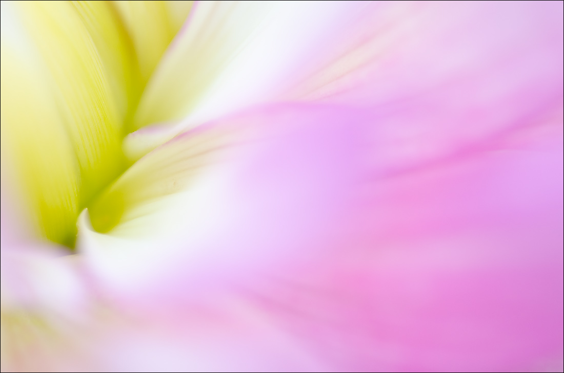
Another abstract dahlia shot that I took recently and would like honest feedback on. Let me know what you think.

I know that this one has even more color wash to it - is there enough definition in the color wash?

Thanks in advance.

Nathan

Nikon D7000, Sigma 180 macro, tripod, ISO 200, f4

Comments

10 comments
Comment posted by Mark Stahlke on October 5, 2012 at 5:59 PM
I find this relaxing to look at. I think the lack of definition in the color wash is what makes the image. All of the subtle lines leading to the white point against the warm green is very nice too.
Registered on November 1, 2003, 97 Posts, 782 Comments
Comment posted by Philip Hodgkins on October 5, 2012 at 6:32 PM
Well composed with pleasing colors and leading lines.
Registered on July 24, 2006, 2741 Posts, 12349 Comments
Comment posted by SandyRichardsBrown on October 5, 2012 at 11:02 PM
Looks great to me - I'm loving this series.
Sandy
Registered on November 24, 2003, 3937 Posts, 12909 Comments
Comment posted by Ken Smith on October 6, 2012 at 12:08 AM
Looking like a water falls into the corner...beautiful.
Registered on September 5, 2008, 449 Posts, 2444 Comments
Comment posted by Gary Yeoh on October 6, 2012 at 3:04 AM
Nathan:
I like the wash in this image the best of the 3 so far. The wash looks graduated from the left to right and quite soothing to look at. I wish there was a sharp edge in the valley on the left to rest the eyes after exploring the wash on the right.
Registered on September 1, 2009, 588 Posts, 8184 Comments
Comment posted by scott lanz on October 6, 2012 at 7:33 AM
Beautiful color and a pleasing image overall. I love the ULC. I think I would like the image better without the oof wash dead center, but the petal was there, so not much to do about it, and I do like the image a lot overall.
Registered on November 14, 2003, 840 Posts, 12902 Comments
Comment posted by Morris McClung on October 6, 2012 at 11:29 AM
O.k., I'm out of Ram and Cram wit, so straight out-Just enough definition to make the washes work great. Another fine image, Nathan. :toast:
Registered on May 7, 2007, 670 Posts, 19650 Comments
Comment posted by Ramamohan Pai on October 6, 2012 at 6:05 PM
Nathan - Another good one in the series. I think you are beginning to get a feel for this work. I like the balance between wash and the detail behind the wash. There is just enough in focus to hold the viewer interest. As I said before working with a shorter lens will help in locating proper edges and possibly better focal points but this one is definitely nice !
Registered on November 1, 2003, 550 Posts, 9037 Comments
Comment posted by Albert Darmo on October 6, 2012 at 10:53 PM
Hi Nathan :wavey: i like the subject matter the best of the three :jump: love the color wash on the RT. agree with Gary about wishing for more detail in the yellow valley on the left :cool: :smile:
Albert Darmo
Registered on November 25, 2008, 1386 Posts, 11978 Comments
Comment posted by Bob&Charly Nelson on October 8, 2012 at 11:26 AM
Another winner Nathan.
Bob :wavey:
Registered on October 27, 2005, 289 Posts, 4202 Comments