Nature Photographers Network
This is the preserved archive of the original Nature Photographers Network. The community continues at naturephotographers.network.
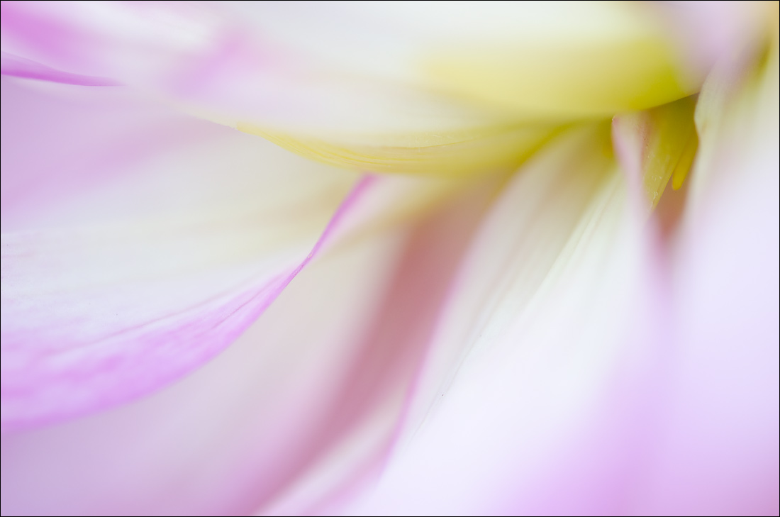
Abstract Dahlia 1
‹ PreviousFlora GalleryNext ›

Abstract Dahlia 1

by Nathan Buck

Gallery: FloraPosted October 2, 2012142 views10 comments
Hi all.

I am going to try to go a bit 'Rammish' for my next few shots. I have been trying to do some abstracts - just because I know that this is an area that I can improve in.

I have been focusing on some dahlias for my abstracts.

Any and all thoughts appreciated.

Nathan

Comments

10 comments
Comment posted by Bob&Charly Nelson on October 2, 2012 at 4:02 PM
Fantastic abstract Nathan. I see no room for improvement here.
Bob :wavey:
Registered on October 27, 2005, 289 Posts, 4202 Comments
Comment posted by Ramamohan Pai on October 2, 2012 at 4:10 PM
Nathan - Wow..What a great start. I am really happy to see this because you are beginning to see Dahlias the way I see them. What a cool abstract :smile: . Love the flow here. You can also darken the magentas a little bit more using the Selective Color Tool in Photoshop and adding a bit more Magenta and Black to the Magenta, so that the darkish tones stand out more from the lightish tones.

Keep going and see if you can do this using a short focal length lens.
Registered on November 1, 2003, 550 Posts, 9037 Comments
Comment posted by Bill Fach on October 2, 2012 at 4:12 PM
Nathan: If imitation is the sincerest form of flattery then you are indeed flattering Ram. Most excellent! >=))>
Registered on November 1, 2003, 1805 Posts, 26981 Comments
Comment posted by Eirini Pajak on October 2, 2012 at 5:09 PM
I was confused at first to see your name & a Ram type image! I like the diagonal part from which the lines flow out either direction!
Registered on December 13, 2011, 216 Posts, 1671 Comments
Comment posted by SandyRichardsBrown on October 2, 2012 at 8:02 PM
Just exquisite - not the smallest nit from me. Looks as if you have this pretty well mastered!
Lovely colours, great perspective, and nice comp.
Sandy
Registered on November 24, 2003, 3937 Posts, 12909 Comments
Comment posted by scott lanz on October 2, 2012 at 9:13 PM
Well done, Nathan. I thought this was Ram's when I saw the thumbnail. It isn't easy to get nice flowing lines and form like you got here.
Registered on November 14, 2003, 840 Posts, 12902 Comments
Comment posted by Ken Smith on October 2, 2012 at 10:21 PM
Nicely done! I like the sense of motion and magentas and whites. I don't know if the yellow is complimentary. Then finding the dof in the upper rt corner...is a meandering w/o focus. yeah...like I know of what I say 'cause I do these in my sleep...not!! ...just easier being a critic than actually producing one. Looking forward to more.
Registered on September 5, 2008, 449 Posts, 2444 Comments
Comment posted by Gary Yeoh on October 3, 2012 at 8:07 PM
Nathan:
Wow, you have drop the 'C' in your cram :biggrin: A very good start in the transformation. Like to see a little more of the sharp edge that is so characteristic of Ram's work.
Registered on September 1, 2009, 588 Posts, 8184 Comments
Comment posted by Morris McClung on October 6, 2012 at 11:16 AM
So, can we call this "Crammin' Ram?" :biggrin:

A wonderful hybrid of two styles. Love everything about this one. :toast:
Registered on May 7, 2007, 670 Posts, 19650 Comments
Comment posted by Albert Darmo on October 6, 2012 at 10:42 PM
Hi Nathan :wavey: Beautifully composed with great flowing lines,agree with Ram about darkening the color tones :smile:
Albert Darmo
Registered on November 25, 2008, 1386 Posts, 11978 Comments