Nature Photographers Network
This is the preserved archive of the original Nature Photographers Network. The community continues at naturephotographers.network.
Indecision
‹ PreviousMan & Nature GalleryNext ›

Indecision

by Youssef Ismail

Gallery: Man & NaturePosted September 18, 2012443 views22 comments
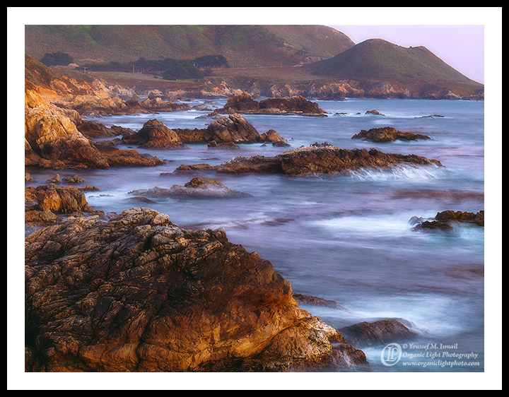
I have been going back to this particular photo for the last two years, unsure of its potential. I like it and still I feel something is just not right. So I thought maybe it needed a different crop. So I did that and now it just added to my indecision as to which one I like and if I like the photo at all, I mean I do like it, aargh!

I would all your honest opinions on this photo and which of the three crops you think works best.

4x5, 300mm, f22, 8 sec on Fuji Provia 100F

First image, full frame, second a 3:1 Crop and the third a 2:1 crop.

Once I decide on this and its crop I will post again with all dust bunnies cloned out and as a larger version for the immense detail.

Comments

22 comments
Comment posted by Youssef Ismail on September 18, 2012 at 3:59 AM
The 3:1 Crop
Registered on November 1, 2003, 474 Posts, 5555 Comments
Comment posted by Youssef Ismail on September 18, 2012 at 4:00 AM
The 2:1 Crop
Registered on November 1, 2003, 474 Posts, 5555 Comments
Comment posted by Venugopal Thantry on September 18, 2012 at 4:07 AM
Difficult to decide.......
IMO first image, as it portrays the vastness of the place....TFS
Registered on May 12, 2011, 33 Posts, 144 Comments
Comment posted by John&Patty Benway on September 18, 2012 at 5:08 AM
Definitely like them in the order you posted them, and I especially like the first post best because of the way the light enhances the color of the FG rocks, beautiful scene Youssef.
John
Registered on May 12, 2006, 626 Posts, 8700 Comments
Comment posted by Reno DiTullio on September 18, 2012 at 5:44 AM
I definitely like the 3:1 crop Youssef, The first image is one most people would shoot and I've seen many with this view point which includes the majority of the Garrapata area and coastline. The second zero's in on the beauty of the rocks along this section of coast without any other distractions; I believe it will make a gorgeous wall-sized print. Well done :toast:
Registered on November 14, 2003, 130 Posts, 1644 Comments
Comment posted by Mark Seaver on September 18, 2012 at 7:02 AM
I like the 2:1 crop the best. For me it shows a really nice long sweeping arc of land with good emphasis on the breakers and off shore rocks. I find myself wondering what including a bit more land at the top would look like. In the full frame, I find the dark rock llc attracting too much attention and wonder what dodging that rock would do. The 3:1 crop feels too restricted for my tastes, but does emphasize the wave breaking on the off shore rock.
Registered on January 23, 2011, 1103 Posts, 17270 Comments
Comment posted by scott lanz on September 18, 2012 at 7:49 AM
I like the photo a lot, including the light on the foreground rock and the beautiful colors. You did not present this as an option, but what about cropping the top just above the distant cliffs (and a little off the right to get rid of the remaining bit of sky)?
Registered on November 14, 2003, 840 Posts, 12902 Comments
Comment posted by Robert Dayton on September 18, 2012 at 9:28 AM
I like them all but prefer the first.
Registered on November 11, 2008, 281 Posts, 3958 Comments
Comment posted by Philip Hodgkins on September 18, 2012 at 10:12 AM
The first for me, definitely, for all the reasons stated by previous commenters.
Registered on July 24, 2006, 2741 Posts, 12349 Comments
Comment posted by Youssef Ismail on September 18, 2012 at 12:13 PM
@Scott, I did make that crop which was close to a 3:2 ratio but it felt odd to me as it cut right through the middle of that small hill.
Registered on November 1, 2003, 474 Posts, 5555 Comments
Comment posted by Dietrich Gloger on September 18, 2012 at 12:59 PM
The pano is the way to go in my opinion. I was not sold on the big rock in the uncropped image. It draws too much attention I think. The pano works beautifully for me!
Registered on January 26, 2007, 360 Posts, 9876 Comments
Comment posted by Dean Sauskojus on September 18, 2012 at 1:42 PM
All three are exceptional images Youssef. In my experience if you plan on selling these the pans will do better. I thinks it's because they fit a wall better. On the 2:1 crop I would consider cropping out the little piece of sky in the URC. The textures on the rocks and the nice warm light add so much to the image. I really like the image and if I were to choose one I like the 2:1 pan but all of them will work.
Registered on September 29, 2009, 137 Posts, 2659 Comments
Comment posted by Carol Nichols on September 18, 2012 at 3:12 PM
Without question I prefer the first image. Beautiful colors and great choice of shutter speed.
Registered on November 7, 2007, 161 Posts, 1420 Comments
Comment posted by Nick Bristol on September 18, 2012 at 5:16 PM
Youssef, I like the the 2:1 crop over the others by quite a bit. It just seems to work better for me. Take care of the urc as Dietrich mentioned and I think it is a fantastic image. Would make a beautiful print! :smile:

Nick Bristol
Lone Rock, WI
Registered on February 1, 2004, 752 Posts, 14140 Comments
Comment posted by Lon Overacker on September 18, 2012 at 6:08 PM
Youssef,

First of all, this is a beautiful coastal seascape from Big Sur - Is this Garrapata also? Looks like.

Here's my .02. I prefer the original simply because of the grand view, showcasing the coast beautifully with the warm glow, color and even the texture, mood of the ocean. I also really, really like the 3:1 crop with a suggestion. This is beautiful and agree with others would make for a gorgeous print. My suggestion is that the top is too cramped. If you had the top equal in spacing to the 2:1 crop, this would be my choice. The 3:1 is my last and least favorite for 2 reasons. 1. The rock in the LL is pretty dominant and I think upsets the overall balance and 2. the corner of sky isn't working - it's more like an oversight or something. I can't see this version making it to a fine art print. Now, if you cloned in some headlands or did something to eliminate any sky in that corner, I would have a different opinion.

You most certainly have a beautiful keeper in that mix somewhere.

Lon
Registered on November 24, 2006, 521 Posts, 19147 Comments
Comment posted by Nathan Apodaca on September 18, 2012 at 7:46 PM
Alright, here it goes. I'll do my best to toss in my thoughts...

First off---INCREDIBLE! I love the scene, and it appears to be edited very well, IMO. Here's my thoughts on each crop...

#1---I like the context here, which just about places the viewer into the scene. I do feel like I don't know where to settle my eyes, though.

#2---I may be leaning towards this simplified version. There's a lot of details, but all of it is one idea---richly colored rocks poking out above the moving water.

#3---This crop catches my eyes, but the small bit of sky is a bit distracting.

All that to say, I prefer the second, but still really like the first. I doubt this was much help, but thought I'd talk out loud here. :smile:

Again, I really am enjoying this image! Great capture, and I hope you find the right crop...
Registered on November 16, 2011, 67 Posts, 1127 Comments
Comment posted by Paul Breitkreuz on September 18, 2012 at 8:34 PM
Youssef, I'm not sure why you've struggled for two years on this image, its wonderful. To be honest, the choices with regard to crops and other ideas only adds to the diversity within this image. I prefer the original, but I also like the cropped versions too. Sorry I cannot be precise in the decision, but again, the original works as is for me. :cool:
Registered on February 25, 2006, 525 Posts, 8448 Comments
Comment posted by Harley Goldman on September 18, 2012 at 10:28 PM
I definitely prefer the first one. It is a grand view with sweet light. The crops feel cramped to me. Real nice image. No need to agonize over it. :biggrin:
Registered on November 19, 2003, 586 Posts, 11271 Comments
Comment posted by David Edwards on September 19, 2012 at 3:57 AM
Beautiful light and glow in this one Youssef. I love both the original and the 3:1 crop. I wouldn't choose between them, but use both. Beautiful work.
Registered on December 6, 2008, 142 Posts, 2623 Comments
Comment posted by Zack Clothier on September 20, 2012 at 1:05 AM
Wonderful shot Youssef, I prefer the 3:1 crop the most, my second choice would be your original post. The sliver of sky in the 2:1 crop is slightly distracting. :toast:
Registered on January 28, 2010, 343 Posts, 2257 Comments
Comment posted by Kah Kit Yoong on September 20, 2012 at 3:20 AM
The original post is best for me. The softness of the water and yellow+blue tones works really well. Probably should be moved to M&N as I can see a road and poles in the background.
Registered on September 27, 2006, 636 Posts, 10682 Comments
Comment posted by Eva McDermott on September 22, 2012 at 6:44 PM
I prefer the original Youssef. It has more of a sense of place than the cropped versions. Wonderful water motion.
Registered on January 4, 2009, 1015 Posts, 13229 Comments