Gallery: Man & NaturePosted September 16, 2012422 views5 comments
D300s
18-200mm @ 82mm
1/25 sec, f/8
Mode: Av
Metering: Multi-segment
ISO: 200
White balance: Auto
Vermont, Sept.2009
Comments
5 comments
Comment posted by Morkel Erasmus on September 16, 2012 at 5:08 PM
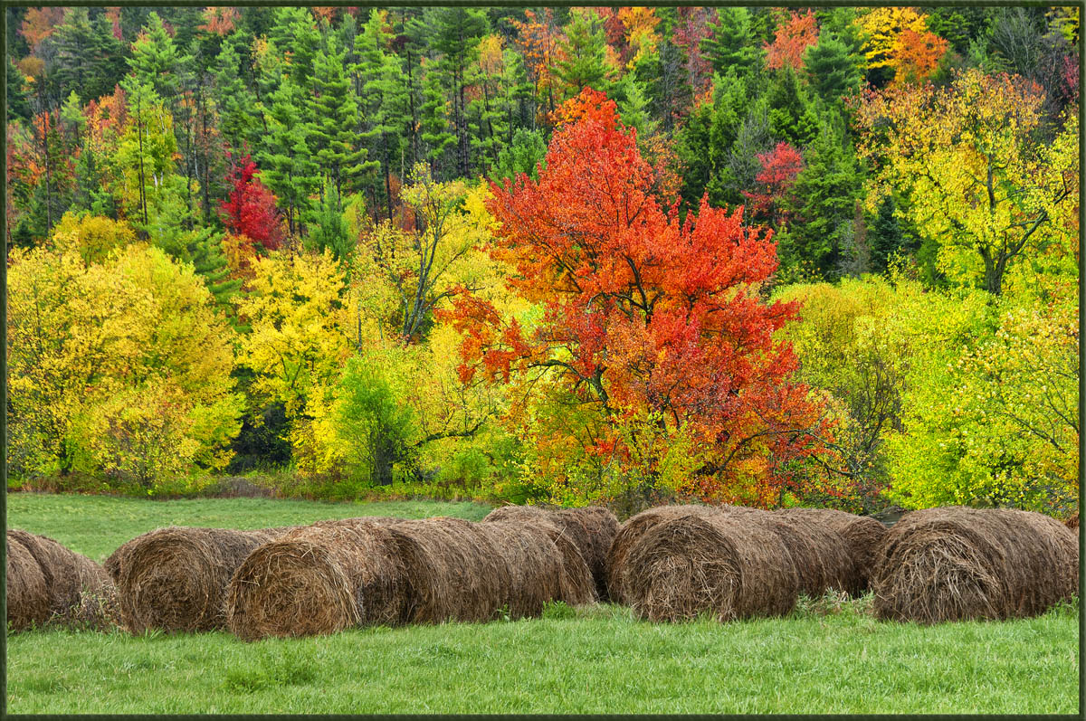
I really like the play of colours here Sandy!
Nice layered image design too.
Registered on March 22, 2011, 385 Posts, 2068 Comments
Comment posted by Kah Kit Yoong on September 17, 2012 at 7:44 AM
Splendid presentation of the colours and various elements.
Registered on September 27, 2006, 636 Posts, 10682 Comments
Comment posted by Peter Conway on September 17, 2012 at 9:52 PM
The foliage is beautiful. I am not sure sure about the round bales, for me they are less interesting than the bg.
Peter
Registered on June 25, 2007, 347 Posts, 3913 Comments
Comment posted by Lon Overacker on September 18, 2012 at 6:43 PM
Sandy,
Splendor indeed! What a great autumn scene. I like the hay rolls, but wish they were more golden - looks like last years crop.
The only small nit I have is that this appears a little over saturated to me. I say that because of the evergreens up top. That's a green that's just too vibrant and the lone red tree in the left too. I wouldn't say super saturated, but enough to make me want to comment on it. It's a killer scene, I would just dial back a tad.
Lon
Registered on November 24, 2006, 521 Posts, 19147 Comments
Comment posted by Marsel van Oosten on September 19, 2012 at 7:52 AM
Great scene Sandy, interesting foreground as well. I agree with Lon on the saturation - especially because the foreground looks so much more natural in terms of saturation. You could also try to brighten the bright parts of those hay things a bit to make their texture stand out more. Just a thought.
Registered on March 9, 2004, 285 Posts, 2277 Comments

Comments
5 commentsNice layered image design too.
Peter
Splendor indeed! What a great autumn scene. I like the hay rolls, but wish they were more golden - looks like last years crop.
The only small nit I have is that this appears a little over saturated to me. I say that because of the evergreens up top. That's a green that's just too vibrant and the lone red tree in the left too. I wouldn't say super saturated, but enough to make me want to comment on it. It's a killer scene, I would just dial back a tad.
Lon