Nature Photographers Network
This is the preserved archive of the original Nature Photographers Network. The community continues at naturephotographers.network.
Glowing
‹ PreviousFlora GalleryNext ›

Glowing

by Jaymes Dempsey

Gallery: FloraPosted August 30, 201279 views11 comments
Thanks for your comments on my last image, everyone. They're much appreciated!
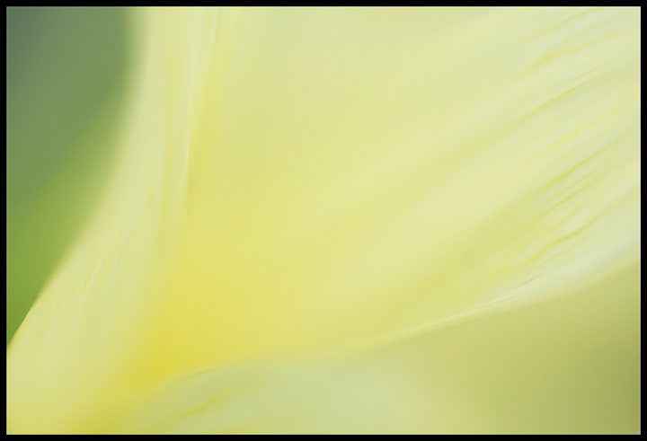
This image is from the same garden. I really enjoy making these sorts of abstracts...There are hardly any sharp edges; however, I like the soft and light feel of this shot. I deliberated about posting this as a black and white, but eventually decided to go with the color.

Some selective sharpening and some selective noise reduction, and a little cropping for composition.
Nikon D200, 60mm, f/3.5, 1/160, ISO 250.

All comments and critiques appreciated.
Thanks in advance!

Jaymes :wavey:

Comments

11 comments
Comment posted by Morris McClung on August 30, 2012 at 3:24 PM
You have a very nice style going here, Jaymes. Lovely softness in focus and color, with just enough in focus for the eye to find.
Registered on May 7, 2007, 670 Posts, 19650 Comments
Comment posted by Nathan Buck on August 30, 2012 at 4:09 PM
I like the glow Jaymes, and I like the in focus streaks. I just wish that the line on the left between flower and BG was not quite so stark. That sort of breaks the illusion of the shot for me.

Nathan
Registered on November 1, 2003, 1101 Posts, 13589 Comments
Comment posted by Gary Yeoh on August 30, 2012 at 8:01 PM
Jaymes:
Abstract are fun to experiment with but I personally find them quite tough; having to find the balance between abstraction and preserving some elements for the viewers to explore and be interested. Ram of course is the master in this genre and what I usually see in his images is some sharply edge or feature. Hope Ram will chime in on this. I like the yellow blush and the lighting here is nice an even. Wish for a sharp edge or a little patch of texture to rest the eye.
Registered on September 1, 2009, 588 Posts, 8184 Comments
Comment posted by scott lanz on August 30, 2012 at 9:40 PM
Hi Jaymes. I love abstracts and I like this one but, as noted by Gary, I wish there was more definition in the edges to give it some form. It's form, lines, flow and color which make abstract images interesting. This one has nice color, flow, and lines, but the lines are not sufficiently discernible, IMO. However, this comes from someone who hasn't made a satisfying floral abstract all summer, although I've tried.
Registered on November 14, 2003, 840 Posts, 12902 Comments
Comment posted by Ramamohan Pai on August 30, 2012 at 9:53 PM
Jaymes - I agree with the responses so far. However there are no real rules for making Abstracts photos - approach may be a better word to use.

I try to fill the frame when I can when I attempt Abstracts as far as possible and do try to incorporate a defined area of interest - usually form or lines. Pulling off abstracts with a single color is difficult in my limited experience.

I really like your attempt here :smile: - but would have loved to see some more definition in the edges somewhere. I am not so sure the green area sits well in the top left corner - some more of that green in the lower right might have balanced it better and also provided some more contrast for the light yellows.

Keep trying and I am sure you will it a winning formula for you.
Registered on November 1, 2003, 550 Posts, 9037 Comments
Comment posted by Dennis Plank on August 30, 2012 at 11:34 PM
Interesting, Jaymes. Neat texture and subtle colors.

:toast:
Registered on January 28, 2008, 1767 Posts, 23192 Comments
Comment posted by Catherine Reilly on August 31, 2012 at 2:44 AM
Almost too abstract, even for me! But as I gaze at the image, I begin to see a flow. The luminance is delightful. It helps if I shed my wanting to "find" something here, to loose my need to identify what this is. Aahhhhh, then there's just pure enjoyment. Thanks for the adventure, Jaymes!
Registered on August 16, 2006, 603 Posts, 9192 Comments
Comment posted by Mark Seaver on August 31, 2012 at 12:56 PM
I like the softly flowing colors and how they lead to the sharp lines in the upper right. It would be a different image, but I could also see cropping the sharp line out.
Registered on January 23, 2011, 1103 Posts, 17270 Comments
Comment posted by Albert Darmo on August 31, 2012 at 4:15 PM
Hi jaymes :wavey: considering my poor eyesight, i need a bit more detail in the structure of this abstract. the soft light and color are very enjoyable :smile:
Albert Darmo
Registered on November 25, 2008, 1386 Posts, 11978 Comments
Comment posted by Robert Dayton on September 1, 2012 at 5:53 PM
I like this, Jaymes. I basically agree with previously made critiques.
Registered on November 11, 2008, 281 Posts, 3958 Comments
Comment posted by Bill Fach on September 2, 2012 at 1:27 AM
Jaymes: Marvelous abstract that was a real pleasant surprise when it opened. The thumbnail does it no justice. Beautiful work. >=))>
Registered on November 1, 2003, 1805 Posts, 26981 Comments