Comment posted by Nancy Lea Sandy on August 22, 2012 at 11:41 AM
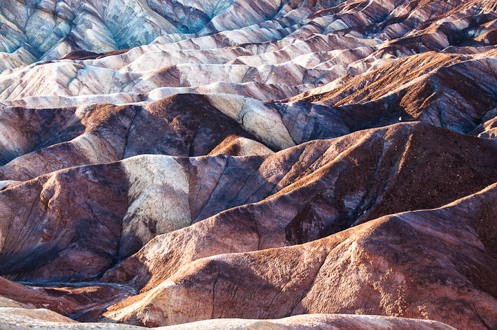
Love this. and I love the association with ice cream. I like the way the ridges recede into the bg, dark to light, and there is just enough detail in the shadowed areas to keep it real. A double scoop of pleasure for me.
Registered on January 24, 2011, 576 Posts, 6942 Comments
Comment posted by Richard Teller on August 22, 2012 at 12:24 PM
Nice composition. I like the repeating patterns. This is a very tricky lighting situation. There are some of the whites that seem to be a little to strong.
Registered on August 23, 2010, 1162 Posts, 6692 Comments
Comment posted by Bret Edge on August 22, 2012 at 2:42 PM
I enjoy the transitions in tones from warm in the foreground to cooler in the background. A nice semi-abstract with some lovely colors.
Registered on November 1, 2003, 711 Posts, 6363 Comments
Comment posted by Rick Everstine on August 22, 2012 at 4:33 PM
Gordacious!
Registered on July 23, 2012, 29 Posts, 91 Comments
Comment posted by Morris McClung on August 22, 2012 at 5:37 PM
Crazy cool and beautiful, too!
Registered on May 7, 2007, 670 Posts, 19650 Comments
Comment posted by Andreas Resch on August 23, 2012 at 12:42 PM
Great subject and layered composition.
Registered on November 14, 2007, 322 Posts, 6101 Comments
Comment posted by Harry Lichtman on August 23, 2012 at 9:20 PM
Wonderful abstract you have created here. The bottom left corner seems a bit out of place considering the flow of the rocks in the rest of the comp, so I might crop it of. The bottom edge is a bit bright, so it's elimination might be a good thing. My 2 cents.
Registered on September 17, 2010, 304 Posts, 3507 Comments
Comment posted by Anil Rao on August 24, 2012 at 12:01 AM
Simply fantastic! The variation in form and color is striking and I love how the image appears both realistic and abstract at the same time. Well done, Margaret.
Registered on November 15, 2003, 234 Posts, 4923 Comments

Comments
8 comments