Nature Photographers Network
This is the preserved archive of the original Nature Photographers Network. The community continues at naturephotographers.network.
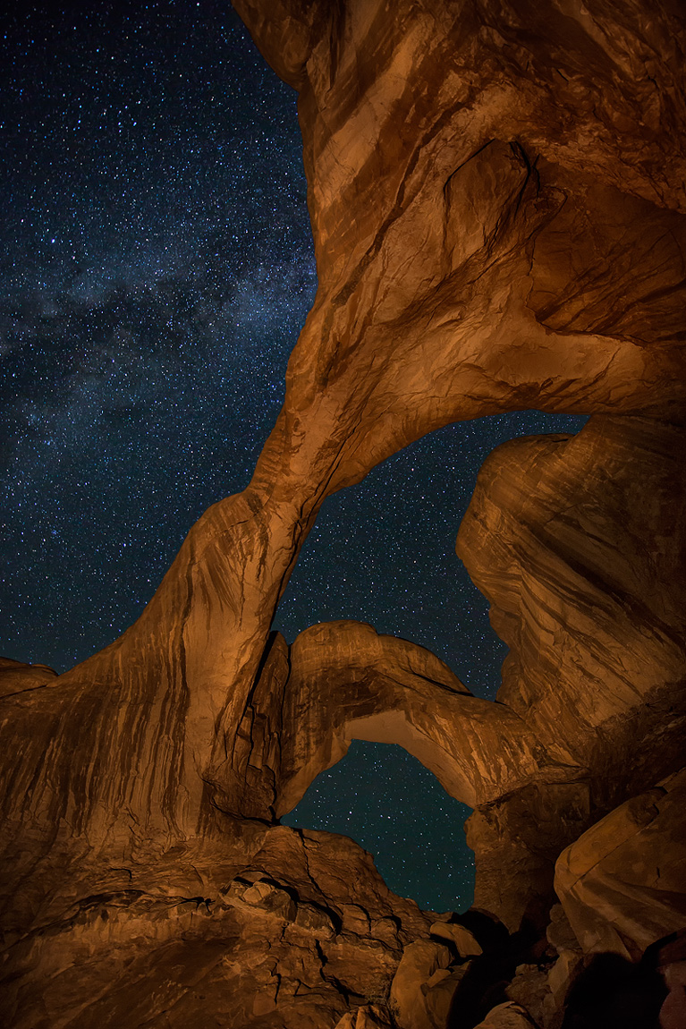
Double Arch at Night
‹ PreviousLandscape GalleryNext ›

Double Arch at Night

by Wick Smith

Gallery: LandscapePosted August 3, 2012450 views15 comments
Marsel van Oosten had a stunning photo very similar to this in Man & Nature a few weeks ago. Here's my interpretation of the same scene. Double Arch - Arches National Park, Utah.

I tried to get a bit of side lighting - set the timer on 10 seconds, jump to the left & light paint. I repeated this several times until I got a frame I liked. The Milky Way came into the scene nicely to add to the star field.

Please view large for more detail.

Canon 5DIII, Nikkor 14-24

Stars: F4, ISO 2000, 25 seconds
Arches: F8, ISO 800, 25 seconds - three exposures blended using "lighten" mode. I couldn't get it all painted evenly in one frame

Comments

15 comments
Comment posted by Rick Turner on August 3, 2012 at 9:07 AM
Wick,

Another home run with the arches. :toast:

God is great indeed. :wavey:
Registered on February 18, 2012, 534 Posts, 2755 Comments
Comment posted by Jim Hackley on August 3, 2012 at 11:16 AM
Wow, way to cool, the painted rock almost looks like wood. A very interesting image with the angle of the arches plus the stars really compliment the scene. One of the best images I have seen of this arch, very well done, the larger image was a pleasure to view.
Registered on September 17, 2009, 302 Posts, 5535 Comments
Comment posted by Stuart Williams on August 3, 2012 at 11:26 AM
your image had me go back to marcel's - which I remembered and which i enjoyed. this is equally compelling in its composition. but going back has one falling to comparisons - i liked the warmer tones of his rocks. the blend looks slightly unreal to my eye - a little bit like a cutting and pasting if you see what i mean - without the ever-so-slight blurring that might occur at the edges. nonetheless, i like it.
Registered on December 7, 2007, 247 Posts, 4792 Comments
Comment posted by Wick Smith on August 3, 2012 at 11:36 AM
Stuart,
I do like the warmer look of Marcel's painting too. I used a yellow/orange gel. I think his was more of a red tone. As for the edges, I deliberately blurred the edges slightly in PP and did NOT sharpen them to make the scene more realistic, as I hate the really hard edges created by blending images, even ones like these that were taken minutes apart from exactly the same spot.
Registered on June 12, 2009, 91 Posts, 379 Comments
Comment posted by Eva McDermott on August 3, 2012 at 11:59 AM
Fascinating image Wick. I like the muted tones in the arch.
Registered on January 4, 2009, 1015 Posts, 13229 Comments
Comment posted by Bruce King on August 3, 2012 at 3:04 PM
awesome Wick! :toast: :toast:
Registered on January 14, 2010, 276 Posts, 2212 Comments
Comment posted by Philip Hodgkins on August 3, 2012 at 3:45 PM
I like this—I like it a lot. The juxtaposition of light painted rock and star background deserves a second look, as it is difficult to achieve balance between the light and dark. Worth playing with to get a more comfortable balance, I think. The light rock just feels awkward to me. This has such potential; I think revisiting it would be really worthwhile.
Registered on July 24, 2006, 2741 Posts, 12349 Comments
Comment posted by Aaron Feinberg on August 3, 2012 at 5:28 PM
Well that doesnt suck ;)
Registered on October 26, 2009, 399 Posts, 2789 Comments
Comment posted by Bill Caldwell on August 3, 2012 at 6:22 PM
Very cool image Wick!
Registered on October 10, 2011, 62 Posts, 508 Comments
Comment posted by Nick Bristol on August 3, 2012 at 7:27 PM
Wow! Darn Impressive, and pretty cool to look at! :toast:

Nick Bristol
Lone Rock, WI
Registered on February 1, 2004, 752 Posts, 14140 Comments
Comment posted by Tony Kuyper on August 3, 2012 at 11:34 PM
A visually very strong image. The contrasts and textures keep me totally engaged.
Registered on November 1, 2003, 364 Posts, 22328 Comments
Comment posted by Nancy Lea Sandy on August 4, 2012 at 8:38 AM
The light painting really brings out the beauty of the sandstone and the stars set it off nicely. this is an excellent image.
Registered on January 24, 2011, 576 Posts, 6942 Comments
Comment posted by John Mumaw on August 4, 2012 at 9:38 PM
The light painting is quite subtle, which I like a lot. I think that this is an excellent starscape!
Registered on September 9, 2005, 62 Posts, 2289 Comments
Comment posted by Mark Metternich on August 5, 2012 at 2:14 PM
Nice job on this Wick! :toast:
Registered on June 19, 2009, 276 Posts, 6240 Comments
Comment posted by Jared Warren on August 8, 2012 at 4:02 PM
Great work here - I think these images are so hard to do but this is excellent. Light painting that large of an area is really challenging. I like that having done it from the lower left you get some texture and contrast. :toast:
Registered on May 11, 2012, 84 Posts, 931 Comments