Nature Photographers Network
This is the preserved archive of the original Nature Photographers Network. The community continues at naturephotographers.network.
Crazier rocks
‹ PreviousLandscape GalleryNext ›

Crazier rocks

by Julian Barkway

Gallery: LandscapePosted August 2, 2012165 views7 comments
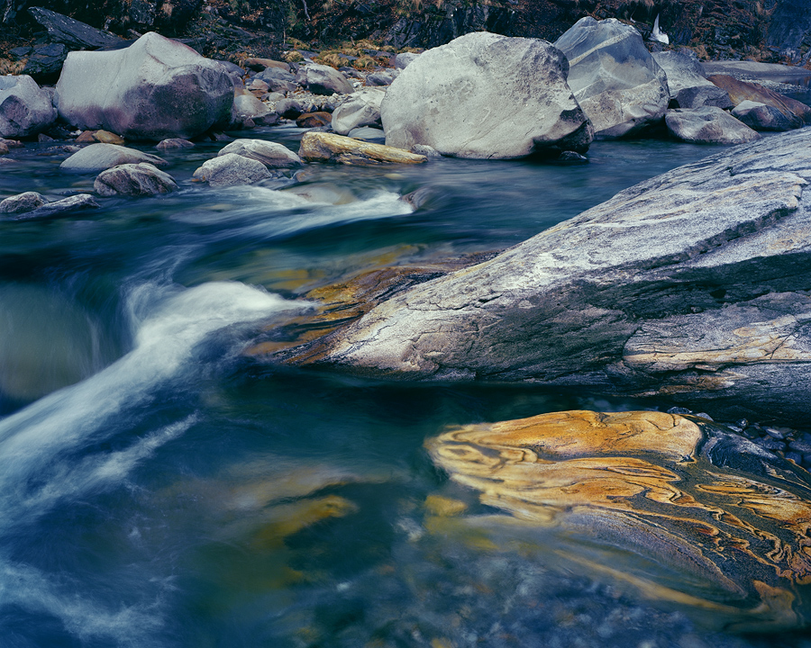
Not so sure about this one. I think it may be a wee bit busy for most people's tastes. I'm also still trying to get to grips with Kodak Ektar - a frustrating film that can produce excellent results with the right handling. Question is, what is the right handling? The magenta shadows tell me I may need to try harder...

Anyway, still in Switzerland's amazing Verzasca Valley, a place that just keeps pulling me back...

-----------------------------------------------------------------------------------------------------------------------
Ebony 45SU, 120mm + polariser, 1/2"@f19, Kodak Ektar.

Comments

7 comments
Comment posted by Paul Breitkreuz on August 2, 2012 at 4:30 PM
Julian, not sure about this one either. Not so much the composition at this point, but the processing. In comparison to your earlier V-50 stuff this has a way to go IMO. Sorry I cannot help with the negative image post processing ideas. I have no idea.
Did you happen to also shoot this with V-50? It would be great to see how the comparison between the apples and oranges are so to speak. I suspect there is another learning curve to be had getting negative stuff to look as nice as the positive stuff depending on what your use to working with in post processing...... :confused:
Registered on February 25, 2006, 525 Posts, 8448 Comments
Comment posted by Julian Barkway on August 2, 2012 at 4:48 PM
Thanks for the honest assessment, Paul. I abandoned this one a couple of times and I even went back and rescanned the neg but it just wouldn't gel. I might have another bash at it but ultimately it will probably be chalked up to the weirdness of Ektar. In any case, I'm moving more towards Portra as it's much easier to work with.

And, no, I didn't shoot this on V50 too as the contrast range would have been too great.
Registered on January 18, 2007, 344 Posts, 1961 Comments
Comment posted by Paul Breitkreuz on August 2, 2012 at 8:35 PM
Julian, I think you're on to a good idea with the Porta. Over the past couple years or since it's release I've heard some good things about it mostly from the UK-LF site. I for one only use positive film so I would surely need help with any thoughts of working with negatives for scans. Good luck going forward with your future tests. :cool:
Registered on February 25, 2006, 525 Posts, 8448 Comments
Comment posted by Dietrich Gloger on August 3, 2012 at 10:24 AM
I like it Julian. The arrangement and the lines work very well for me and the color contrasts work well. Perhaps not the "perfect" composition, but very interesting. I enjoy looking at it, exporing the scene.
Registered on January 26, 2007, 360 Posts, 9876 Comments
Comment posted by Harley Goldman on August 3, 2012 at 2:44 PM
I am seeing a lot of blue/cyan in the rock and scene in general. I am on a crappy work monitor, but the colors are generally somewhat close. I think this one is worth spending a bit more time. I am really liking the foreground and middle.

I got my Ektar and Porta, so I can do a bit of experimenting myself. Thanks again for your input.
Registered on November 19, 2003, 586 Posts, 11271 Comments
Comment posted by John Williams on August 3, 2012 at 3:14 PM
Absolutely love the bottom 2/3rds, not so much the top.
Registered on September 6, 2007, 221 Posts, 5985 Comments
Comment posted by Nancy Lea Sandy on August 3, 2012 at 10:13 PM
I think this would be a stronger image cropped to just below the line of rocks in the bg. IMO, it produces a more abstract image that emphasizes the velvety water and the strong patterns in the rocks. This is a beautiful image and well worth working with.
Registered on January 24, 2011, 576 Posts, 6942 Comments