Nature Photographers Network
This is the preserved archive of the original Nature Photographers Network. The community continues at naturephotographers.network.
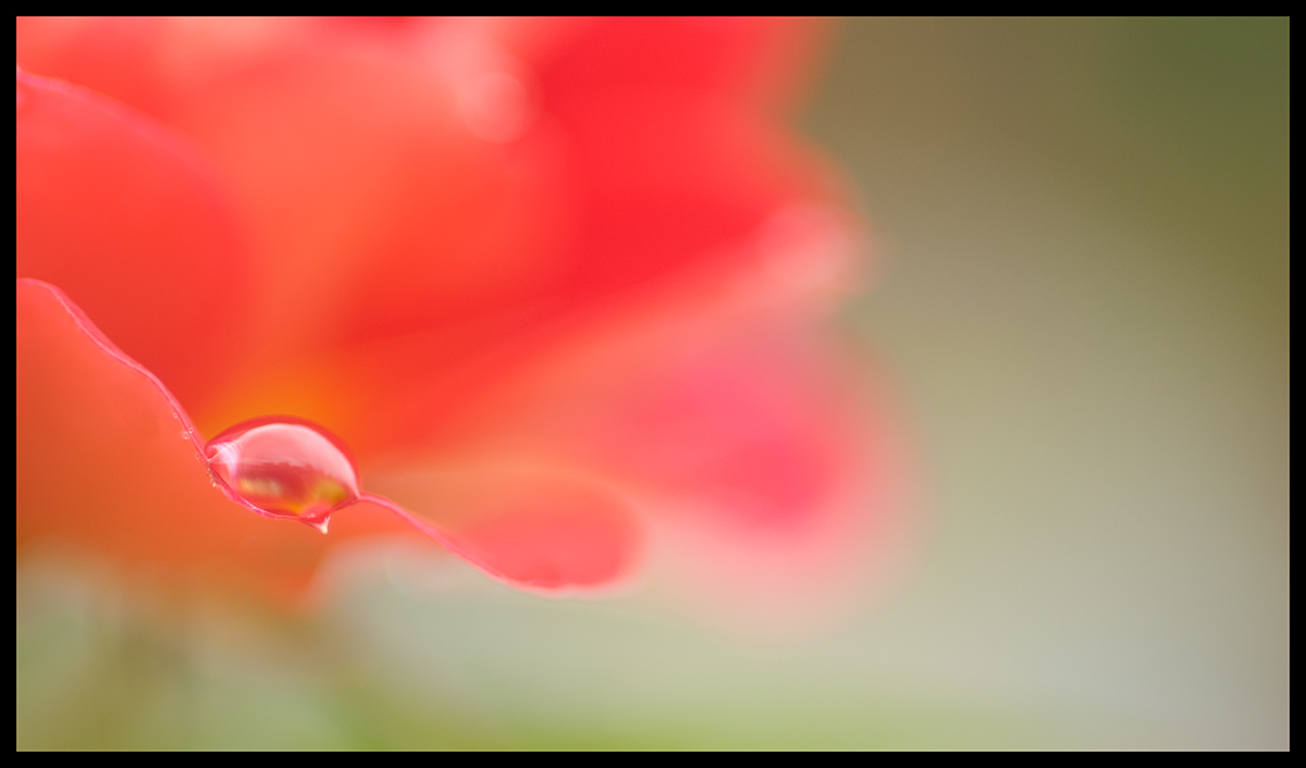
Raindrops on roses...
‹ PreviousFlora GalleryNext ›

Raindrops on roses...

by Jaymes Dempsey

Gallery: FloraPosted July 25, 201286 views7 comments
Here's a shot from last summer...

I like the colors and depth of field, but I think I wish for a little more separation between the the in-focus petal and the ones above it, in order to give them less presence. Also, the more that I look at it, the out of focus whiter parts on the higher parts of the rose seem as if they should be removed.

I did a bit of cloning to get rid of a white spot on the petal, along with a distracting out of focus droplet.
This is about 80% of the original image.

Nikon D200, f/4.5, 1/160, ISO 250, 60mm.

All comments and critiques appreciated!

Jaymes

Comments

7 comments
Comment posted by Ian Wolfenden on July 26, 2012 at 3:50 AM
I think maybe you are being overly self critical, Jaymes. This works beautifully for me - the sharp petal edge and the droplet looking fine against the petal backdrop - and the off centre composition is very satisfying. Lovely abstract !
Registered on May 18, 2007, 1108 Posts, 7647 Comments
Comment posted by Mark Windom on July 26, 2012 at 10:35 AM
I agree with you re: the OOF white areas toward the top of the petals but that is a rather minor point. I like the DOF and presence of just a single drop. I might be inclined to crop just a bit from the right as there is a lot of empty space over there.
Registered on November 1, 2003, 176 Posts, 2302 Comments
Comment posted by Lorna Taylor on July 26, 2012 at 10:46 AM
Dreamy loveliness. The bokeh in the BG or OOF white area adds balance to the image and is needed to add depth to the piece so it works for me. I would have liked the drop to be a touch sharper but that is just a personal preference. Beautiful work . :toast:
Registered on November 12, 2010, 254 Posts, 3083 Comments
Comment posted by Philip Hodgkins on July 26, 2012 at 2:28 PM
Good comp! I would go with a slight crop from the right. Everything else is pretty much up to snuff.
Registered on July 24, 2006, 2741 Posts, 12349 Comments
Comment posted by Nathan Buck on July 26, 2012 at 4:19 PM
Works very well, I think, Jaymes. I like the look of the droplet, and the color. I might darken the OOF lighter parts of the rose just a bit.

Nathan
Registered on November 1, 2003, 1101 Posts, 13589 Comments
Comment posted by Gary Yeoh on July 26, 2012 at 7:54 PM
Jaymes:
The image is just fine. Another vote for cropping the right; this will bring the drop to the powerpoint and make the image stronger.
Registered on September 1, 2009, 588 Posts, 8184 Comments
Comment posted by Albert Darmo on July 26, 2012 at 10:05 PM
Hi Jaymes :wavey: Well composed with good detail :smile: Agree with the others about croping on the RT, and a bit more sharpness on the drop :cool: :smile:
Albert Darmo
Registered on November 25, 2008, 1386 Posts, 11978 Comments