Gallery: POP PhotosPosted July 24, 2012247 views12 comments
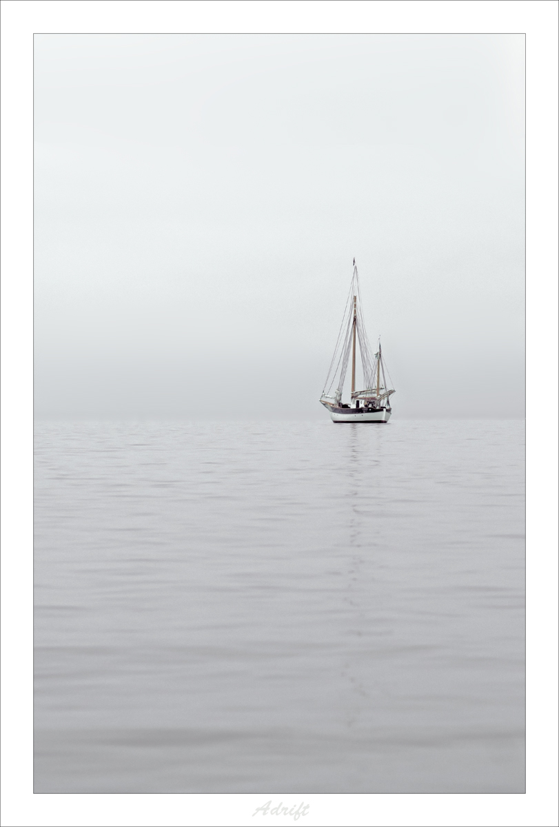
Another shot from Coupeville, WA.
Thanks for all the comments...and WP!
Cropping...I was never certain what worked best. The tilt towards keeping the bottom was to retain the reflection as showing slowly dissolving.
Comments
12 comments
Comment posted by Philip Hodgkins on July 25, 2012 at 10:23 AM
Very expressive, and I understand the symbolism, but this lacks enough tones to be good b/w. A crop from the top might help some, The biggest drawback is the size of the subject. It shouldn't dominate the frame, else the symbolism would be lost, but it should be larger if only to satisfy the eye's need to see darker tones.
Registered on July 24, 2006, 2741 Posts, 12349 Comments
Comment posted by Allen Brooks on July 25, 2012 at 6:02 PM
My first thought was, "I like this". I would agree with Phillip that a small crop from the top might help and even a little off the bottom. If this is black and white, my monitor is acting up as a see blue and red tones in the photo. Overall, I find this type of scene pleasing.
P.S. I probably would have placed this in Man and Nature.
Registered on July 27, 2011, 262 Posts, 2597 Comments
Comment posted by Kent Staubus on July 26, 2012 at 9:00 AM
This is a color shot, but there isn't much color in it. I'll give a different take. I like the indistinct horizon, and the present cropping is working for me. What it does is place the boat half way in the frame, emphasizing how it is caught in-between, on the border between the ocean and the sky. This shot would not work on a sunny day, I don't think.
Kent in SD
Registered on November 11, 2003, 121 Posts, 2098 Comments
Comment posted by Harley Goldman on July 26, 2012 at 12:26 PM
Beautiful simplicity and sense of isolation. Tough call, but I am liking it as presented rather than cropped. I think either version works, but provides a different feel. Very nicely done.
Registered on November 19, 2003, 586 Posts, 11271 Comments
Comment posted by Chris Grabski on July 26, 2012 at 4:29 PM
Words that come to my mind: isolation, simplicity and calm. Love it as it is, but agree that a crop would make it even more expressive.
Registered on April 29, 2011, 122 Posts, 431 Comments
Comment posted by Danny Laureys on July 30, 2012 at 6:50 PM
I Like this, I would go completely the other way on cropping, Crop a lot from bottom about 1inch from boat and add more sky on top, a lot, 2x the amount between the top of the mast and the border in PS .Maybe make it B&W also. very well seen.
Registered on January 5, 2008, 590 Posts, 1261 Comments
Comment posted by SandyRichardsBrown on August 1, 2012 at 2:33 PM
Congrats on the WP!
I agree tht a crop from the bottom would make this even stronger -
Sandy
Registered on November 24, 2003, 3937 Posts, 12909 Comments
Comment posted by Bill Chambers on August 1, 2012 at 3:20 PM
Congrats on the WP. Personally, I like this, but agree with the bottom crop suggestions.
Registered on April 10, 2005, 753 Posts, 21216 Comments
Comment posted by Bruce King on August 2, 2012 at 1:11 PM
Hey Ken congrats on the WP. Love the minimalist comp....subtly alluring.
Registered on January 14, 2010, 276 Posts, 2212 Comments
Comment posted by Eva McDermott on August 5, 2012 at 12:54 AM
I really like images like this Ken. Works well as is for me. BTW - Congratulations on the WP.
Registered on January 4, 2009, 1015 Posts, 13229 Comments
Comment posted by Bunn Martin on August 8, 2012 at 6:01 AM
Very serene lovely image. Personally I like the composition and muted tones. Many terrific images from the B&W Masters had limited range of tones
Registered on September 17, 2011, 38 Posts, 167 Comments
Comment posted by Catherine Reilly on August 25, 2012 at 1:56 PM
Magnificent! Hearty congrat on the Pick!!
Registered on August 16, 2006, 603 Posts, 9192 Comments

Comments
12 commentsP.S. I probably would have placed this in Man and Nature.
Kent in SD
I agree tht a crop from the bottom would make this even stronger -
Sandy