Gallery: LandscapePosted July 24, 2012406 views20 comments
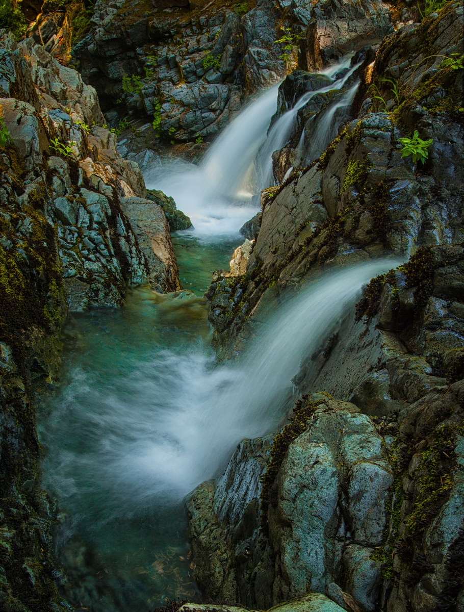
Canon 5DMk2, 24-105mm at 35mm, Polarizer
f16, iso 250, 0.5sec. 3 images merged for DOF
Comments
20 comments
Comment posted by Ronald Murphy on July 24, 2012 at 2:57 PM
Great composition. Maybe a little heavy on the blue/cyan. I would suggest cropping out the bottom two rocks peaking in, but it might upset the vertical balance. Clone them out?
Registered on March 13, 2012, 279 Posts, 975 Comments
Comment posted by Danny Laureys on July 24, 2012 at 4:30 PM
Excellent, Crop rock at bottom, one of my favorite places to go.
Registered on January 5, 2008, 590 Posts, 1261 Comments
Comment posted by Morris McClung on July 24, 2012 at 4:30 PM
I agree it could use a little crop to remove the partial rocks at the bottom, and about warming it up a touch. But, that's always a personal preference. The water flow is very good, and the multiple falls make a great subject. Very well done.
Registered on May 7, 2007, 670 Posts, 19650 Comments
Comment posted by Nathan Apodaca on July 24, 2012 at 5:47 PM
I agree with the above, but other than that, the image really sticks out. I really like the shutter speed on the water. Just right, IMO.
Registered on November 16, 2011, 67 Posts, 1127 Comments
Comment posted by Nancy Lea Sandy on July 24, 2012 at 7:30 PM
excellent scene and very well composed. the cyan/blues have already been mentioned so I'm just going to enjoy this image.
Registered on January 24, 2011, 576 Posts, 6942 Comments
Comment posted by Dennis Harding on July 24, 2012 at 8:20 PM
Very nice work Daniel. Top comp with perfect water movement. I also agree with the above comments.... it does also look a little over saturated IMO.
Registered on January 19, 2011, 33 Posts, 408 Comments
Comment posted by Tony Kuyper on July 24, 2012 at 9:42 PM
Interesting comp. I like the textures quite well. It feels a bit bluish, but that sort of works here.
Registered on November 1, 2003, 364 Posts, 22328 Comments
Comment posted by Bret Edge on July 24, 2012 at 10:11 PM
This is really cool. I like the splashes of color and the bit of light in the background. Looks like a nice cool place to spend a hot summer day.
Registered on November 1, 2003, 711 Posts, 6363 Comments
Comment posted by Chad Merrell on July 25, 2012 at 8:57 AM
I like the colors, comp, shutter speed etc. I'd like to see the rocks just a little lighter. It might not work but it seems just a very little bit dark to me.
Registered on July 8, 2010, 91 Posts, 304 Comments
Comment posted by Nancy Wolfe on July 25, 2012 at 9:05 AM
Love the water speed, and also the colors of the rocks. Agree that the bottom could be cropped a little to get rid of the 2 rocks that are pointing up from the bottom.
Registered on April 7, 2012, 42 Posts, 103 Comments
Comment posted by Chris Moore on July 25, 2012 at 11:42 AM
I like the colors here and the shutter speed is perfect IMO. I may dodge the front waterfall a bit.
Registered on January 12, 2010, 84 Posts, 388 Comments
Comment posted by Jack Garrett on July 25, 2012 at 7:05 PM
Love the colors here and the exposure time is spot on!
Registered on November 7, 2007, 41 Posts, 251 Comments
Comment posted by Ben Horne on July 25, 2012 at 10:59 PM
This is a very beautiful, and wonderfully complex photo. I like all the rock texture, and the look and feel of the water. The subtle light play in the background is a nice touch. My only recommendation is an ever so slight crop of the bottom to get rid of the protruding rock on the bottom middle.
Registered on August 27, 2009, 51 Posts, 959 Comments
Comment posted by Andreas Resch on July 26, 2012 at 11:10 AM
Maybe a bit low in dynamic range and a there seems to be a color cast on it - but love the composition and the feel of the place.
Registered on November 14, 2007, 322 Posts, 6101 Comments
Comment posted by Wick Smith on July 26, 2012 at 2:00 PM
What great color! I agree to crop/clone out the rocks in the foreground. It's a great shot!
Registered on June 12, 2009, 91 Posts, 379 Comments
Comment posted by Mark Metternich on July 26, 2012 at 4:10 PM
Intriguing shot Daniel! Nice job on this one.
Registered on June 19, 2009, 276 Posts, 6240 Comments
Comment posted by Daniel Rappaport on July 27, 2012 at 6:51 PM
Thanks for the comments. Here's a version that I think is a bit better, incorporating some adjustments suggested.
Registered on September 9, 2009, 294 Posts, 2006 Comments
Comment posted by Zack Clothier on July 27, 2012 at 7:32 PM
The dappled light is lovely, I might crop a small amount off the bottom to remove those lighter rocks protruding into the scene, but that's minor..nice work.
Registered on January 28, 2010, 343 Posts, 2257 Comments
Comment posted by Kah Kit Yoong on July 28, 2012 at 9:16 PM
Significantly improved. Lovely shot.
Registered on September 27, 2006, 636 Posts, 10682 Comments
Comment posted by John Williams on July 28, 2012 at 10:02 PM
Superb Daniel. I love the dramatic rocks and the double falls. I agree a slight crop added a lot. I like a mix of the two contrast ranges; the second goes a tad too far for my eye.
Registered on September 6, 2007, 221 Posts, 5985 Comments

Comments
20 comments