Gallery: Man & NaturePosted July 22, 2012251 views13 comments
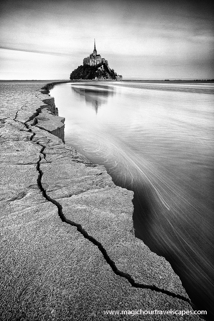
I posted a blue hour version of Mont St Michel a little while ago which most people seem to prefer. Personally I like this one better. Opinions?
Canon 5DMkII, 16-35mm
Comments
13 comments
Comment posted by Peter Coskun on July 22, 2012 at 10:37 PM
I love the composition herre. Really draws the viewer in nicely. Looks a bit noisy, but with the black and white it makes it look more "vintage" in a way. Neat looking location.
Registered on October 31, 2011, 170 Posts, 1240 Comments
Comment posted by Morris McClung on July 22, 2012 at 10:38 PM
There seems to be some noise showing up in this version. Now, that might be what you want to simulate grain? I think the conversion works because of the strong lines and tones. But, I love blue hour photograpy, so I'm still partial to that one.
The comp is still really strong, too.
Registered on May 7, 2007, 670 Posts, 19650 Comments
Comment posted by Kah Kit Yoong on July 22, 2012 at 11:48 PM
Oh yes, I've got some 'film grain' added in.
Registered on September 27, 2006, 636 Posts, 10682 Comments
Comment posted by Eva McDermott on July 22, 2012 at 11:55 PM
Wonderful B&W Kah Kit! Love the lines in the crack and surf. Having done B&W film in the olden days for quite some time, the graininess is appreciated. Like this a lot.
Registered on January 4, 2009, 1015 Posts, 13229 Comments
Comment posted by Luke Ormand on July 23, 2012 at 3:49 PM
I like hte stubtle swirl of the water and the structure is intriguing. I'm wondering why there is so much grain in the water and sky though - (I think it detracts a bit from the image.
Registered on February 4, 2009, 1093 Posts, 7035 Comments
Comment posted by Kah Kit Yoong on July 23, 2012 at 4:01 PM
It was a personal decision to simulate film grain. I love the look of old B&W photos in my many books by masters like HCB and this it the appearance I'm going for. There's always the colour version for the less nostalgic ;)
Registered on September 27, 2006, 636 Posts, 10682 Comments
Comment posted by Navin Sarma on July 23, 2012 at 10:10 PM
I love this! B&W for sure. Very nice work, Kah Kit!
Registered on July 17, 2011, 233 Posts, 1373 Comments
Comment posted by Paul DeCesare on July 24, 2012 at 1:41 AM
Bravo. I was so pulled into the sort-of fantasy world feel I didn't even notice grain added on purpose (I'd starve as a photo editor). Point is, this is such as intriguing image, you wonder "where on earth is this?". The comp is infectious.
Registered on August 31, 2007, 29 Posts, 202 Comments
Comment posted by Mark Seawell on July 24, 2012 at 11:54 AM
This is on point. Composition is great as is the subject matter. Love how all roads lead to Rome. Great capture.
Mark
Registered on December 5, 2011, 197 Posts, 237 Comments
Comment posted by Carol Nichols on July 24, 2012 at 2:35 PM
Kah Kit, I have to say I like the blue hour version much better. Not only because of the color, but also because of the composition as Mont St Michel is more prominent in the color version.
Registered on November 7, 2007, 161 Posts, 1420 Comments
Comment posted by Yiming Hu on July 25, 2012 at 5:39 PM
Both versions are beautiful. If I have to choose one, I will pick this BW version. I am fine with the simulated grain.
Registered on April 28, 2011, 38 Posts, 733 Comments
Comment posted by David Edwards on July 26, 2012 at 5:22 AM
Cool shot Kah Kit. Love the cracked fg leading line. I do like the b&w treatment, but not too keen on the grain and vignette.
Registered on December 6, 2008, 142 Posts, 2623 Comments
Comment posted by Ruben Vicente on July 28, 2012 at 8:46 AM
The composition is pretty good and I think it suits perfectly the black & white tone.

Comments
13 commentsThe comp is still really strong, too.
Mark