Nature Photographers Network
This is the preserved archive of the original Nature Photographers Network. The community continues at naturephotographers.network.
Marooned
‹ PreviousLandscape GalleryNext ›

Marooned

by Brian Schrayer

Gallery: LandscapePosted July 14, 2012317 views6 comments
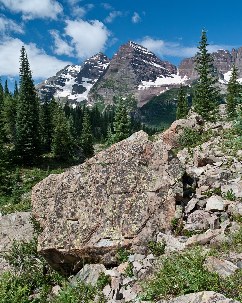
You may have heard of a couple of peaks in Colorado called the Maroon Bells. It's a bit of a secret location but from time to time you might see images of them online. :wink:

Well, here is my effort to capture an original image, if that's possible, of this location. This was not taken from the typical vantage point at Maroon Lake. Regardless of how many times these mountains have been photographed I am still mesmerized by their striking profile. They have been called the Monarchs of the Rockies and it is hard to argue with the majestic nature of these peaks. This was the first time that I had seen them in person after many years of wanting to do so.

As always all honest comments and critiques are welcome.

Specs:
D700
21mm
f16; 1/80 sec
ISO 200

Processing:

Perspective control to fix leaning trees (there is still some distortion evident on the left hand side of the frame but correcting this made the Bells look bloated so I left it as is. I may revisit this later - is it a deal breaker?)

Vibrance adjustment combined with selective color to back off on the brightest greens a little after the vibrance adjustment.

Global curves adjustment for contrast.

TK's Luminosity masks for mid-tone contrast using curves.

Cropped to 4X5 format.

Comments

6 comments
Comment posted by Nick Bristol on July 14, 2012 at 10:23 PM
A beautiful scene Brian! Besides the great view there is a wonderful natural feel to this image...like take a breath of fresh air! I like it as is but also think it looks great with about 1/3 of the bottom cropped off. Maybe close to half way up the big rock. For me it enhances and simplifies the comp in a good way, but very nice as you have it too... it's just a thought I had while looking at this. :smile:

Nick Bristol
Lone Rock, WI
Registered on February 1, 2004, 752 Posts, 14140 Comments
Comment posted by Nick Bristol on July 15, 2012 at 1:30 AM
Well, I came back to look again. Now I'm not so sure about the crop I was thinking. Maybe just darken the foreground a little. It might just be my monitor but seems a little bright there on mine. I notice the tilt of the trees but it is not a deal breaker to me, but it might improve the overall look if you could straighten them. Funny how looking at something a second time and a couple of hours later can make you see it different... :smile:

Nick Bristol
Lone Rock, WI
Registered on February 1, 2004, 752 Posts, 14140 Comments
Comment posted by Nancy Lea Sandy on July 15, 2012 at 8:16 AM
Wonderful clarity and freshness, as Nick said. IMO, the big rock takes up a little too much space and attention and competes with the peaks as the subject of the image. It's a great rock and the Maroon Bells make a nice backdrop for it but I'm not sure that was your intent. Beyond that, the natural feel to this image is impressive and I like that a lot.
Registered on January 24, 2011, 576 Posts, 6942 Comments
Comment posted by Floris van Breugel on July 15, 2012 at 1:14 PM
Certainly refreshing to see something a little different. The framing of the trees around the peaks is quite nice, though the rock front and center takes up too much space IMO, and sort of blocks the view. With this sort of light I typically think of going black and white - perhaps worth playing around with.
Registered on December 19, 2008, 306 Posts, 4840 Comments
Comment posted by Tony Kuyper on July 15, 2012 at 7:37 PM
Interesting. I thought the only place you could see these were from across a lake. Had no idea there were alternate viewpoints. While you've managed the light well, the lightness of the foreground rock is the major focus and maybe detracts somewhat from the Bells. Could also see maybe going a little tighter to remove the rubble.
Registered on November 1, 2003, 364 Posts, 22328 Comments
Comment posted by Morris McClung on July 15, 2012 at 10:51 PM
I like the comp a lot, and I think you have a unique view for here. I also like a crop off of the bottom, but just to above the lower closest rock. Color and detail are really good, too. Well done, Brian!
Registered on May 7, 2007, 670 Posts, 19650 Comments