Nature Photographers Network
This is the preserved archive of the original Nature Photographers Network. The community continues at naturephotographers.network.
Scarlet Sunrise +Repost
‹ PreviousLandscape GalleryNext ›

Scarlet Sunrise +Repost

by Eva McDermott

Gallery: LandscapePosted July 9, 2012673 views13 comments
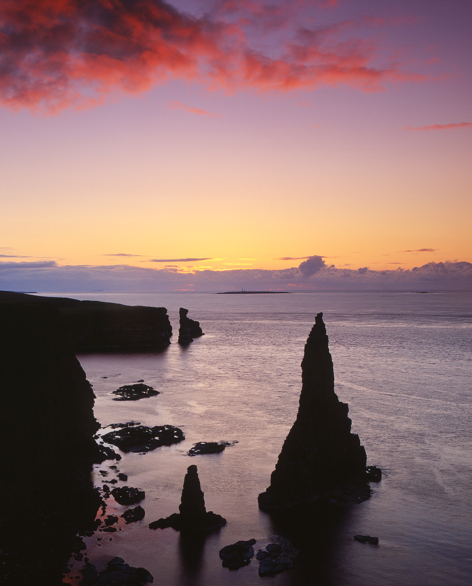
Duncansby Stacks, Caithness, Scotland

I have several images from this particular location taken on Ian's Transient Light Workshop that I really like, but this is my favorite..... a film image taken with my Pentax 67II on Velvia 50 (also have a bunch with my 5DM2). Glad I got back to film again since I enjoy its simplicity and richness. I know, just my bias for having done it for so long in past but I can envision printing this on Cibachrome 16X20 in my old darkroom (which no longer exists) with my Beseler 45 with Dichro 45 S Colorhead.

Pentax 67II
Pentax 55-100mm
Velvia 50
Graduated HE filter, 1.5 stop Lee

Epson V750 Scan with betterscanning.com holder and ANR glass, Silverfast Ai Studio 8 software.

Thanks for having a look and for any comments and critiques which are always welcome.

Comments

13 comments
Comment posted by Nancy Lea Sandy on July 9, 2012 at 11:00 PM
Stunning color and fascinating silhouettes. I like the 'texture" in the water---this is a 'breathe in the peace' image. Very nice
Registered on January 24, 2011, 576 Posts, 6942 Comments
Comment posted by Alister Benn on July 10, 2012 at 2:11 AM
It is a truly stunning location and you've captured some lovely light. To be honest though, the image is not working for me on a few levels.

The cliffs on the left have silhouetted into a solid block that hides their intricacy and texture, and the centered horizon line makes it feel like two images instead of one. Obviously the desire to get the beautiful cloud in the frame would have been a factor i that decision.

Maybe take some of the left to minimise the heaviness of that bottom left corner..
Registered on June 9, 2011, 23 Posts, 258 Comments
Comment posted by Kah Kit Yoong on July 10, 2012 at 2:16 AM
Lovely work. I meant to come here but somehow didn't get the time.
Registered on September 27, 2006, 636 Posts, 10682 Comments
Comment posted by Morris McClung on July 10, 2012 at 11:22 AM
I applaud your use of film! And, yes, being an old timer myself, I still like the richness and simplicity of it. The color pop of the Velvia is just as great. Fantastic image, Eva! :toast:
Registered on May 7, 2007, 670 Posts, 19650 Comments
Comment posted by Eva McDermott on July 10, 2012 at 1:08 PM
This version (different transparency) does show detail in the stacks but I like the cloud in the original better. Removed the black boarder in the original as well.
Registered on January 4, 2009, 1015 Posts, 13229 Comments
Comment posted by R.Bill Moser on July 10, 2012 at 2:04 PM
Beautiful work
Registered on January 29, 2010, 285 Posts, 4281 Comments
Comment posted by Kah Kit Yoong on July 10, 2012 at 5:54 PM
The rework is an Improvement.
Registered on September 27, 2006, 636 Posts, 10682 Comments
Comment posted by Harry Lichtman on July 10, 2012 at 7:14 PM
Eva - My initial response is wow, great colors in that sky. The image seems a little disjointed to me. The lighting is great but the arrangement seems a bit forced. There may have been few other options to position yourself, and that may account for the compositon? Does look like some breathtaking coast line.
Registered on September 17, 2010, 304 Posts, 3507 Comments
Comment posted by Brian Schrayer on July 10, 2012 at 8:40 PM
When done well silhouettes can be a great compositional tool - something that seems to be lost in our digital age. I think you have used them very well here and the forms hold my interest and compliment that beautiful sky.
Registered on May 28, 2004, 114 Posts, 2890 Comments
Comment posted by Tony Kuyper on July 10, 2012 at 9:45 PM
Love the glowing clouds. Rocks look too black, though. Compositionally, I guess I wish for my sky and less ocean and rocks.
Registered on November 1, 2003, 364 Posts, 22328 Comments
Comment posted by Ian Cameron on July 11, 2012 at 9:13 AM
Hi Eva. Gorgeous colours i guess perhaps the cliff line is a little too heavy and competes with the weigt of the triangular stack but I really like the reflected cloud light at the foot of the cliffs and the rich blood red appearance of the sky. Perhaps overall the second post is a little better as it offers velvet silhouettes of the stack and just a hint of definition in the cliffs.
Registered on August 6, 2004, 1125 Posts, 3318 Comments
Comment posted by Natalie Mikaels on July 11, 2012 at 10:52 AM
Film...cool! I like the silhouette of the rocks. No one seems to do silhouettes anymore with digital. I guess we all became obsessed with the fill light feature in photoshop :wink:
Registered on November 3, 2011, 45 Posts, 181 Comments
Comment posted by Lon Overacker on July 11, 2012 at 2:46 PM
Eva,

Great clouds, color, silhouette and I really like the calmness of the sea here. Not the strongest of comps, but it is what it is when you're there. I like the repost in terms of the hint of detail, but still can be considered a silhouette, but like you I like the sky in the first. Why not blend them together? Looks like this particular scene it could be easily done with your film scans. (not that I would know... :wink: )

Lon
Registered on November 24, 2006, 521 Posts, 19147 Comments