Nature Photographers Network
This is the preserved archive of the original Nature Photographers Network. The community continues at naturephotographers.network.
Hidden Hues + RAW file
‹ PreviousLandscape GalleryNext ›

Hidden Hues + RAW file

by Tony Kuyper

Gallery: LandscapePosted July 7, 2012755 views37 comments
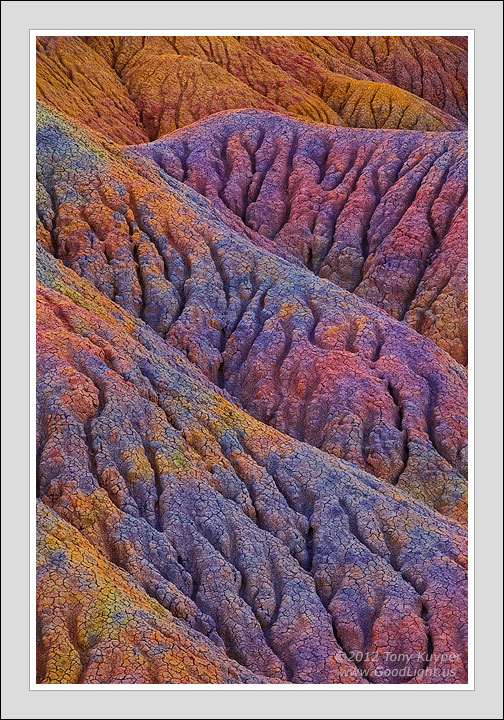
This is an image that builds on the "blended balance" concept in my last post. In addition to playing up the blues from the open sky, I also tried to bring out the underlying coloration, though the reality on the ground is that these colors are quite subtle to both the eye and the camera. A straight conversion of the RAW file is posted below for reference. Hopefully, though, it's obvious that the colors and patterns in the final image are actually present in the scene itself.

I honestly didn't see or even imagine this image when I first hiked here. Aside from the obvious yellow in the background, there wasn't much color. It was only after getting the exposures into Photoshop that the colors hidden in the formations became apparent. I've already mentioned in a previous post that this place Photoshops better than it photographs, and this is a case in point.

I know this level of enhancement doesn't feel right sometimes, but I think it's pretty neat that these colors do exist at a subliminal level in the natural world and that we now have the technology to capture and express them in our photographs.

I would, as always, be very interested in hearing your thoughts on this image and how it could be improved.

5D2, Tamron 28-300 @ 209 mm per EXIF data, but I thought it was 300 mm, f/16, 1/6 sec, ISO 100, five focus-blended images.

Follow-up: Saturation mask also posted below.

Comments

37 comments
Comment posted by Tony Kuyper on July 7, 2012 at 12:31 AM
RAW file with no adjustments.
Registered on November 1, 2003, 364 Posts, 22328 Comments
Comment posted by Bob Miller on July 7, 2012 at 12:39 AM
Pretty wild stuff. I like the way the detail really stands out with this processing. I prefer this vertical over the horizontal previously posted.
Registered on January 24, 2005, 152 Posts, 405 Comments
Comment posted by Jared Warren on July 7, 2012 at 12:44 AM
I really like this. Very fascinating and creative technique. I think the colors grabbed my attention first but the textures, lines, and composition keep me looking.
Registered on May 11, 2012, 84 Posts, 931 Comments
Comment posted by Youssef Ismail on July 7, 2012 at 3:29 AM
Tony what is interesting is that you can actually see hints of the colors you present in the RAW file. Very cool and wild.
Registered on November 1, 2003, 474 Posts, 5555 Comments
Comment posted by Kah Kit Yoong on July 7, 2012 at 4:46 AM
I have to say this is one of the few of yours where the colours seem a bit over the top, almost neon. Enjoy the abstract composition though.
Registered on September 27, 2006, 636 Posts, 10682 Comments
Comment posted by Alister Benn on July 7, 2012 at 5:44 AM
That's wild Tony - Once again we see a situation where the camera does not in any way capture the reality of situations. Processing closes the circle between experience and image.
Registered on June 9, 2011, 23 Posts, 258 Comments
Comment posted by Tom Haxby on July 7, 2012 at 6:24 AM
Pretty amazing the colors that we cannot perceive with our eyes or capture with our cameras. I like the texture, lines and detail and as an expression of art - it works. The composition is good too.
Registered on July 6, 2006, 126 Posts, 647 Comments
Comment posted by Mark Seawell on July 7, 2012 at 7:42 AM
Tony, this is so different from what I'm accustomed to seeing in Germany. I do like the texture, fascinating. Personally, I would like to see this as a B&W because I'm me! ;) Great shot!

Rgds

Mark
Registered on December 5, 2011, 197 Posts, 237 Comments
Comment posted by John Fan on July 7, 2012 at 7:55 AM
It is wild, Tony. I like the way you bring out colors in those rocks. It has become your signature work. Although I would prefer a slightly less saturated color on this one.
Registered on August 24, 2010, 135 Posts, 489 Comments
Comment posted by Rick Turner on July 7, 2012 at 9:03 AM
Interesting work Tony. A tad too much saturation but beautiful :toast:
Registered on February 18, 2012, 534 Posts, 2755 Comments
Comment posted by Tony Kuyper on July 7, 2012 at 9:24 AM
Thanks for the comments. It's interesting to hear the different perspectives. I thought I'd post a saturation mask of the the image to show that, overall, these colors really aren't that saturated. The lighter the gray value in the mask, the more saturated the color in the image. It's mostly the warm tones that have the most saturation. The cooler colors are pretty unsaturated. My goal was to fully develop all the colors (but not over-saturate them) and to bring a degree of balance to the image so that no color seemed too dominant. I wonder if the unusual hues are leading to a sense of over-saturated color?
Registered on November 1, 2003, 364 Posts, 22328 Comments
Comment posted by Gary Yeoh on July 7, 2012 at 10:17 AM
Tony:
Really wild and pretty amazing :jump:
Registered on September 1, 2009, 588 Posts, 8184 Comments
Comment posted by John Williams on July 7, 2012 at 11:15 AM
The comp is perfection Tony. At this level the color emphasizes the "art" end more than the "photo" end (IMHO), but I have no problem with that. I especially like your adding the information on where the photo started. Hopefully most of us have worked RAW enough to realize that a straight conversion is _not_ the full story.
Registered on September 6, 2007, 221 Posts, 5985 Comments
Comment posted by Mark Seaver on July 7, 2012 at 11:20 AM
Pretty amazing difference. I'm sensitive to the saturation changes that both photoshop and lightroom do "behind the scenes" when you make "brightness" changes. You sure know how to use those to great advantage. I like the colors and layers here, but most of all I like the textures created by the erosion lines and the cracks in the dried mud (at least it looks like mud).
Registered on January 23, 2011, 1103 Posts, 17270 Comments
Comment posted by Nancy Lea Sandy on July 7, 2012 at 2:33 PM
Amazing what the blend of photographic and processing skill can produce. There are places here in Wyoming where I can see all these colors in the soil but they seem to go away when photographed. Now I know where they go. This is a masterful composition with color, pattern, and texture all pulling together to create astonishing beauty. Very nice, indeed
Registered on January 24, 2011, 576 Posts, 6942 Comments
Comment posted by Tom Kualii on July 7, 2012 at 3:24 PM
wow.....cool
Registered on November 24, 2010, 53 Posts, 139 Comments
Comment posted by Morris McClung on July 7, 2012 at 3:40 PM
Art has no bounds. Is it accurate to what our eyes would probably see, probably not. Who cares? This is your expression of what you see, and it is beautiful, as usual. Every possible nuance wringed out of the Raw. :toast:

Reminds me of a chenille bedspread I saw somewhere when I was young. :biggrin:
Registered on May 7, 2007, 670 Posts, 19650 Comments
Comment posted by Catherine Reilly on July 7, 2012 at 3:43 PM
Enjoyed reading your comment, Tony, as much as viewing the image. I totally identify with what you are saying. As I discovered (with some excitement!) in processing my recent waterfall scenes, there is more than the eye, or camera, can see. For me it feels as though I can now reveal "what the soul sees." And you clearly are doing that with these images. No, it does not look "natural" perhaps, but as you say, the color is there in reality. We only see a little bit of paradise with our senses. With your gift of "seeing" and processing, wow, we see more of what is there. If we could see that much color around us all the time, I think we would be overwhelmed with beauty and unable to function! Sounds like heavenly bliss to me!

Thank you so much for your comment on my most recent waterfall post. I reworked it according to your suggestion and reposted it, so people could see what you saw, that was there but not seen in my version of processing. So exciting!
Registered on August 16, 2006, 603 Posts, 9192 Comments
Comment posted by Yiming Hu on July 7, 2012 at 5:22 PM
Very interesting interpretation of the nature, Tony. Looking at the original image, it is very hard to believe that there are so much colors hidden there. This picture surely belongs to the photo art category, IMO, but it nevertheless is a great image. :smile:
Registered on April 28, 2011, 38 Posts, 733 Comments
Comment posted by Nick Bristol on July 7, 2012 at 5:54 PM
Beautiful image! Perfect comp. :smile:

Nick Bristol
Lone Rock, WI
Registered on February 1, 2004, 752 Posts, 14140 Comments
Comment posted by Todd Liotine on July 7, 2012 at 8:23 PM
Some kind of crazy alien brain, I like it!
Registered on July 1, 2008, 131 Posts, 671 Comments
Comment posted by Bret Edge on July 7, 2012 at 8:38 PM
Fantastic, Tony. The colors are exquisite and the contrast between the background yellows and the rest of the image is striking.
Registered on November 1, 2003, 711 Posts, 6363 Comments
Comment posted by Harley Goldman on July 7, 2012 at 9:19 PM
Once again, I am the minority contrarian. I much prefer the RAW file, as the super,super saturated colors are not working for me.
Registered on November 19, 2003, 586 Posts, 11271 Comments
Comment posted by Tony Kuyper on July 7, 2012 at 9:58 PM
Actually, the RAW file's hues are no more saturated than those in the final image. This is the saturation mask of the RAW file. Again, the lighter the gray value in the mask, the more saturated the color in the image (RAW image this time). It can be compared to the one above for the final image. The color saturation has sort of been flipped from the RAW file to the final version. To some degree, it's removing the over-saturation of the RAW file that uncovers the other colors in the scene. I think it's interesting how the colors here are perceived as over-saturated when they're actually no more saturated than that of the RAW file. I'm still trying to work out what that means.
Registered on November 1, 2003, 364 Posts, 22328 Comments
Comment posted by Nicolaus Wegner on July 7, 2012 at 10:42 PM
First two things that came to my mind...Electric Cool-aid acid test and brain. ;]

Wonderfully done Tony.
Registered on February 21, 2010, 133 Posts, 1509 Comments
Comment posted by David Edwards on July 8, 2012 at 4:11 AM
I love your comp here Tony, but I'm in two minds about the color work. Thank you for sharing your processing details, it really is quite remarkable the amount of color you have pulled from the file, and I do think it is balanced very well. Personally, I find the total amount of color a little overwhelming, and would probably put the color version on top of the raw version and adjust opacity to around 20% for a more subtle effect. However, each to their own and that's what makes personal artwork so interesting and individual. :toast:
Registered on December 6, 2008, 142 Posts, 2623 Comments
Comment posted by James Fougère on July 8, 2012 at 12:30 PM
Amazing image with interesting information :cool:
Registered on October 25, 2010, 41 Posts, 831 Comments
Comment posted by Zack Clothier on July 8, 2012 at 3:50 PM
It' amazing how much information you were able to pull out of the RAW file, nice work as always, Tony. No nits from me. :toast:
Registered on January 28, 2010, 343 Posts, 2257 Comments
Comment posted by Leo Collazo on July 8, 2012 at 8:13 PM
Awesome Tony! I really like the texture and detail in this image, and the colors are amazing. Actually, I kind of like the non adjusted RAW file as well. I find the pastel violets and the variation of very subtle colors within it to be really beautiful.
Registered on August 4, 2011, 19 Posts, 69 Comments
Comment posted by Vance Gese on July 9, 2012 at 2:00 AM
This is amazing, Tony. The textures and forms are incredible, but together with the color that you have brought out, this becomes a breathtaking work of art. Stunning.
Registered on November 13, 2008, 298 Posts, 6629 Comments
Comment posted by Anil Rao on July 9, 2012 at 3:58 AM
I love the composition, the texture and the gorgeous colors. They are working together so well that the end result is more than the sum of their parts.

I do wish, however, that you didn't provide all the details behind the making of the photograph. In many way, it seems to spoil the overall effect (for me at least). There is an element of wonder and mystery behind the making of any artwork and I feel that some things are best left unknown.

As always, I look forward to seeing more of your work.
Registered on November 15, 2003, 234 Posts, 4923 Comments
Comment posted by Kory Lidstrom on July 9, 2012 at 12:55 PM
The image itself is very nice. That said, the colors do, to me at least, appear to be unnatural. Not that they aren't pretty and compelling, because they are. The just look artificial.
Registered on November 19, 2008, 49 Posts, 1035 Comments
Comment posted by Abdulla Bin Touq on July 9, 2012 at 2:47 PM
Tony this is wonderful!

I think its every scene when click a shutter we capture the most of the light data and we extrapolate it using Photoshop. You presented it here very clearly that I really admire. Could ask where is this on earth?

Registered on January 2, 2011, 10 Posts, 68 Comments
Comment posted by Mark Metternich on July 9, 2012 at 10:09 PM
That is crazy! That would sell!
Registered on June 19, 2009, 276 Posts, 6240 Comments
Comment posted by Harry Lichtman on July 10, 2012 at 7:20 PM
Tony - Have you considered cropping off the top orange most mound? For me it breaks up the nice diagonal flow of the nearer mounds. Stunning presentation.
Registered on September 17, 2010, 304 Posts, 3507 Comments
Comment posted by Scott Miller on July 10, 2012 at 7:38 PM
Tony, I immediately knew from the thumbnail that this was one of yours. I really like it. I don't feel it looks over-saturated at all, but I do feel that it looks unnatural. Personally I don't mind that it looks a bit surreal, just because it isn't something you see often doesn't make it anything other than gorgeous.

Registered on May 9, 2011, 23 Posts, 322 Comments
Comment posted by Floris van Breugel on July 11, 2012 at 6:37 PM
Fascinating to see the difference between the raw and the developed work. Regarding why the colors appear so much more vibrant without being more "saturated" as per the definition of saturation... I often apply "saturation" with the channel mixer, which rather than increasing true saturation really just purify's the colors, so greens become more green, reds more red, etc. The result is similar to boosting saturation, but really it's affecting the hue more. Similar things happen when you crank on the contrast through curves. So, while you may not be altering the saturation, the hues are being pulled apart and purified by other parts of your workflow, and the result is similar to an increase in saturation. At least, that's my understanding. Anyways, the result is fascinating, and as I said before, from a art appreciation perspective, I don't think the details need or should be shared.. but with my photographer and scientist hat on, I really like thinking about the process!
Registered on December 19, 2008, 306 Posts, 4840 Comments