Rock and a hard place +rp
by Lon Overacker
or for lack of a better title...
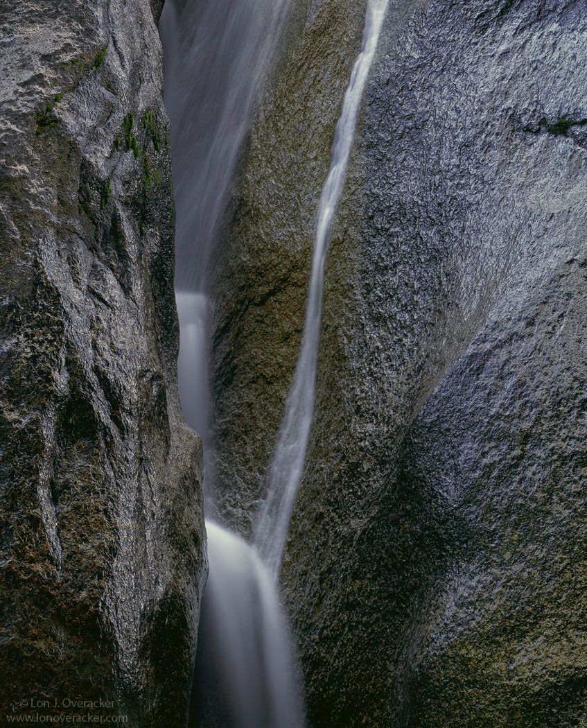
Thanks for your thoughts and comments on my previous post. This one differs in the sense that it's pretty straight forward. No crops to consider, no special vision or seeing, just a straight image of granite and water.
I've posted the color version for the larger view, but I think I'm leaning to the b&w version. Not quite satisfied with the colors yet. What say you? All comments welcomed and appreciated.
BTW, this is very similar to Harley's version that he posted a few weeks back. There were four of us focusing on this granite wall below the Royal Arch in Yosemite back in May.
4x5, 300mm, V100F, f/22 @10s, PL
Thanks!
Lon

Comments
30 commentsThanks Youssef. I kinda have an uneasy feeling about this one too. Probably more about the metalic sheen Nick referred to and less about composition and emotional appeal or impact.
Lon
Nick Bristol
Lone Rock, WI
I am prone to prefer the color version because of its almost monochromatic character. I would not want to miss the subtle color shades, they just make the difference for me in this image. Regarding the crop, the stronger asymmetry in the first version has a lot of tension for me, and the fluvial traces at the right balance the falls nicely in my opinion.
Peter
B/W works best. Good eye nice composition
For me B&W vs color was close contest, but in the end subtlety of greens in color won out. Just a wonderful feel.
thanks again!
Lon
Cheers, Gary.