Gallery: FloraPosted June 21, 2012196 views12 comments
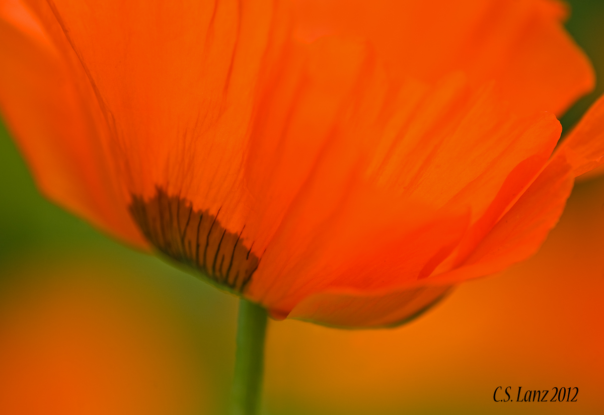
Thank you for your comments on PP1. Here's a variation on the theme taken at the same time. I am curious as to which one is preferred. Nikon D700, 180 macro, f4, iso 250, 1/800.
Comments
12 comments
Comment posted by Wayne Jones on June 21, 2012 at 11:23 PM
Hmmm, hard to say which one I like best. I can see more detail in the edge of the petal in the previous one, but that may be partly due to the position in the frame. I usually don't comment anymore on matters of saturation because I think my wide-gamut monitor gives me a different view of colors than most people see, even though it's calibrated, and I am viewing it in Firefox. However, I wonder if your histogram shows the red channel jumping off the right side of the graph. That's a common problem (if you want to call it a problem) with intense reds like this. There are various ways of dealing with it if you are interested in recovering details in the intense red areas. However, that's a matter of taste, and if you are going for a high-impact abstract view like this, more power to the reds. (No old-fashioned political meaning intended. )
Oops -- almost forgot to answer the question. As I said, it's a tough call, but since I am more of a documentary guy, I like this one because it shows more details in the flower, at the bottom even though the top edge of the petal fades into the "no details" zone at the top.
Registered on April 18, 2007, 953 Posts, 6435 Comments
Comment posted by scott lanz on June 22, 2012 at 8:07 AM
Thanks for the suggestion, Wayne. Much appreciated. Here is a repost with reduced red.
Registered on November 14, 2003, 840 Posts, 12902 Comments
Comment posted by Mark Seaver on June 22, 2012 at 8:18 AM
I like your first post best, largely because of the added interest that the second dark area provides. In this version, I think the soft edge of the petals and the green URC are distractions.
Registered on January 23, 2011, 1103 Posts, 17270 Comments
Comment posted by Ian Wolfenden on June 22, 2012 at 10:24 AM
I think I would have to say I prefer this version, Scott. I feel that it's somehow more satisfying compositionally and it gives a stronger sense of the form of the flower. The colours, by the way, I find exquisite in both.
Registered on May 18, 2007, 1108 Posts, 7647 Comments
Comment posted by Mark Windom on June 22, 2012 at 11:10 AM
I tend to agree with Mark re: the dark green in the URC being a little distracting but I still prefer this version to the first. What about a slight crop from the right to remove that green area?
Registered on November 1, 2003, 176 Posts, 2302 Comments
Comment posted by Eirini Pajak on June 22, 2012 at 11:21 AM
Reducing the red really improved this a lot! I like this post much better than the other...I think the composition is better & I think seeing the brown spot from the outside only is more interesting. I don't find the green at all distracting, if anything it adds more interest & shape to the flower in my opinion!
Registered on December 13, 2011, 216 Posts, 1671 Comments
Comment posted by Elisabeth Czwikla on June 22, 2012 at 9:12 PM
this is the better one with all those oranges in the bg, like it a lot.
Registered on December 9, 2007, 145 Posts, 852 Comments
Comment posted by Ramamohan Pai on June 22, 2012 at 10:21 PM
Scott - I like the previous one and this one equally. In this I might like a version with colors somewhere in between but the first even though a bit saturated (and may have the red channel blown), still packs a punch for me.
Registered on November 1, 2003, 550 Posts, 9037 Comments
Comment posted by Catherine Reilly on June 23, 2012 at 7:01 PM
I sure like this one, Scott. The color on the orange poppies is really this intense, and I think you handled the color well. Like the selective focus, too. I think the repost is a little too reduced in color...
Registered on August 16, 2006, 603 Posts, 9192 Comments
Comment posted by Howard Cheek on June 24, 2012 at 7:46 AM
I prefer this version for its slightly pulled back comp, and it clearly puts the dark center as your focal point.
As before, I like the color combo and the added wash of orange along the bottom works nicely
Post script: IMO the initial post here was fine, and I prefer it..
Registered on July 24, 2008, 1201 Posts, 10758 Comments
Comment posted by Bill Fach on June 24, 2012 at 9:32 AM
Scott: I do prefer this one for the POF choice. The dark OOF center part on the first bugged me a little. On my monitor the colors look pretty good but I do see where Wayne is coming from and like the repost here as well. Very nice work.>=))>
Registered on November 1, 2003, 1805 Posts, 26981 Comments
Comment posted by Gary Yeoh on June 25, 2012 at 4:26 AM
Scott
I like this one better. For me, poppy mean intense color and all about color which come through loud and clear in this version.
Registered on September 1, 2009, 588 Posts, 8184 Comments

Comments
12 commentsOops -- almost forgot to answer the question. As I said, it's a tough call, but since I am more of a documentary guy, I like this one because it shows more details in the flower, at the bottom even though the top edge of the petal fades into the "no details" zone at the top.
As before, I like the color combo and the added wash of orange along the bottom works nicely
Post script: IMO the initial post here was fine, and I prefer it..
I like this one better. For me, poppy mean intense color and all about color which come through loud and clear in this version.