Nature Photographers Network
This is the preserved archive of the original Nature Photographers Network. The community continues at naturephotographers.network.
 Sunrise + Repost # 2
‹ PreviousLandscape GalleryNext ›

Sunrise + Repost # 2

by Nick Bristol

Gallery: LandscapePosted June 20, 2012514 views26 comments
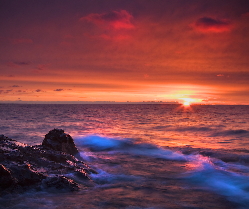
A wonderful sunrise on Lake Superior that I so much enjoyed. One of the most vibrant sunrises I have seen in quite awhile. Taken on the north shore of the lake in northern MN.
Canon, 35mm, iso 200, f/16, 1/2 sec & reverse grad.

Comments

26 comments
Comment posted by Morris McClung on June 20, 2012 at 9:34 PM
Wow, is this ever gorgeous! You took some artistic license for the higlights of the water, but I like it, and it works well for me. Very painterly.
Registered on May 7, 2007, 670 Posts, 19650 Comments
Comment posted by Nick Bristol on June 20, 2012 at 9:44 PM
Thanks Morris! Glad you enjoyed this. I did bring the highlightes up and saturation in the foreground water and rocks... and it seemed to give me the feel of being there again, which was so enjoyable. A fun morning I had! :smile: Nick
Registered on February 1, 2004, 752 Posts, 14140 Comments
Comment posted by Stan Rose on June 20, 2012 at 10:30 PM
Gorgeous sunset, Nick--just wow! I have two thoughts. I know there are some cute clouds up top, but this is screaming thirds to me, so id crop the top half of sky, which would have the added benefit of increasing the overall intensity (since the top sky is dark). Also, the blue highlights are jut a bit too radioactive IMO -- i half expect Godzilla to be rising out of that water at any moment :wink: Love the overall comp, subject, and exposure though!
Registered on September 15, 2005, 836 Posts, 17099 Comments
Comment posted by Yiming Hu on June 20, 2012 at 10:32 PM
A killer sky. Overall a great show. Agree with Stan about the crop and blue saturation.
Registered on April 28, 2011, 38 Posts, 733 Comments
Comment posted by Nick Bristol on June 20, 2012 at 10:47 PM
Thanks guys! I lowered the blue saturation to -10 and also went with Stan and Yiming's suggestion on the crop. I had thought about that before but decided not to do it I guess. It did look a little to saturated (blues especially) after I posted it here to me.
Thanks for your thoughts and suggestions! :smile: Nick
Registered on February 1, 2004, 752 Posts, 14140 Comments
Comment posted by Nick Bristol on June 20, 2012 at 10:50 PM
Whoops! forgot to add the repost with my last post! Here it is. I hope Godzilla is gone too! :smile: Thanks for the help.
Registered on February 1, 2004, 752 Posts, 14140 Comments
Comment posted by Vance Gese on June 20, 2012 at 11:12 PM
Whoa, this is incredible, Nick. Gorgeous.
Registered on November 13, 2008, 298 Posts, 6629 Comments
Comment posted by Jeremy Cram on June 20, 2012 at 11:48 PM
Geez! That sky is awesome!
Registered on June 4, 2006, 204 Posts, 818 Comments
Comment posted by Alister Benn on June 21, 2012 at 12:02 AM
Repost appeals much more, having addressed the majority of my concerns in the original... For a simple comp it's very effective...
Registered on June 9, 2011, 23 Posts, 258 Comments
Comment posted by Peter Richter on June 21, 2012 at 4:34 AM
Nick, I prefer the composition in the uncropped version, the clouds and also the darker parts at the top make for a very appealing symmetry to my eye. I think you reduced the saturation in a favorable way in the second version. Your choice of shutter speed conveys a rather immediate experience of this unique scene to me.

Maybe the horizon could use a slight rotation ccw, but that is only a minor matter. Thanks for sharing!

Peter
Registered on November 10, 2010, 218 Posts, 2723 Comments
Comment posted by Mark Seaver on June 21, 2012 at 8:35 AM
Spectacular sunrise, Nick. The colors do seem "other worldly" but they work very well and there's nice balance between the foreground rocks and the sun. I like both versions, the sky is neat and adds distance in the original post while the crops adds dynamism in the repost...two noticeably different visual effects.
Registered on January 23, 2011, 1103 Posts, 17270 Comments
Comment posted by Stan Rose on June 21, 2012 at 8:58 AM
Nick, maybe its my imagination but i could swear the repost looks less vibrant--did you reduce the sat globally? If so, ill stress that i was just suggesting to reduce the blue highlights locally, everything else looked fine. If not, i need a vacation...
Registered on September 15, 2005, 836 Posts, 17099 Comments
Comment posted by Nick Bristol on June 21, 2012 at 9:13 AM
Thanks for your thoughts guys, much appreciated!
Stan, I did lower the blue saturation to the whole image and I'm seeing what you see this morning. It looks different to me today than it did last night... :smile: I will work on it a bit more as soon as I can. Nick :wavey:
Registered on February 1, 2004, 752 Posts, 14140 Comments
Comment posted by Rick Turner on June 21, 2012 at 9:28 AM
The re post is better great. :toast:
Registered on February 18, 2012, 534 Posts, 2755 Comments
Comment posted by Nicolaus Wegner on June 21, 2012 at 9:55 AM
I like the suggested crop better. Gives more attention to the rocks on the left. Nice work Nick.
Registered on February 21, 2010, 133 Posts, 1509 Comments
Comment posted by Bill Chambers on June 21, 2012 at 10:35 AM
Repost looks much nicer, both in composition and saturation IMO. Love the reflected color on the water.
Registered on April 10, 2005, 753 Posts, 21216 Comments
Comment posted by Joseph Campisi on June 21, 2012 at 11:53 AM
Repost is the ticket Nick. Gorgeous light!
Registered on November 24, 2008, 304 Posts, 3211 Comments
Comment posted by Todd Liotine on June 21, 2012 at 3:55 PM
The repost it much better, if you could get those water highlights a little truer white and fix the horizon tilting to the right it would be real winnner. The colors of the sky are stunning!
Registered on July 1, 2008, 131 Posts, 671 Comments
Comment posted by Nick Bristol on June 21, 2012 at 4:43 PM
Again...thanks for your thoughts! In this version I put the blue back where it was in the first one, then lowered it again just in the waves (I think). I also tried to bring the white out a little more in the blue area of the waves, but not really that good at that kind of work in photoshop yet, even though it is probably easy when you know how. I really couldn't see the tilt to the right but since it was mentioned at least twice I did rotate it ccw, but only 0.2. I think the line of clouds right on the horizon and ending just to the left of the sun may have added to the tilt appearance...or it was just tilted! :smile: Thanks much to all of you for your comments so far. Cheers, Nick
Registered on February 1, 2004, 752 Posts, 14140 Comments
Comment posted by Dean Sauskojus on June 22, 2012 at 4:07 PM
Wow, love the color! Nice that you included some of the shoreline to provide a base to the image. Great work Nick.

Just saw the crop. Wonderful shot, I do like it better.
Registered on September 29, 2009, 137 Posts, 2659 Comments
Comment posted by Nick Bristol on June 22, 2012 at 7:36 PM
Thanks Dean! Nick
Registered on February 1, 2004, 752 Posts, 14140 Comments
Comment posted by Mark Metternich on June 22, 2012 at 9:08 PM
Wow, super surreal! :toast:
Registered on June 19, 2009, 276 Posts, 6240 Comments
Comment posted by Tom Haxby on June 22, 2012 at 10:01 PM
Great shot Nick. I like the cropped version with the blue saturation kept. That must have been the right place and time. Sunrises like that are rare.
Registered on July 6, 2006, 126 Posts, 647 Comments
Comment posted by Nick Bristol on June 23, 2012 at 9:07 AM
Mark and Tom, Thanks guys! Appreciate your thoughts! Nick
Registered on February 1, 2004, 752 Posts, 14140 Comments
Comment posted by Ed Lowe on June 24, 2012 at 11:36 AM
W :eek: w, talk about an epic sunrise. It must have been great to witness this beauty first hand. Beautifully done, Nick. :toast:

Ed
Registered on February 7, 2004, 414 Posts, 7115 Comments
Comment posted by Nick Bristol on June 25, 2012 at 8:15 AM
Hi Ed, Thanks! Nick
Registered on February 1, 2004, 752 Posts, 14140 Comments