Nature Photographers Network
This is the preserved archive of the original Nature Photographers Network. The community continues at naturephotographers.network.
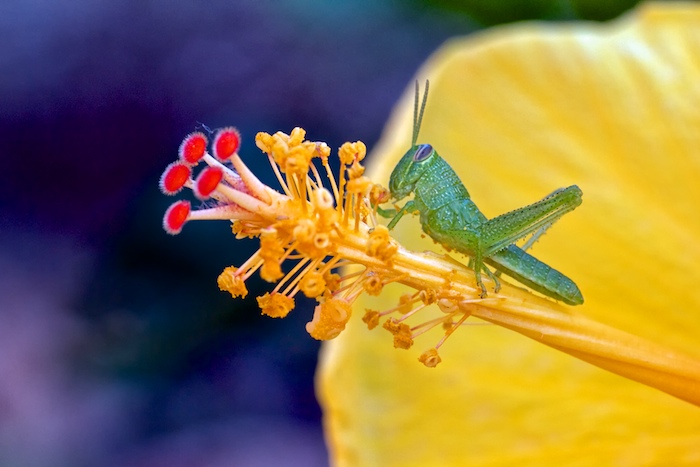
Grasshopper & Hibiscus
‹ PreviousMacro & Close-up GalleryNext ›

Grasshopper & Hibiscus

by Scott Day

Gallery: Macro & Close-upPosted June 19, 201288 views6 comments
I posted a similar image last week and your comments told me I needed to revisit with regard to my processing. I like this view better because the hoppers front leg is raking in the pollen but the techs are the same as the last version. I toned down the sharpening and applied noise reduction in the dark areas and the crop is a little different. What do you think?

Canon 7D, EF100 f2.8L, 1/50 sec @ f8, ISO 400, tripod

Comments

6 comments
Comment posted by Rick Turner on June 19, 2012 at 12:08 PM
This looks much better. :toast:
Registered on February 18, 2012, 534 Posts, 2755 Comments
Comment posted by scott lanz on June 19, 2012 at 8:30 PM
Scott, the processing looks much better in this image, both with regard to sharpness and lack of noise. This version looks very clean. The subject cuteness factor is obviously still there, as are the excellent colors. Comparing the two images, I do like the comp in the first version a bit better, especially the perspective angle and background colors. Had I not seen the other comp, however, I'd find nothing wrong with this one. Now, if you could just process the first to get the same sharp, clean look you achieved in the second, I think it would be perfect. Only other nit is the fact that the larger image here is actually smaller than the smaller. :wavey:
Registered on November 14, 2003, 840 Posts, 12902 Comments
Comment posted by Carolyn Derstine on June 20, 2012 at 9:54 PM
I didn't comment on your previous similar image but I do like this one a lot better. The processing looks more natural. Good focus on the little guy. I like the pollen that appears to be stuck to his belly. :smile: Nice perch and good overall comp. Great colors too.
Registered on February 16, 2011, 610 Posts, 3684 Comments
Comment posted by Chris Grabski on June 21, 2012 at 1:21 PM
The colours look great and the comp is very interesting , too. Really like it. :wavey:
Registered on April 29, 2011, 122 Posts, 431 Comments
Comment posted by Mark Seaver on June 21, 2012 at 6:24 PM
Great collection of colors, those in the background really set off the flower's center. The processing looks good and the comp is excellent.
Registered on January 23, 2011, 1103 Posts, 17270 Comments
Comment posted by Bunn Martin on July 2, 2012 at 5:10 PM
I like this image but the deep blue/black BG doesn't look natural and doesn't really contribute to the image. Perhaps you could make a selection in PS and work with it a little. Just my take anyhow.
Registered on September 17, 2011, 38 Posts, 167 Comments