Gallery: LandscapePosted June 18, 2012387 views17 comments
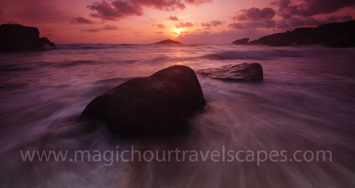
Quiberon, Brittany
I've been playing around with the lighting levels for a few weeks now and concluded that darker is better. Best viewed in a darkened room.
Canon 5DMkII, 16-35mm 2.8L
Comments
17 comments
Comment posted by R.Bill Moser on June 18, 2012 at 12:37 PM
I love the dark presentation of this one. Stunning colors and perfect shutter speed. Great mood!!!
Registered on January 29, 2010, 285 Posts, 4281 Comments
Comment posted by Nick Bristol on June 18, 2012 at 2:27 PM
I agree with Bill...Fantastic mood! I love the motion of the water and the color really adds to the mood. Very nice, Kah Kit.
Nick Bristol
Lone Rock, WI
Registered on February 1, 2004, 752 Posts, 14140 Comments
Comment posted by Mark Seaver on June 18, 2012 at 2:41 PM
Lovely colors and I really like how the shutter speed choice pulls my eyes from front to back.
Registered on January 23, 2011, 1103 Posts, 17270 Comments
Comment posted by Alister Benn on June 18, 2012 at 8:55 PM
I agree, it is something I am working on as well. I work all my images with a dark sheet in mind, which allows for far more subtle details in the shadows, that tend to look a little blocked and lifeless on a pale sheet online.
As you say, this one needs to be viewed big and on black to fully appreciate its delicate light...
Registered on June 9, 2011, 23 Posts, 258 Comments
Comment posted by Tony Kuyper on June 18, 2012 at 10:07 PM
I like the comp and the feeling of actually standing in the surf. Undecided about the light level. Overtime, when I have dark images hanging, I find I lose interest in them.
Registered on November 1, 2003, 364 Posts, 22328 Comments
Comment posted by Harley Goldman on June 18, 2012 at 10:14 PM
Nice scene, but rather heavy on the magenta for my tastes.
Registered on November 19, 2003, 586 Posts, 11271 Comments
Comment posted by Eva McDermott on June 19, 2012 at 1:23 AM
I like as is Kah Kit. Color and light levels are all a matter of preference. This works for me, but yes, you do need to view this in a dark room.
Registered on January 4, 2009, 1015 Posts, 13229 Comments
Comment posted by David Edwards on June 19, 2012 at 5:54 AM
Wonderful colors here Kah Kit. I really like your darker processing which seems to concentrate my senses on the color and light exclusively. I can see a large print having tonnes of impact.
Registered on December 6, 2008, 142 Posts, 2623 Comments
Comment posted by Kurt Budliger on June 19, 2012 at 10:31 AM
Totally agree Kah Kit, love the moodiness and fantastic color throughout.
Registered on June 11, 2006, 113 Posts, 2116 Comments
Comment posted by Cliff Dodge on June 19, 2012 at 10:52 AM
Keep playing! :) Love the mood of this shot.
Registered on March 25, 2006, 125 Posts, 507 Comments
Comment posted by Joseph Campisi on June 19, 2012 at 11:55 AM
Gorgeous Kah Kit. I think the dark presentation is totally appropriate here. Those colors are wonderful. Great mood to this!
Registered on November 24, 2008, 304 Posts, 3211 Comments
Comment posted by John Fan on June 19, 2012 at 1:09 PM
Fantastic image. I like your choice of shutter speed to retain the texture in water.
Registered on August 24, 2010, 135 Posts, 489 Comments
Comment posted by Shantikara Valuska on June 19, 2012 at 4:00 PM
Another great picture from you! I love your dark images (also) they inspire me very much.
Registered on July 25, 2011, 38 Posts, 451 Comments
Comment posted by Nicolaus Wegner on June 19, 2012 at 6:45 PM
Some magical colors Kah Kit Yoong.
Darker works for me here. You don't always have to have detail in the shadows to create a great photo. No idea what it would look like in print though...a lot of empty space. Digitally it works for me.
Registered on February 21, 2010, 133 Posts, 1509 Comments
Comment posted by Scott Smorra on June 19, 2012 at 6:58 PM
The dark and moody feel of this image definitely works for me. Nice colors as well.
Registered on November 2, 2009, 161 Posts, 2143 Comments
Comment posted by Lon Overacker on June 19, 2012 at 8:44 PM
Kah Kit,
If you're gonna go dark, then go dark, which is what you've done here. What this does is make the image about light, motion, flow, form, etc. and not about detail. What is also does is keep someone like me from making a comment about shadow detail...
I do think it's scene and image dependent, but I can say for certain it works well here.
Lon
Registered on November 24, 2006, 521 Posts, 19147 Comments
Comment posted by Morris McClung on June 20, 2012 at 3:56 PM
Dark and moody, and very well done.
Registered on May 7, 2007, 670 Posts, 19650 Comments

Comments
17 commentsNick Bristol
Lone Rock, WI
As you say, this one needs to be viewed big and on black to fully appreciate its delicate light...
Darker works for me here. You don't always have to have detail in the shadows to create a great photo. No idea what it would look like in print though...a lot of empty space. Digitally it works for me.
If you're gonna go dark, then go dark, which is what you've done here. What this does is make the image about light, motion, flow, form, etc. and not about detail. What is also does is keep someone like me from making a comment about shadow detail...
I do think it's scene and image dependent, but I can say for certain it works well here.
Lon