Nature Photographers Network
This is the preserved archive of the original Nature Photographers Network. The community continues at naturephotographers.network.
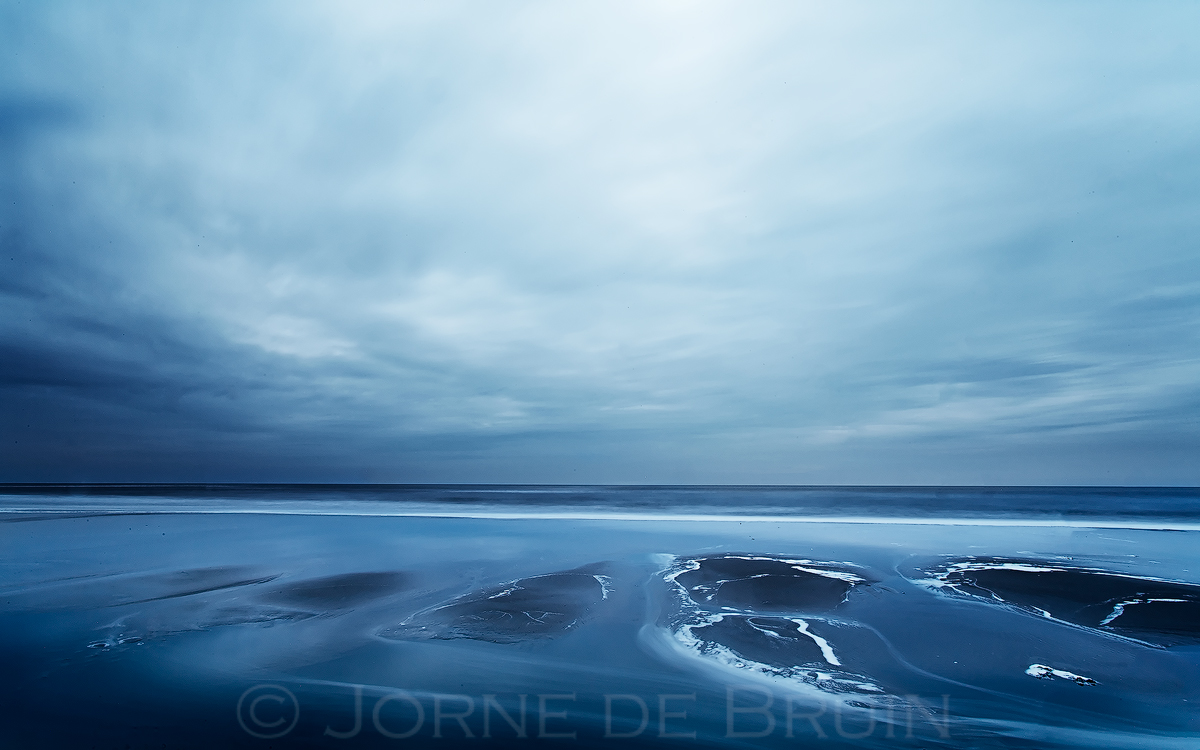
Fade to Blue II
‹ PreviousLandscape GalleryNext ›

Fade to Blue II

by Jorne de Bruin

Gallery: LandscapePosted June 17, 2012147 views9 comments
Another long exposure image from the beach, this time I opted for a foreground to have a nice contrast between the moving waters and the still beach/sand. Going to the islands again next week for some more shooting, can;t wait to shoot at the coast again!

Thanks for looking, and please view large :smile:

1dsII, 17mm

Comments

9 comments
Comment posted by Peter Richter on June 17, 2012 at 9:30 AM
Jorne, like the last posts of this series, your image conveys "blue" in an impressive way to me. The foreground elements make for interesting focal points to my eye that keep my attention.

Peter
Registered on November 10, 2010, 218 Posts, 2723 Comments
Comment posted by Shantikara Valuska on June 17, 2012 at 9:57 AM
Another great seascape from you! I wish there would be some more motion in the clouds. I would maybe darken the top a little. There's some small tilt in the horizon. Sorry for the nitpicking! :smile:
:toast:
Registered on July 25, 2011, 38 Posts, 451 Comments
Comment posted by Jorne de Bruin on June 17, 2012 at 10:21 AM
Thanks for the comments guys! Shantikara, no need to apologize! All c&c are welcome :wink:
Registered on June 26, 2008, 178 Posts, 2136 Comments
Comment posted by Joerg Bonner on June 17, 2012 at 11:29 AM
nice textures and wonderful mood. i agree about the darkening of the top. have you tried another comp with the foreground being more prominently in the image?

best,
joerg
Registered on September 5, 2011, 44 Posts, 221 Comments
Comment posted by Nick Bristol on June 17, 2012 at 3:12 PM
I'm really enjoying this image, Jorne, especially the larger version! The foreground is very interesting to me and the colors are wonderful. I think the sky works well here and adds to the special feel and mood of this picture, but could see it just a bit darker across the top also. Very nicely done!

Nick Bristol
Lone Rock, WI
Registered on February 1, 2004, 752 Posts, 14140 Comments
Comment posted by Tony Kuyper on June 17, 2012 at 10:45 PM
The monochrome works nicely here, especially because it's blue. I really like the abstract quality in the beach shapes.
Registered on November 1, 2003, 364 Posts, 22328 Comments
Comment posted by Eva McDermott on June 17, 2012 at 10:46 PM
I think it is going to be difficult to beat your previous post Jorne. Interesting foreground elements here but I think they compete too much with the sky.
Registered on January 4, 2009, 1015 Posts, 13229 Comments
Comment posted by Lon Overacker on June 18, 2012 at 3:54 AM
Jorne,

Another wonderful and simplistic seascape. The foreground is quite interesting and makes this one a little more grounded in reality than your previous version. And for that, I prefer your previous version because of that simplicity. this is a bit different from that one - but this is well done in it's own right.

Lon
Registered on November 24, 2006, 521 Posts, 19147 Comments
Comment posted by Jorne de Bruin on June 18, 2012 at 5:00 AM
Thank you all for he insightfull comments everyone! I find the different views on the image very intersting, and I will definitly experiment with a cropped sky :toast:
Registered on June 26, 2008, 178 Posts, 2136 Comments